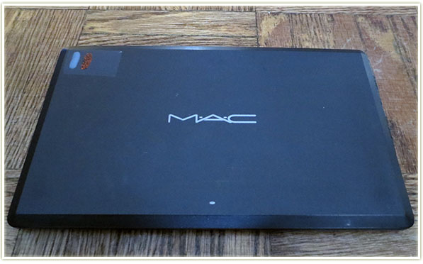
I thought I’d show you all a look into my MAC Neutrals palette. I also tend to think of this palette as the one with the “metals” because the middle row inspired me to think that way (gold, bronze, copper).
In order to identify my palettes since I do have the old style and won’t be converting to the new ones (I don’t see the point really, kind of a waste of money purely for aesthetics – says the person who loves makeup… lol) I put a piece of tape on the top left hand corner and then paint a nailpolish colour or two that best describes the shades in the palette. For my neutrals palette, there’s a stripe of nude polish and one of a sparkly orange because that was the closest I could get to neutral shades out of what I had!
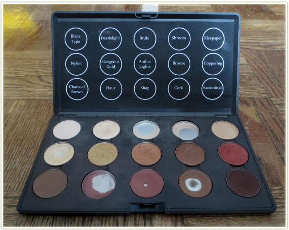
Although the highlight shades are used quite often, this is probably my least used MAC palette. Some of the browns are showing a lot of pan, but that’s because those are my oldest shades that date back to when I had less makeup so they got used a lot more often. Since I tend to prefer coloured eyeshadow, I don’t reach for this palette as often.
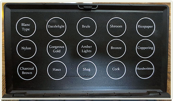
These fantastic labels were completely stolen from Zabrena. You can find her video tutorial for creating these templates here. They are fantastic and much nicer looking than the ghetto Post-It notes I had stuck to the top of the palette before!
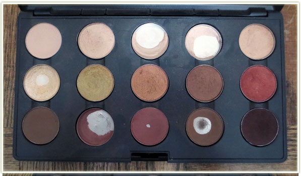
Let’s take a look at the individual shades I’ve plunked in. All swatches will be a diagonal stripe through the middle of graphic – I point this out because some of the swatches were a bit too close together on my arm so you may see more than one colour in some pictures.
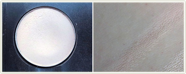
Name: Blanc Type
Finish: Matte2
Notes: Blanc Type is one of MAC’s buttery, soft Matte2 formula. On my my skin it looks slightly pink in the swatch, but it does wonders to brighten up any look and I tend to think of it as whiter than my other highlight shades. The texture is very, very smooth.
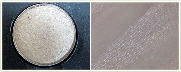
Name: Dazzlelight
Finish: Veluxe Pearl
Notes: This shade is slightly underused in my palette, but to me it’s a paler, whiter Shroom and definitely more shimmery.
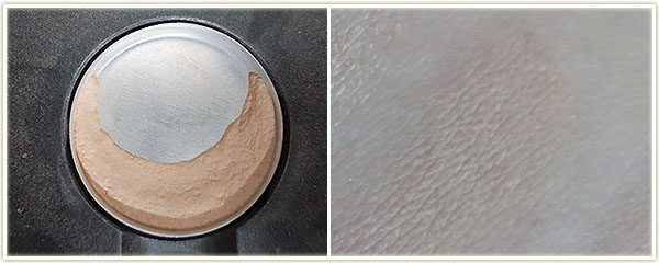
Name: Brule
Finish: Satin
Notes: Brule is an off-white that seems to completely melt into my skin. I’ve been trying to bust through this shade but it feels like the pan is never ending! This makes a great brow highlight on me and honestly, that’s the only thing I ever use it for. When I’m done with this, I’ll end up using Blanc Type as my usual brow highlight as I prefer the brightening effect that Blanc Typeprovides.
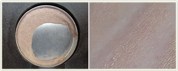
Name: Shroom
Finish: Satin
Notes: I like to think of Shroom as a shimmery Brule. I’m confused as to why this shadow is a satin finish because it definitely has shimmer to it that you don’t often see in satins. A great deal of people compare Shroom to Urban Decay‘s Virgin, but I personally do not feel they are the same.
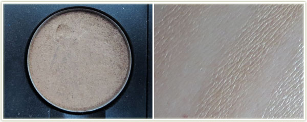
Name: Ricepaper
Finish: Frost
Notes: Ricepaper is a yellow tinted, shimmery beige. It has a frost finish, but it doesn’t reflect the same amount of frost that some of the frost finishes do… such as the next one:
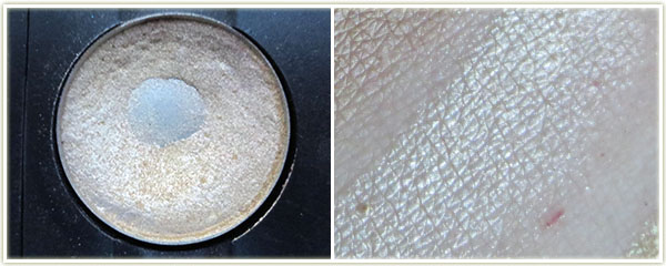
Name: Nylon
Finish: Frost
Notes: Nylon is phenomenal. In the pan, it looks like a white-gold, but on the skin it definitely seems to just embody the term “frost”. It definitely has a frost finish and looks slightly yellow. This is my second pot of this shadow and one of the first ones I ever owned from MAC.
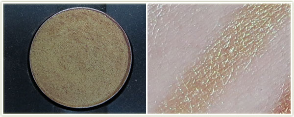
Name: Gorgeous Gold
Finish: Veluxe Pearl
Notes: This was was a nightmare to photograph in the pot, but as you can see from the swatch, it’s a beautiful reflective gold with hints of green.
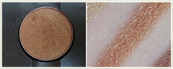
Name: Amber Lights
Finish: Frost
Notes: I know this is supposed to be phenomenal for blue eyes, but I must be mixing this with the wrong shades because it never looks that good on me. It’s very frosted and very orange. The pigmentation is fantastic and it smoothes on the lid beautifully.
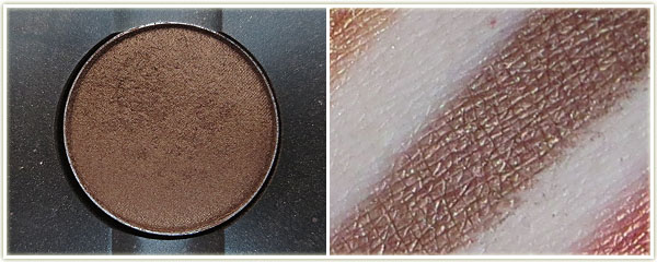
Name: Bronze
Finish: Frost
Notes: Beautifully pigmented, although not one I use often.
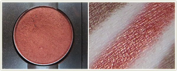
Name: Coppering
Finish: Veluxe Pearl
Notes: This is an absolutely outstanding colour, easily my number one favourite by MAC. This is a bright copper that has wonderful pigmentation.
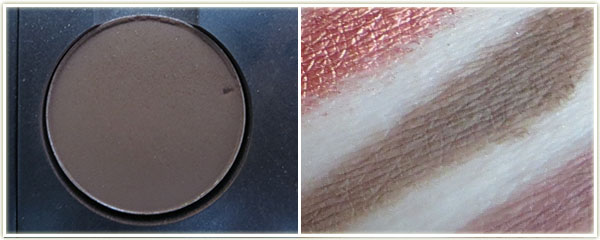
Name: Charcoal Brown
Finish: Matte
Notes: Another shade I’ve not used often. Seems to apply quite well, but it’s not as smooth as their Matte2 formula.
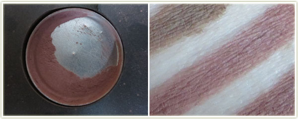
Name: Haux
Finish: Satin
Notes: This pan is my first ever MAC eyeshadow, bought in 1995. Yes, this shadow is that old! It’s a rosy-tinted brown and does wonders to make my eyes look awake. I use it in my crease with some kind of light shimmery shade on the lid.
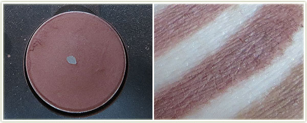
Name: Shag
Finish: Unknown, likely a satin
Notes: This is another incredibly old shade. MAC doesn’t seem to make this shade anymore and a quick Google search didn’t indicate to me when they discontinued it. That being said, it’s very similar to Haux. Maybe slightly deeper, but not by much. I usually pair this with Nylon.
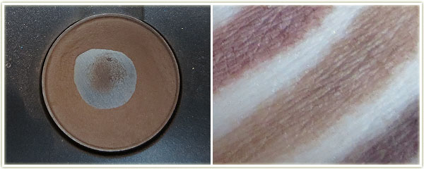
Name: Cork
Finish: Satin
Notes: I used to use this shade a lot, but I don’t even remember touching it in the last year.
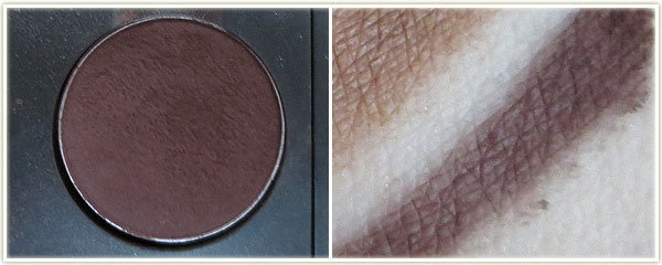
Name: Handwritten
Finish: Matte2
Notes: If you buy this shade, one of the first things you need to do is touch it with your fingertip. The texture is so incredibly soft that it actually feels pillowy. I’ve never felt a shadow like that before! The pigmentation on this is insane – to the point where it can actually be too soft so be careful when you stick your brush into the eyeshadow!
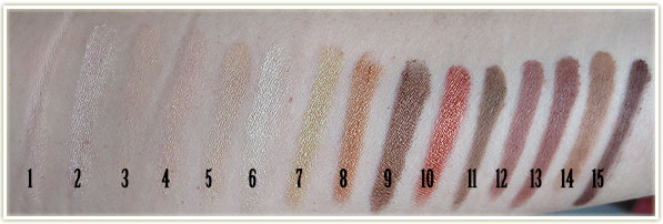
- Blanc Type
- Dazzlelight
- Brule
- Shroom
- Ricepaper
- Nylon
- Gorgeous Gold
- Amber Lights
- Bronze
- Coppering
- Charcoal Brown
- Haux
- Shag
- Cork
- Handwritten
So that was my neutrals palette! I’ll have three more MAC palettes to show you in the upcoming weeks.
One thought on “My MAC Neutrals Palette”