You know… I have this labelled as my MAC Whites and Blacks palette… and I have to say, while photographing and swatching this palette, it is very distinctly not whites and blacks. In fact, there’s only one white and only one black (and it’s a charcoal colour at that).
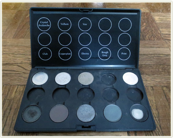
So I guess that my original thought when I created this palette would be that this would range from pure white to black, with all the shades of grey in between… but that never worked out. There’s some greys in here and some colours I probably should’ve put in other palettes if I have room.
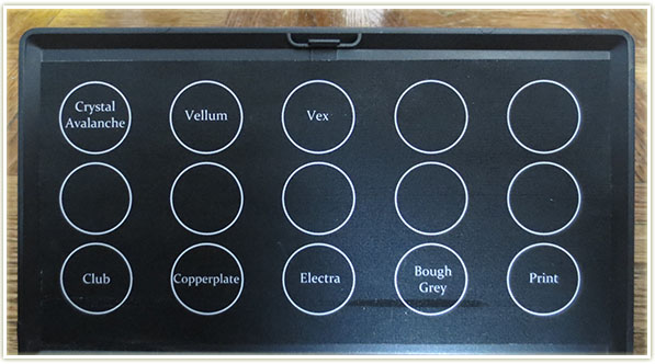
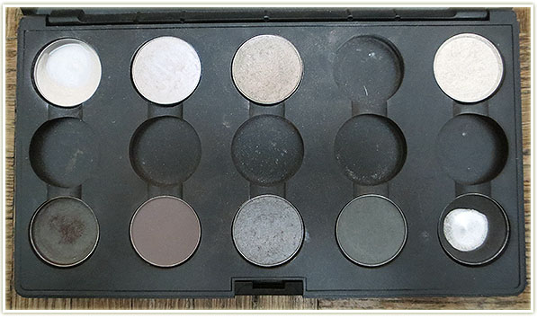
Unfortunately (or fortunately, for my wallet), this palette isn’t full, so I have a few less shades to share with you today.
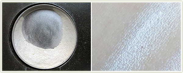
Name: Crystal Avalanche
Finish: Frost
Notes: Super frosty and super white. I use this primarily on the lid with Print in the crease. I think I also bought this as a replacement for the now discontinued Krisp from years ago (it’s not even remotely a dupe though).
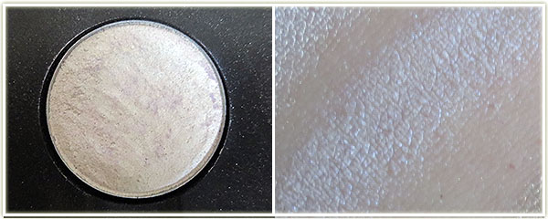
Name: Vellum
Finish: Frost
Notes: I’ve owned a few of these pans, in fact, probably about three or four of them over the years. This used to come in the larger pan sizes (back in the 90s anyway), but I can’t quite remember if it was the same size as a blush. It’s a white frosted shade with a blue/violet sheen to it which is a nightmare to photograph. You can see that the pan has shades of purple in it, and you can see the swatch has shades of blue, that’s the duochrome. I love the colour, but the current pan I have (and I remember this from older version as well) gets really crusty on top and ends up requiring you to scrape a few layers off every now and then in order to get colour payoff. Very much worth owning however.
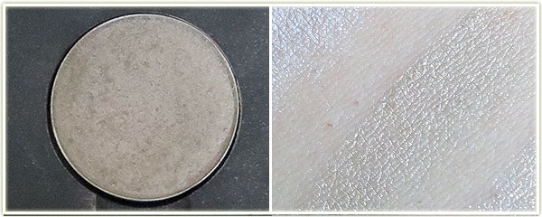
Name: Vex
Finish: Frost
Notes: Another nightmare colour to photograph. This is a pinky-green duochrome shade. It’s beautiful and is one of MAC’s softer shades – I always love applying this colour to my lids because it just goes on so easily.
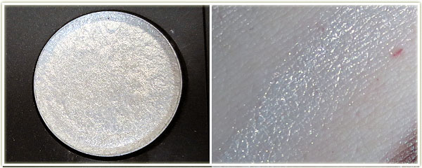
Name: Vanilla
Finish: Pigment
Notes: Unlabelled in my palette at the moment since I’d just recently pressed it – this colour is like fairy dust. I don’t even know how to describe the base colour of this shade, maybe off-white, although I wouldn’t use it hoping for “off-white” on my lids. The sparkle within it is gold with some pink and orange in there. It’s absolutely stunning.
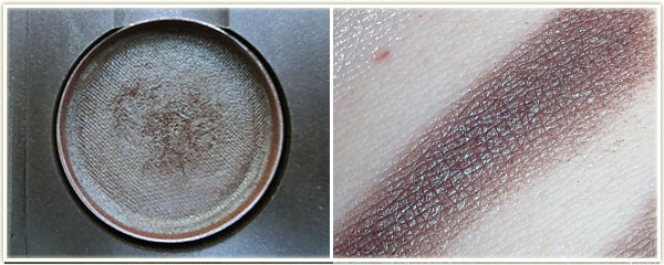
Name: Club
Finish: Satin
Notes: Satin is a weird finish for this one since it’s a duochrome and definitely has shimmer to it. The base of the shade is a red-brown colour and the duochrome is decidedly green. I love this especially with Vex.
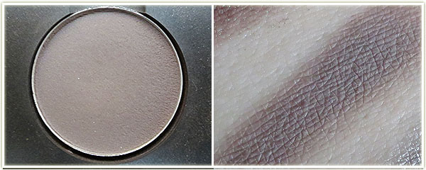
Name: Copperplate
Finish: Matte2
Notes: Beautiful brown-grey in a lovely matte2 formula (although not as soft as Handwritten which is like butter!).
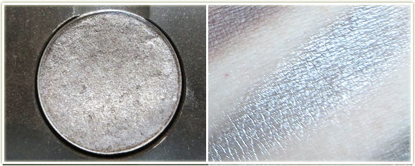
Name: Electra
Finish: Frost
Notes: Probably my second pan of this shade – I used this to death in my early twenties as my “going out” look. It’s a very frosty, very shiny silver.
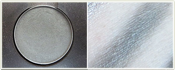
Name: Bough Grey
Finish: Satin
Notes: Limited edition – I picked this up with the Liberty of London collection in 2010. Very muted grey.
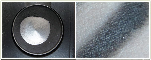
Name: Print
Finish: Satin
Notes: A not-quite-black shade (more charcoal than black) that goes on with very minimal sheen.
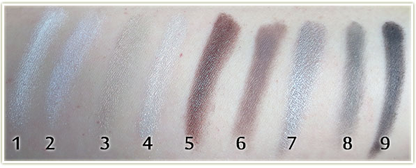
- Crystal Avalanche
- Vellum
- Vex
- Vanilla Pigment
- Club
- Copperplate
- Electra
- Bough Grey
There’s only one palette left in my MAC collection, and that’s my Purples and Pinks palette, which should be up within the next two weeks. If you’re interested in seeing my previously posted palettes (wooo alliteration!), you can check them out here:
2 thoughts on “My MAC Whites & Blacks Palette”