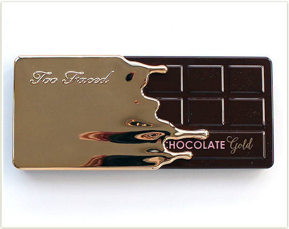
Yesssss!!!! Say hello to the Too Faced Chocolate Gold palette! Created, in my eyes, as the antithesis to the White Chocolate Bar palette, this one is chockfull of rich, vibrant jewel tones centered around a golden theme.
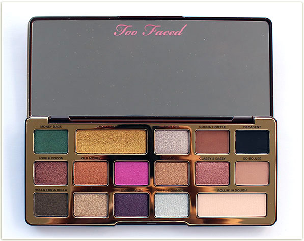
While I haven ‘t used the palette on my face yet (I was rushing to get swatches up and I’m about to film a try on with this palette – so watch out for that on my YouTube channel as it’ll be up this week), what I can tell you is that these shadows feel more like foiled shadows. They’re almost wet looking on the skin and there’s a density to them that was unexpected but so appreciated. The palette also comes with four absolutely vital matte shades (a brow bone highlight, a transition shade, a deeper brown and a black) amongst all the shimmers.
Too Faced Chocolate Gold Swatches
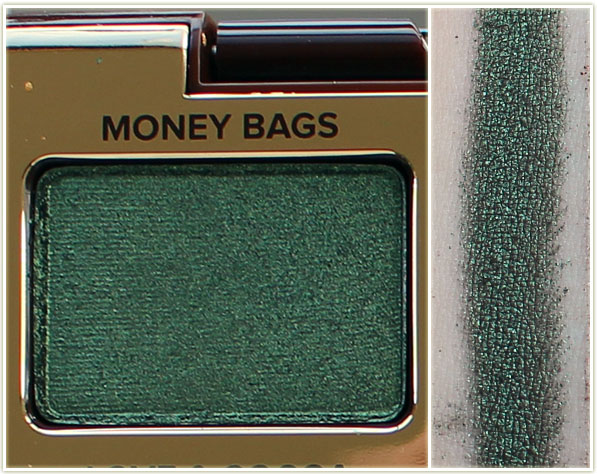
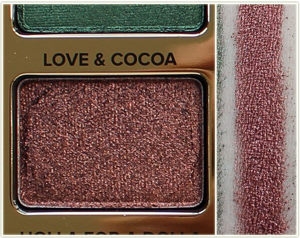
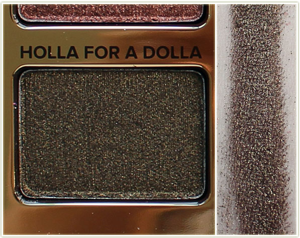
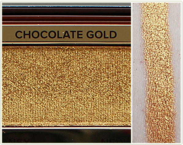
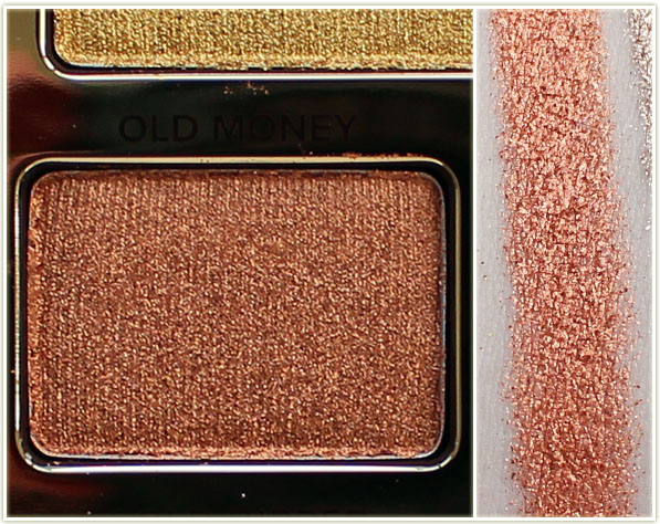
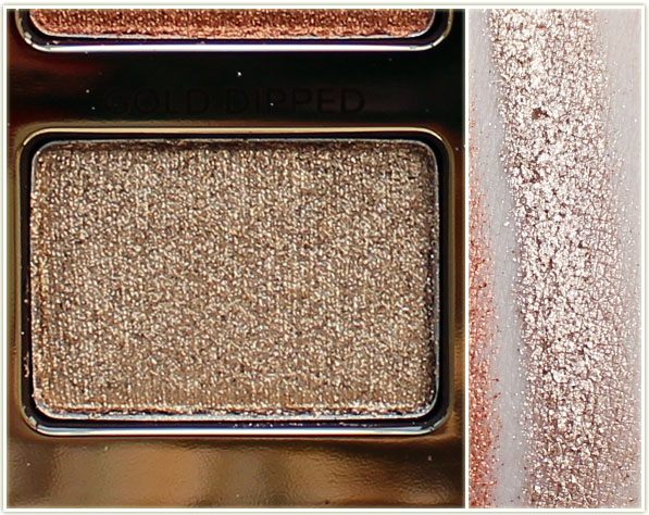
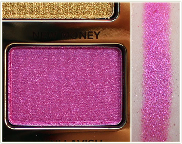
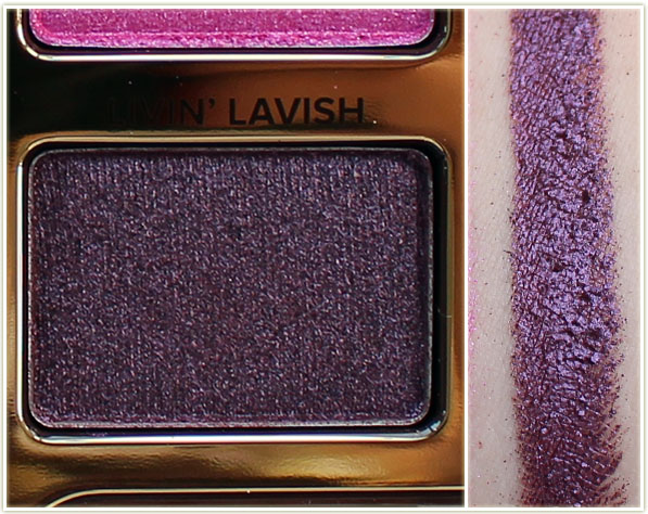
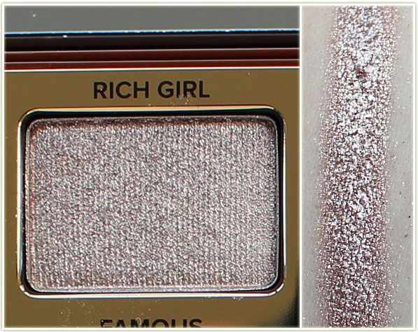
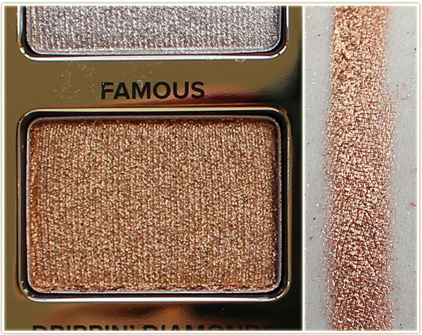
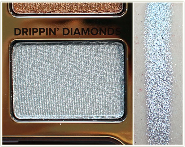
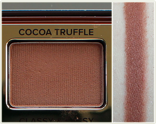
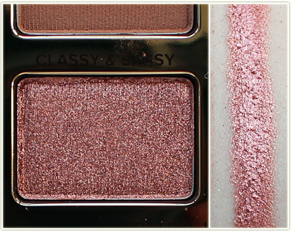
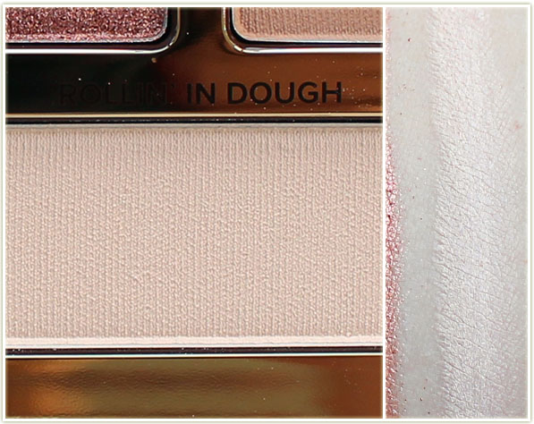
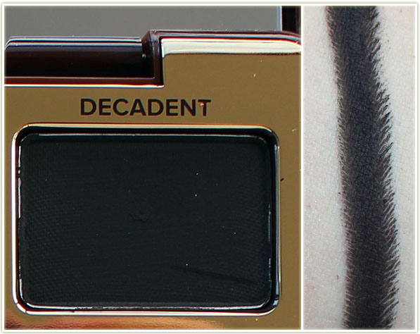
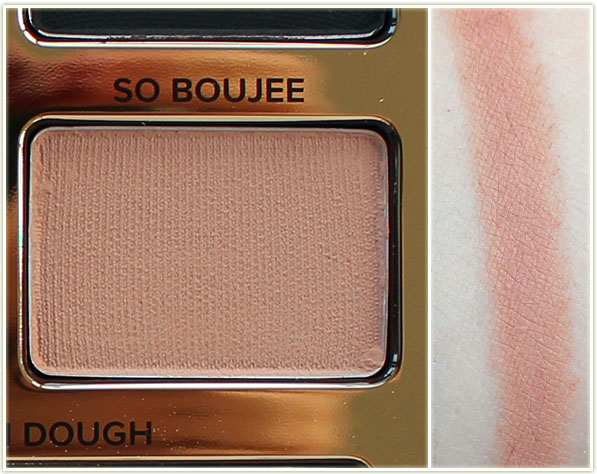
The Too Faced Chocolate Gold palette can be purchased on sephora.ca for $59 CAD or on sephora.com for $49 USD.
The product featured in this post was sent to me for consideration. Post contains affiliate links.
That packaging is awesome!
While I love some of the colours (Love & Cocoa, Holla For A Dolla, and Classy & Sassy) in this palette, I just know that there are a bunch that I would hardly use.
Thanks for the swatches!
stashy recently posted…November 2017 No-Buy-Low-Buy Accountability
I was surprised that there were so many neutrals to be honest – my overall impression of the palette was quite colourful (mostly because the green, pink and gold really stick out).
I would love to have at least one palette full of shimmers, sparkles, or metals. This one seems quite appealing and it’s a tie between that and Urban Decay’s Heavy Metal one. (I wonder if whoever came up with the name for that palette actually listens to heavy metal music like I do) I have no clue, that shiny pink would look nice on me though.
I love the colours in the UD Heavy Metal palette, but I CANNOT get down with that packaging. What the hell were they thinking putting a mirror in the MIDDLE of the eyeshadows?? It’s so freaking bizarre!
Yeah I’ve seen some complaints about it like it’s too bulky and the mirror to separate bolds from neutrals. I don’t know, I don’t see anything wrong with it, all I got was one of the new glitter liners instead. Could just be they were trying to experiment?
Emily recently posted…Hakkon Wintersbreath Risen Again
Whoa, those colours really wake you up. New Money looks like an outlier, it’s a deeper pink, but still very bright.
Core matte shades AND they’re positioned together? Someone on the design team is paying attention! 😀
I wish brands would stop sticking this random pink in palettes though. While the rest of the palette is very good, that particular shade just looks so weird in there!
And yes, ALL THE MATTES YOU NEED! I was so pleased!
Wow.. What a palette.. OMG.. I am in love..
Isn’t it beautiful??
I need this! I think I have dupes for some of these shades, but I just can’t resist a palette like this. I’m such a magpie for shiny, colourful things.
How similar is the scent to the Tartelette in Bloom palette?
hahaha I think we’re all magpies to a certain extent!
I don’t think it’s similar to Tartelette in Bloom at all. This one has far more colour and the in Bloom palette has so much shimmery shades in comparison.
I swatched this pallette and fell in love. That pink looks ridiculous untill I tried it on my lip and wowza! So I just the UD heavy metal. What do I do? They are so similar and yer different. Please help me choose between the two! Can’t have both!
LOL! The pink really does look like such an oddball shade doesn’t it? Interesting that you tried on your lips – glad it worked out that way for you! I’m just never inclined to put shadow on my lips (too much upkeep for my tastes), but I’m glad there’s SOME use for it… I haven’t a clue how I’m going to use it personally.
I don’t have the UD Heavy Metal palette because I CANNOT get behind that packaging. The mirror in the middle of the freaking palette totally ruined the whole aesthetic of it for me so I just said “nope, pass!”.
I love the Old Money shade. Overall a really nice palette for the holidays.
It’s definitely a phenomenal palette for the holidays!