Category Archives: Reviews

Too Faced Sweet Peach Glow & Papa Don’t Peach (Review & Swatches)

Too Faced Sweet Peach

Too Faced Sweet Peach – the (original) eyeshadow palette launch that broke the hopes and dreams of many people out there because the demand was just too damn high for the supply they had. I was (and still am) obsessed with that eyeshadow palette – it was one of my favourite launches of 2016!
Too Faced Sweet Peach Glow + Papa Don't Peach
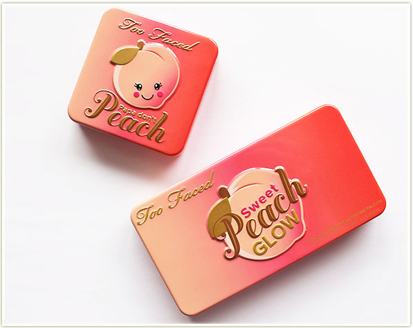
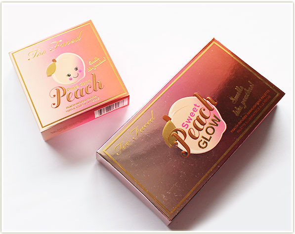
Too Faced Sweet Peach Glow + Papa Don’t Peach

So when they decided to relaunch the eyeshadow palette as a permanent product, Too Faced also decided to expand the collection with a full range of peach lip oils (review of those coming soon), a blush/bronze/highlight palette (Sweet Peach Glow) and having a dig through their product archives to re-release the Papa Don’t Peach blush.

I was excited for the launch, but I almost wondered if it would be peach overkill. I mean, that’s a LOT of peach! But as I’ve been mentioning more and more lately – I’ve grown to almost REQUIRE scent in my products as it really elevates my mood while I’m doing my makeup. So I’ve come to the conclusion that I am 100% full steam ahead with these scented launches!
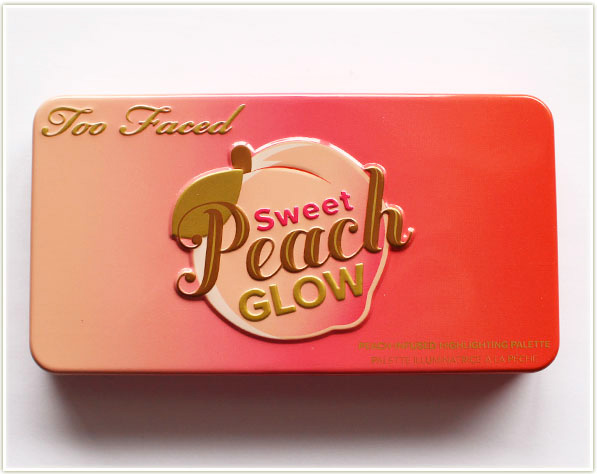
Too Faced Sweet Peach Glow palette

The item that had the most appealed to me when I saw the initial sneak peeks was the Sweet Peach Glow palette. It has the same metal tin packaging as the Sweet Peach eyeshadow palette – it snaps shut with a magnetic lid, has a decently sized mirror and is covered in a beautiful light to dark peach gradient.
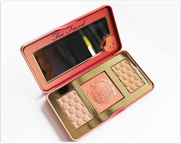
Too Faced Sweet Peach Glow palette

Inside you’ve got a light beige-veering-peach highlighter, a bright peach blush and a pale, slightly warm, bronzer.
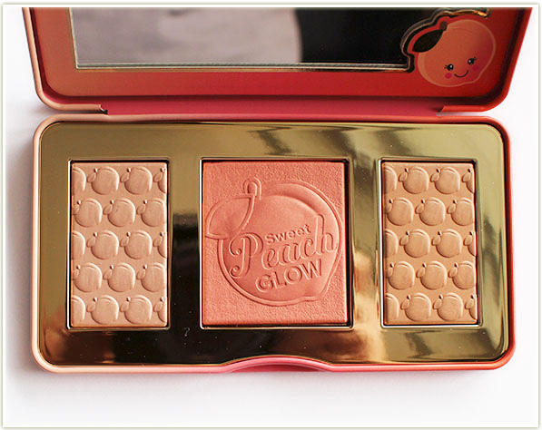
Too Faced Sweet Peach Glow palette

The palette does skew towards more fair-toned folk, although I think that impression is given off mostly by the bronzer which is quite pale. The peachy blush and the highlighter are definitely strong enough for medium-toned skin.
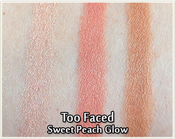
Too Faced Sweet Peach Glow palette - swatches
Too Faced Sweet Peach Glow palette – swatches

In swatches, you can see that the pigmentation is surprisingly strong (especially the bronzer – I was not expecting that!). I had read an awful lot of reviews that felt like the pigmentation of this palette was just not there, so I was really surprised when I tried it out myself because I’ve got a totally different viewpoint. The pigmentation is definitely there, but since these are more firmly packed gelee-type formula products, you need to use a stiffer brush to pick up the product.
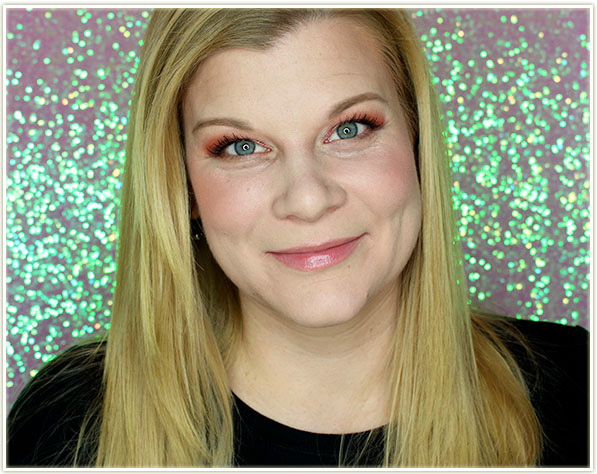
Wearing Too Faced Sweet Peach Glow palette

On the face? I’m in love. I love the shade of the blush (but like… it’s coral, did you expect me to hate it?!), the bronzer is surprisingly not orange (hooray!) and the highlighter, although a bit more subtle than some of the “BAM! IN YOUR FACE!” ones that are currently on the market, is gorgeous!
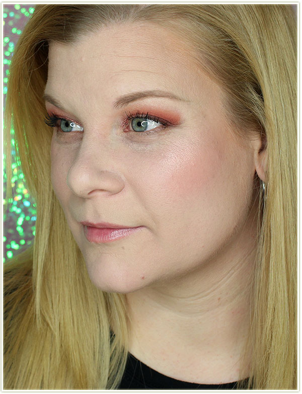
Wearing Too Faced Sweet Peach Glow palette

The highlighter definitely provides a much softer glow and there is a very faint peachy tinge to it. LOVE!
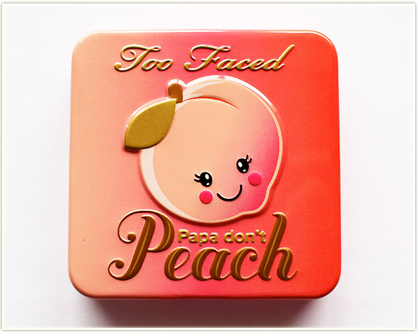
Too Faced Papa Don't Peach blush
Too Faced Papa Don’t Peach blush

The other powder product Sweet Peach launch item was a re-release of their Papa Don’t Peach blush. (I never owned the singular blush packaging, but I did have it in a palette, so there’s a swatch comparison below.) In sticking with the Sweet Peach theme, it also has its own tin packaging with a mirror (I’m growing more and more in love with blushes that come with a mirror – it’s just so handy).
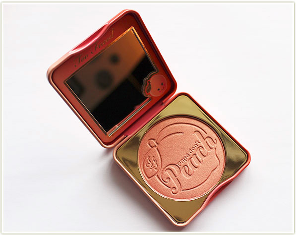
Too Faced Papa Don't Peach blush
Too Faced Papa Don’t Peach blush

The Papa Don’t Peach blush features a whopping 9 grams of product – which is easily three times more than your average blush!
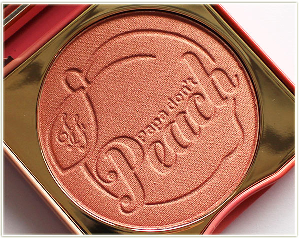
Too Faced Papa Don't Peach blush
Too Faced Papa Don’t Peach blush

And, of course, it’s infused with peach fragrance AND has an embossed logo (just like the Glow palette) – I mean… if that’s not love at first sight, then I don’t know what is!
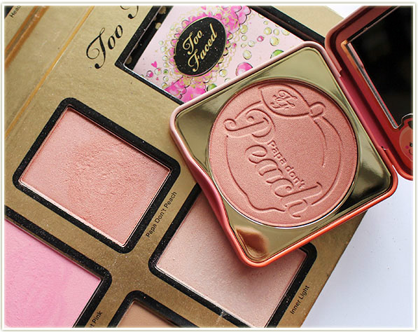
Too Faced Papa Don't Peach blush
Too Faced Papa Don’t Peach blush

I pulled out my Too Faced Everything Nice (2014 holiday) palette which has the only other copy of Too Faced‘s Papa Don’t Peach blush that I own. The shades are, of course, remarkably similar, but you will notice a slight difference in the swatch:
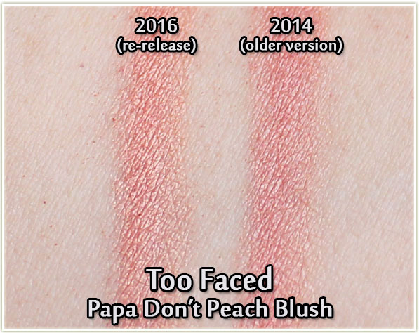
Too Faced Papa Don't Peach blush swatches - comparison with old version
Too Faced Papa Don’t Peach blush swatches – comparison with old version

Both versions of Papa Don’t Peach are incredibly luminescent – this is the kind of blush you don’t really need a highlighter with because it will definitely light up your face! The older version of Papa Don’t Peach is a touch deeper in tone, maybe a hint more pink. With the new version, I see more peach and a slight bit more of a sheen. All of that being said, I really doubt you’re going to notice a discernible difference on your cheeks between the two shades!
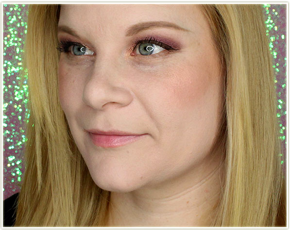
Wearing Too Faced Papa Don’t Peach blush

I avoided applying highlighter when I used this blush just so I could see more of the product at work. In comparison to the Sweet Peach Glow blush, the Papa Don’t Peach blush is definitely less bright and deeper in tone. I did notice a lot of luminescence added to my cheeks in real life with this blush, but I’m not seeing that translated on camera.
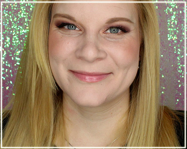
Wearing Too Faced Papa Don't Peach blush
Wearing Too Faced Papa Don’t Peach blush

Papa Don’t Peach is stunning – it’s an easy to apply shade that will match a wide variety of eye looks which makes this not only beautiful, but a workhorse product as well!

Final Thoughts

Both products have that luscious, juicy fake peach scent – so if you’re not a fan of scented products, I think you may struggle with these. However, for those of us who love our powder products to have a tasty scent… these are glorious!

Overall, I was extremely impressed with both the standalone Papa Don’t Peach blush, as well as the Sweet Peach Glow palette. I had seen a lot of not so favourable reviews for the Glow palette, so I was a little bit nervous to try it out. However, at first application, I loved them! I like the tone of all of the shades, and I like that the blushes can pack a pigmented punch. If, however, you’re of a far deeper skin tone, I think you’ll struggle with the Glow palette because it seems quite obvious that it caters to us paler folk. I would love to see Too Faced put out a deep version of this palette! For me though: these are absolutely stunning products and I am happy to welcome them in my Sweet Peach collection alongside the eyeshadow palette I bought early last year! <3

If you’re looking for the Too Faced Sweet Peach collection, you can snag it at Sephora (Canada/USA) or at Ulta (USA).

The products featured in this post were sent to me for review. This post may contain affiliate links.
NARS Spring 2017 (Review & Swatches)

NARS Spring 2017
NARS Spring 2017

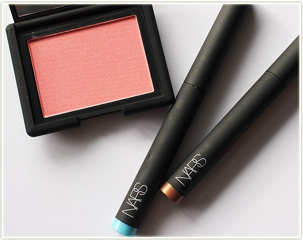
NARS‘ spring 2017 collection has hit stores and I’m getting a very “cool waters, bronzey tones and coral flare” to the whole collection. It’s a nice change from the “flowers for spring” theme that people just will NOT LET DIE – so I’m really happy to see NARS try something a little bit different. This collection feels like a pre-cursor to summer!

NARS Spring 2017
NARS Spring 2017

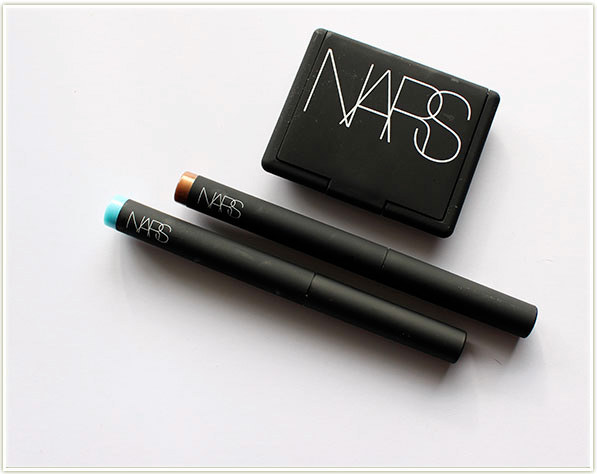
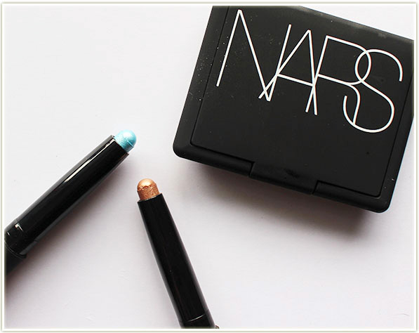
I don’t have the full collection (you can see that whole roundup on NARS‘ site here), but I’ve got a couple of their Velvet Shadow Sticks and a gorgous new blush.

NARS Spring 2017
NARS Spring 2017
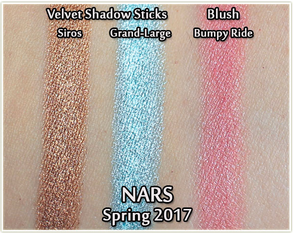
NARS Spring 2017 - Velvet Shadow Sticks in Siros and Grand-Large, Blush in Bumpy Ride - swatches
NARS Spring 2017 – Velvet Shadow Sticks in Siros and Grand-Large, Blush in Bumpy Ride – swatches

The two Velvet Shadow Sticks are in the shades Siros (bronzey-amber) and Grand-Large (shimmery sky blue). The Bumpy Ride blush is a *stunning* pink-coral with a faint hint of shimmer. It doesn’t look like glitter on the cheeks, but there is some definite added luminosity coming from the blush.

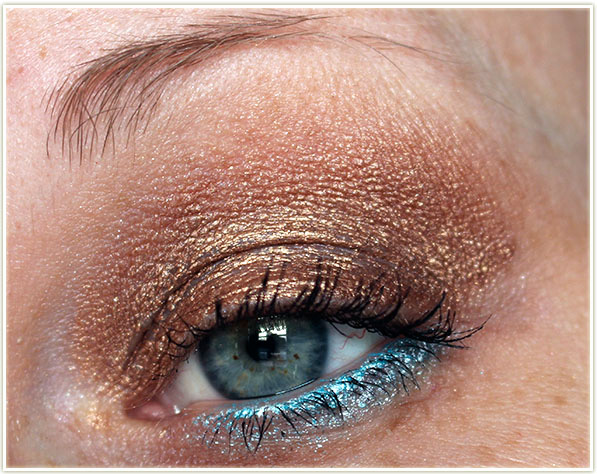
Wearing Velvet Shadow Sticks in Siros and Grand-Large

In terms of colour, the Velvet Shadow Sticks are beautiful. The bronzey-amber Siros shade is absolutely stunning on the lid and blends out very nicely with a fluffy brush. Great for quick and easy application!

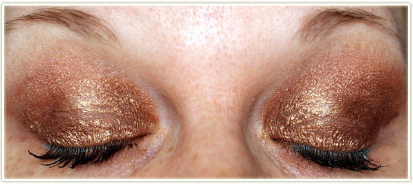
Major, MAJOR creasing! My left eye (your right on the screen) has primer, the other eye does not.

However… it doesn’t last. The Velvet Shadow Sticks are an absolute disaster on my eyelids. When I initially wore this out to a movie one evening I couldn’t believe how badly my eyes looked afterwards – they were creased and tacky-feeling. Just all around gross. I reapplied the shadow sticks over the weekend so you could see what happens to them within a scant few minutes of application. My left eye (your right side in the picture) has eyeshadow primer on it… and as you can see, it didn’t make any damn difference. I don’t even know how anyone could successfully wear these without causing creasing. Ugh.

Wearing Bumpy Ride blush

Moving on to something I did love: the blush. Bumpy Ride is absolutely stunning. It’s pigmented and easy to apply. This shade is everything I *love* in a blush – it’s a coral-pink which is pretty much perfection in my book! As with all NARS blushes I’ve tried, the powder is absolutely flawless.

Final Thoughts

The Velvet Touch Shadow Sticks are… (sorry NARS) garbage. Do not buy them. (And if you’re someone who loves these shadow sticks, please, PLEASE tell me how you wear them!)

That Bumpy Ride blush though? Holy smokes man… that is absolutely 100% worth your money. It’s a gorgeous shade, packs plenty of pigment punch and is easy to apply and blend out. As it turns out, Bumpy Ride is being introduced with this collection but it’s also now a permanent shade! Huzzah!

The products in this post were sent to me for consideration. Post may contain affiliate links.
Clinique x Crayola Chubby Sticks (Review & Swatches)

Clinique x Crayola Chubby Sticks

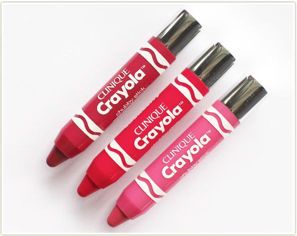
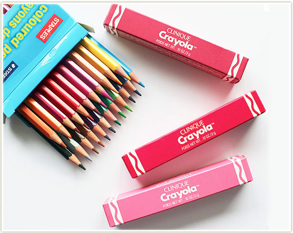
When I saw the spoiler images of the Clinique and Crayola Chubby Sticks appearing online a few weeks (maybe a month?) ago, I was more than a little in enamoured. Clinique‘s Chubby Sticks have been around for ages, but there is really no better brand to pair with than Crayola for these products! I mean, they already look like crayons!

Clinique x Crayola Chubby Sticks

Not unexpectedly, but just so you’re aware, this Clinique and Crayola team up is a limited edition collection. The collection features eight shades that  veer very much towards the pink and red side of things. While there are some lesser tinted shades, you won’t find a true nude in the bunch (when I say that, I mean something more brown/caramel in tone).

Clinique x Crayola Chubby Sticks

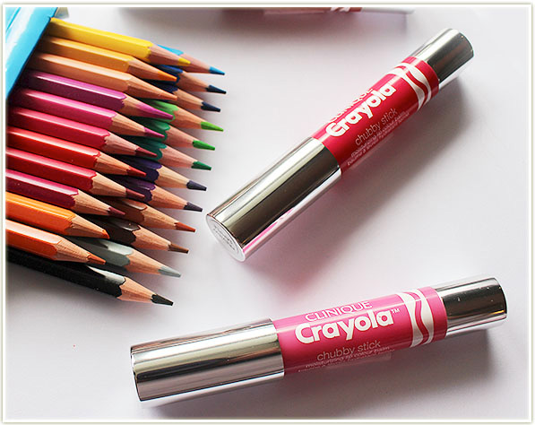
Although I’ve been aware of Clinique‘s Chubby Stick pencils for years, I’ve never actually tried them before now. These particular Chubby Sticks are branded as a “Moisturizing Lip Colour Balm” and they really do feel that way. They’re loaded with mango and shea butters and the end result is that you get a sheer wash of colour on the lips in a texture that feels akin to any other lip balm on the market. If you’re comfortable wearing lip balm, then these will feel no different to you!

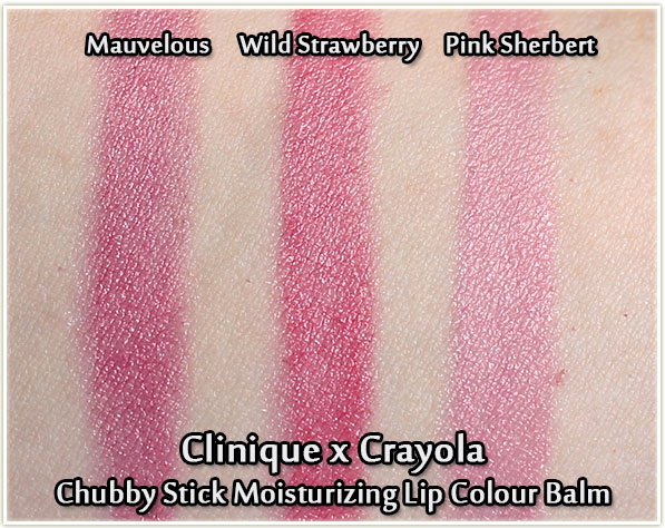
Clinique x Crayola Chubby Stick swatches - Mauvelous, Wild Strawberry and Pink Sherbert
Clinique x Crayola Chubby Stick swatches – Mauvelous, Wild Strawberry and Pink Sherbert

As you can see from the three shades swatched above (Mauvelous, Wild Strawberry and Pink Sherbet), the tones are very much in the pink/red family. The colours are fairly sheer (the swatches were layered quite a bit) but the texture is quite balmy.

Clinique x Crayola Chubby Stick Moisturizing Lip Colour Balm Swatches

Wearing Clinique Crayola Chubby Stick in Mauvelous

I don’t see quite as much mauve in this shade as I would expect for a shade named Mauvelous in the title, but it is absolutely stunning regardless!

Wearing Clinique Crayola Chubby Stick in Wild Strawberry

My favourite of the three shades – Wild Strawberry! Gives that perfect “cherry popsicle” lip look!

Wearing Clinique Crayola Chubby Stick in Pink Sherbert

I’m not a soft pink person, but I know a lot of people are going to love Pink Sherbet because it’s an easy to wear shade that will match a ton of eye looks!

Final Thoughts

Ummm I don’t know where I’ve been, but I’m happy to report that I am sitting comfy on the Clinique Chubby Stick bandwagon now. I love that these feel like lip balm – that’s an ENORMOUS selling point for me because it makes them super easy to apply. The bullets are also quite sturdy which means you’re not going to be slopping the lip colour all over the place while you’re applying it either.

The Clinique x Crayola colours are pretty basic in the grand scheme of things, but that’s not a downer. (And I really do like the added touch of the crayon look!) It means that they’ve got some great shades that are lot of people are going to enjoy wearing on the daily. Longevity is also fairly impressive, especially given the texture of these products. I get about two hours of wear before I feel like I need to refresh my lip colour. It does fade nicely, so you needn’t worry about that either! And, to top it all off, these are scent and taste free!

The Clinique x Crayola Chubby Sticks are limited edition and you can snap them up at sephora.ca for $21 CAD each or on sephora.com for $17 USD each. If you’re interested in trying out all of the shades, they even have a mini set of all eight colours!

The products featured in this post were sent to me for review. Post may contain affiliate links.
Kat Von D Alchemist Holographic Palette (Review & Swatches)

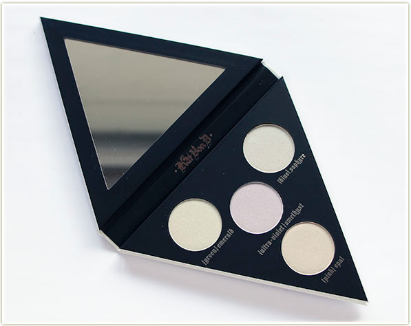
Kat Von D Alchemist Holographic Palette

At long last, Kat Von D has delivered the Alchemist Holographic Palette to us makeup loving fiends who just want a little bit more of an edge of colour in our looks.

Kat Von D Alchemist Holographic Palette

One thing to clear up though: this is not holographic by any means, despite the palette claiming to be. These are duochrome pigments which means they look one colour (mostly pale white) but refract another (an actual colour, like green, blue, etc.). Holographic, on the other hand, reflects every single colour of the rainbow (think of the reflect on the backside of a CD). I think they were mostly just trying to get us with the buzz word, but frankly, the term “Alchemist” is far more appealing to me. I like the idea that this palette was created with the idea in mind of creating something from nothing, or turning new things into different things. It all feels very mysterious and crafty!

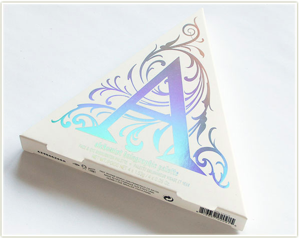
Kat Von D Alchemist Holographic Palette

Gripes of the palette name aside, let’s take a look at it.

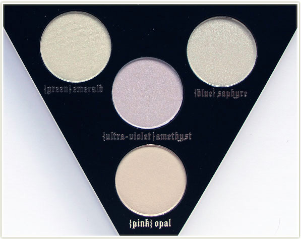
The Alchemist Holographic palette is incredible small – seriously, the whole thing fits in the palm of my hand! However, the pan sizes are large enough to get a smaller size powder brush in there (my Real Techniques Contour Brush fits perfectly, as does a MAC 109). Each pan contains 1.53 grams of product, which is about on par with your standard eyeshadow pan.

The product themselves are all eye, lip and face safe – so wherever you want to put them on your face, you can do it and rest assured that they’re not going to give you problems.

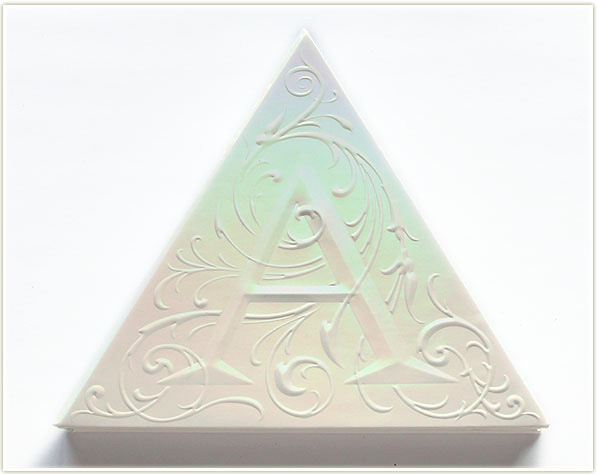
Kat Von D Alchemist Holographic Palette

The layout of the palette is interesting and intriguing, as is the (actual) holographic pattern on the front of the case (it’s kind of breathtaking to be honest). That being said, it is a bit oddly shaped compared to all my other palettes, so I still haven’t got a clue how I’m going to store it.

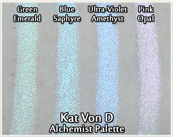
Moving on to the powders, I know they look exceptionally boring in the pan, but just take a look at the swatches:

Kat Von D Alchemist Holographic Palette - swatches
Kat Von D Alchemist Holographic Palette – swatches

Swatched out, you can see how the shades in the palette really shine! This kind of sheer wash of pastel, bright neon is reminiscent of Naked Cosmetics Ivory Stack (which has been around for absolute ages, but it’s hard to get your hands on) as well as the more recent Anastasia Beverly Hills Moonchild palette. Each colour is very much individually its own colour – it’s the kind of pale shadow you can really use to transform your look.

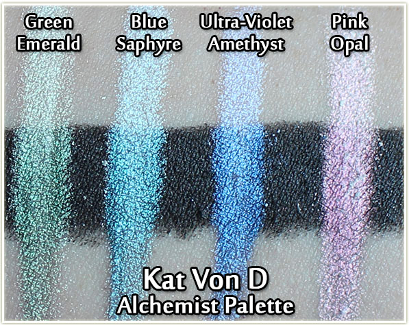
Kat Von D Alchemist Holographic Palette - swatches over black
Kat Von D Alchemist Holographic Palette – swatches over black

As encouraged by the brand, you can also mix it with other colours (such as the black above) to really transform the pigment. I’m personally more inclined to use it as a face highlighter or inner corner highlight though because I find it to be a little less fussy that way.

Kat Von D Alchemist Holographic Palette versus Anastasia Beverly Hills Moonchild Palette

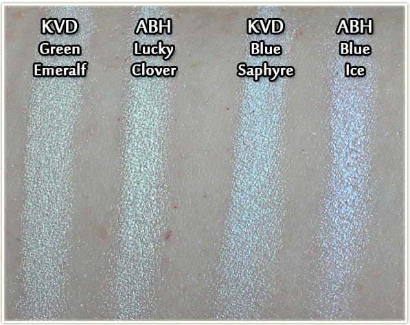
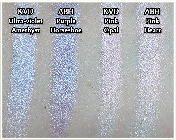
When I mentioned this palette on Snapchat (find me over there: muyourmind), I had a few people asking me about how it compared to the ABH Moonchild palette, so I’ve included the shades that matched the closest in these swatches. In general, I find the green shade to be brighter in the ABH palette, the blue shades are completely different (KVD seems more teal, whereas ABH seems more blue).

Kat Von D Alchemist Holographic Palette versus Anastasia Beverly Hills Moonchild Palette

The purples are quite different – KVD is more ultra-violet, whereas ABH is far more purple and it has specs of glitter in it. Between the two pinks, I find them near identical, but I do see a bit more brightness in the KVD one in the swatch above.

Kat Von D Alchemist Holographic Palette – Face Swatches

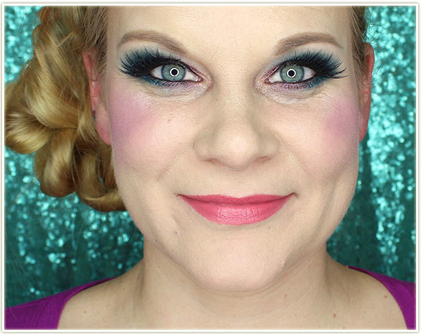
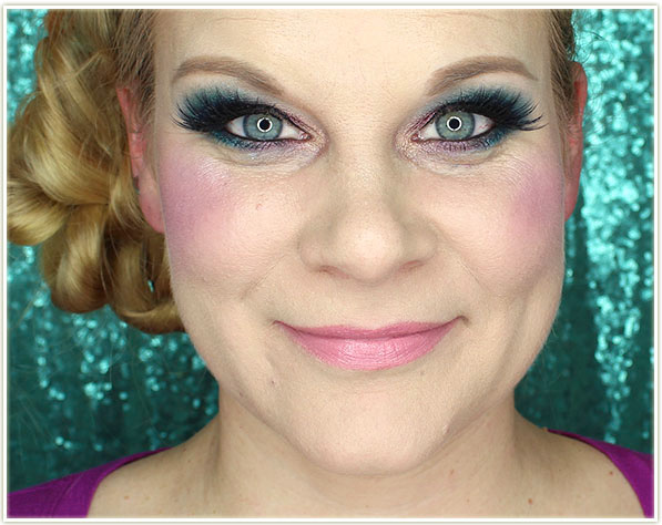
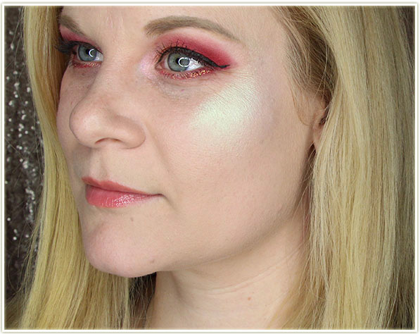
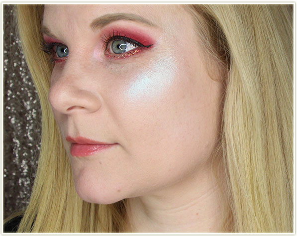
These are full-on, heavy cheek swatches to give you an idea of how this looks when built up. You can definitely wear it more softly if you want less impact.

Wearing Green Emerald
Wearing Blue Saphyre
Wearing Ultra-violet Amethyst
Wearing Pink Opal
Wearing Pink Opal

Kat Von D Alchemist Holographic Palette – Eye Swatches

I do wear this palette as an inner corner eyeshadow highlight, so I wanted to show you a few examples of that as well. My usual technique is to try to create some kind of symbiosis with the inner corner shade in combination with the lid shade.

Wearing Green Emerald
Wearing Pink Opal
Wearing Pink Opal

Final Thoughts

The timing of this palette was a little bizarre – I think I read that Kat Von D spent four years (or was it seven?) formulating the pigments in this product in order to get it perfect. And I kind of feel like Anastasia Beverly Hills scooped them on the release of this palette because the two products are very, very similar. That being said, the Kat Von D Alchemist Holographic palette is the only readily accessible pale ivory duochrome palette like this which makes it hugely appealing to me since more people can get their hands on it. It also has no glitter in it whatsoever, whereas the ABH one does have some shades with embedded glitter.

Release commentary aside: I have no qualms with this palette. I think it’s an absolutely wonderful product. I’ve seen a few people mention the pan size as a deterrent, but I don’t agree – this isn’t the kind of product you’re going to go through quickly, so I don’t think large pans are necessary. I found the pigmentation of the shades to be beautiful – I love, love, LOVE that kind of pale iridescent sheen that I can use to amp up a makeup look. In the last year I’ve become rather obsessed with coloured highlighters and this only helps to fuel that fire.

This is something I think the makeup world needs more of, so if you’re in the market for something new, I’d definitely say you should at least go swatch this palette at Sephora!

The Kat Von D Alchemist Holographic Palette can be purchased at sephora.ca for $43 CAD or on sephora.com for $38 USD.

The product featured in this review was sent to me for consideration.