Category Archives: Reviews

QUO Summer 2016 (Review, Swatches & Look)

201606_quo_summer2016

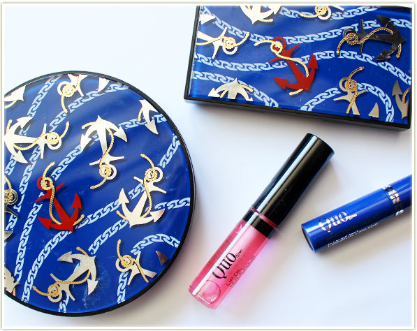
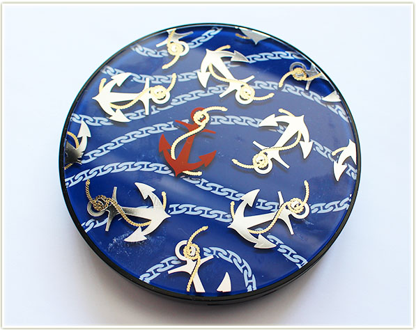
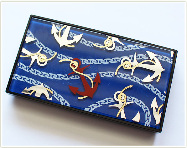
Nautical *anything* isn’t really my jam… but there’s something that really speaks to me in the packaging design for the new QUO Cosmetics Summer 2016 launch! There’s something about the glossy packaging with a foiled overlay of anchors and chains on the layer beneath that is just insanely gorgeous on these products. They are eyecatching and definitely make you take a closer look!

Let’s take a deeper dive into some of the products from the collection:
QUO - Summer 2016 - Sunny Days Bronzer
QUO – Summer 2016 – Sunny Days Bronzer

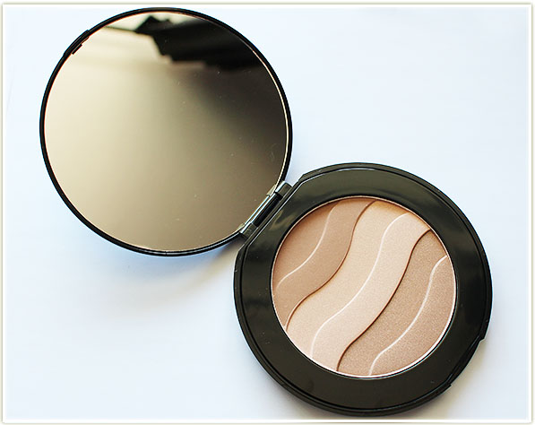
The first thing that caught my eye was this ENORMOUS  bronzer disc. And when I say enormous, I do mean it! The Sunny Days bronzer is about the size of my outstretched palm, fingers included!
QUO - Summer 2016 - Sunny Days Bronzer
QUO – Summer 2016 – Sunny Days Bronzer

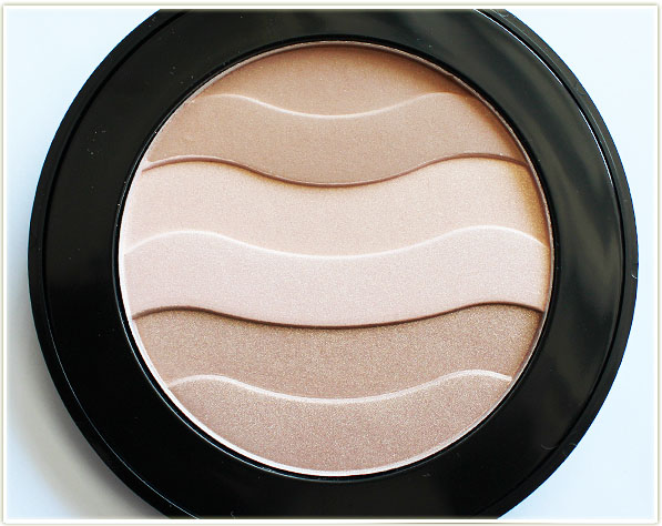
Inside the compact you’ll find a three-stripe bronzer that is embossed to emulate a wave pattern.
QUO - Sunny Days Bronzer
QUO – Sunny Days Bronzer

The top stripe is satin warm shade, the middle is a shimmery cream highlight and the bottom is a shimmery bronzer. You can use each strip individually to get a more customized look… but if you’re like me, you’re just going to take your brush and swirl it amongst all the shades for an all over glowing effect.
QUO - Summer 2016 - Sunny Days Bronzer - swatched
QUO – Summer 2016 – Sunny Days Bronzer – swatched

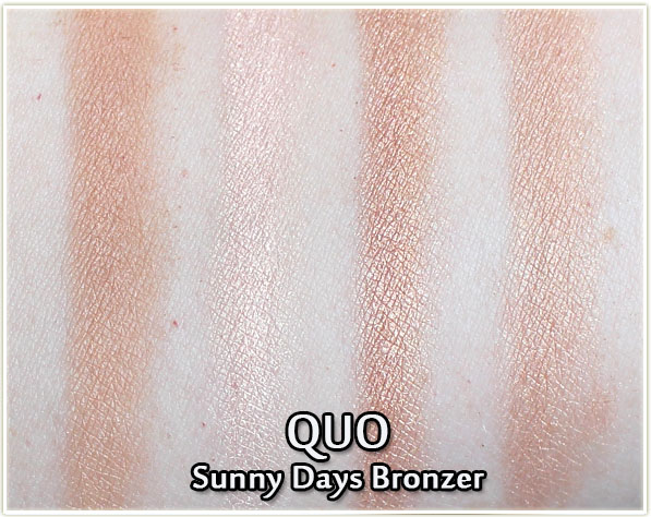
And thankfully, the end results of all three colours swirled together delivers a gorgeous shimmery bronzer that’s just beautiful (although very obviously targeted towards us fair folk). The powder feels smooth and was easy to blend onto my skin. Because of the pale tone of it, it is EXCEPTIONALLY easy to apply on fair skin – no fear of looking like an oompa loompa here!
QUO Sea Sun Sand Eyeshadow Palette

Like the bronzer disc, the eyeshadow palettes also have the gorgeous anchor and chains print.
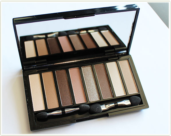
QUO Sea Sun Sand Eyeshadow Palette

The Sea Sun Sand eyeshadow palette contains eight neutral shades that come in a variety of finishes – a few shimmery, a few satin and a few matte.
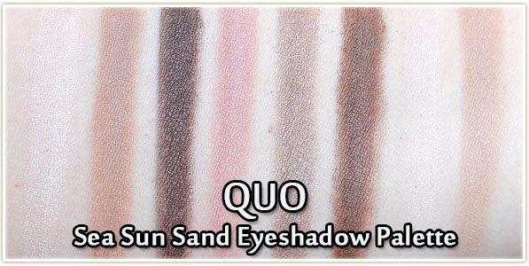
QUO Sea Sun Sand Eyeshadow Palette - swatches
QUO Sea Sun Sand Eyeshadow Palette – swatches

Sadly, while the eyeshadows do swatch nicely, they are incredibly powdery and very subtle. You’ll need to pack on some of the lighter shades to really get some impact. However, the upside is that if you’re someone who doesn’t need a ton of pigmentation to your shadows, these could very well work for you.
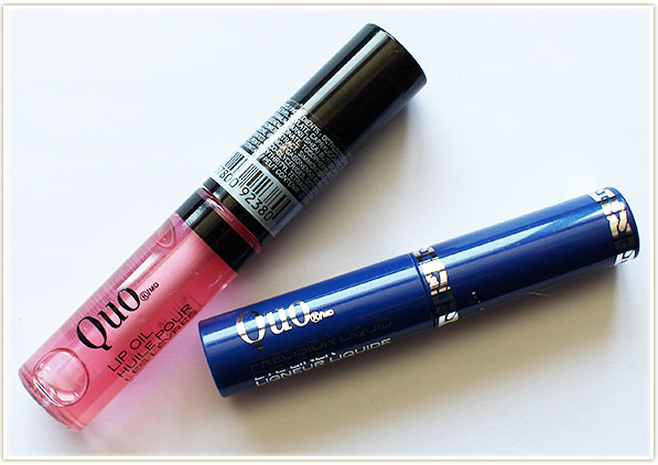
QUO - Lip Oil in 40 Knots and Liquid Liner in In The Navy
QUO – Lip Oil in 40 Knots and Liquid Liner in In The Navy

The last two products are the Lip Oil in 40 Knots and the Precision Liquid Eye Liner in In The Navy.
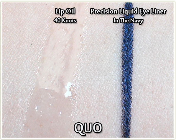
QUO Lip Oil in 40 Knots and Precision Liquid Eye Liner in In The Navy - swatches
QUO Lip Oil in 40 Knots and Precision Liquid Eye Liner in In The Navy – swatches

I wasn’t really sure what to expect from the Lip Oil in 40 Knots as I’d never used one before. It’s primarily a very slippery, soft gloss with a liquid texture. It doesn’t feel oily (more slippery than anything else) and it imparts no colour on the lips. It felt hydrating and comfortable, although it did require constant reapplication.

The Precision Liquid Eye liner in In the Navy is not an unexpected colour for the summer, but it’s a welcome addition to help us get away from the constant black or brown liner. The liner is pigmented, applies well and I love that it has a faint hint of metallic blue sheen to it. Makes it stand out from every other flat navy liner out there!

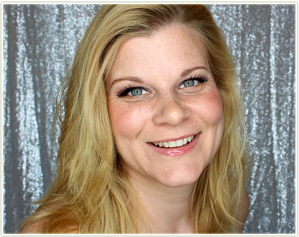
QUO Summer 2016 Look
201606_quo_summer2016_look1

This is the look I ended up putting together with the products. I skipped the foundation, letting the Sunny Days bronzer do its job on the perimeter of my face.
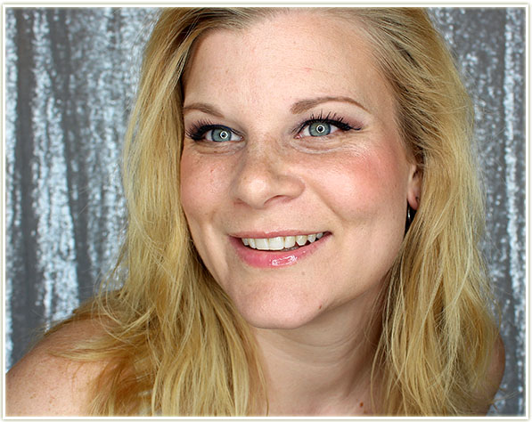
201606_quo_summer2016_look2

I’m also wearing the lip oil on (you guessed it) my lips. It’s an easy to wear product that adds a ton of shine.
201606_quo_summer2016_look_eyecloseup1

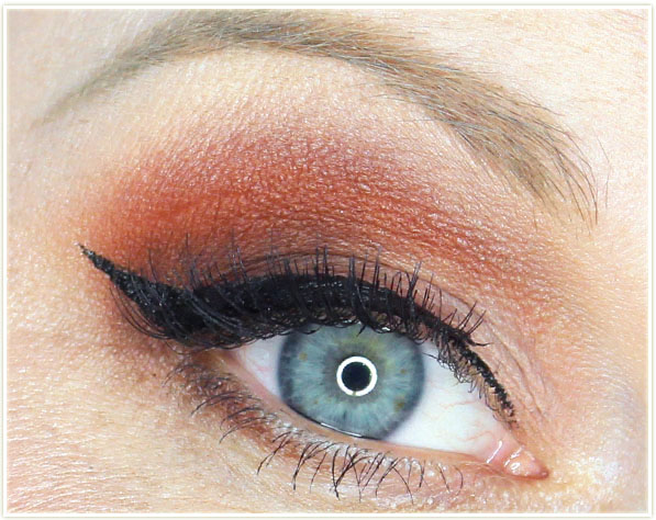
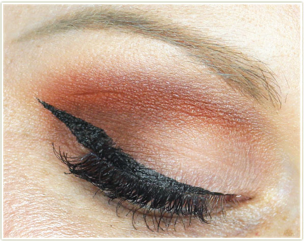
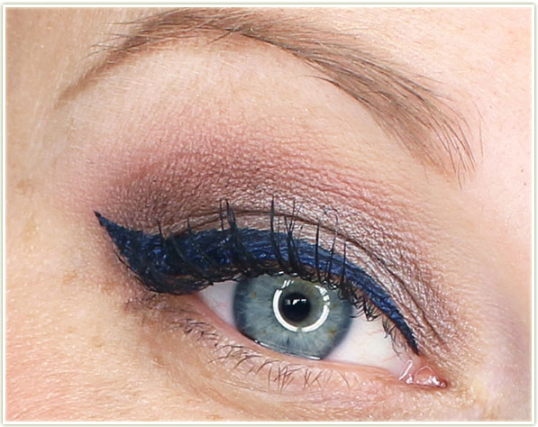
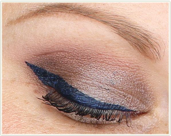
For my lids, I opted for the pink shade in the upper crease, the taupey-silver on the lid and one of the deeper browns in the crease. I highlighted my brow with the lightest shade… which pretty much matched my skin tone. I also create a beautiful wing with the In The Navy liner. I really love a thick wing with softer makeup like this.
201606_quo_summer2016_look_eyecloseup2

So that’s my roundup of QUO‘s latest summer collecton. Do you think you’ll be picking anything up?

QUO is a Canadian brand and can be purchased at Shopper Drug Mart.

The products featured in this review were sent to me for consideration.
Too Faced Born This Way Foundation + Concealer (Review & Swatches)

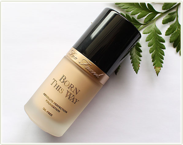
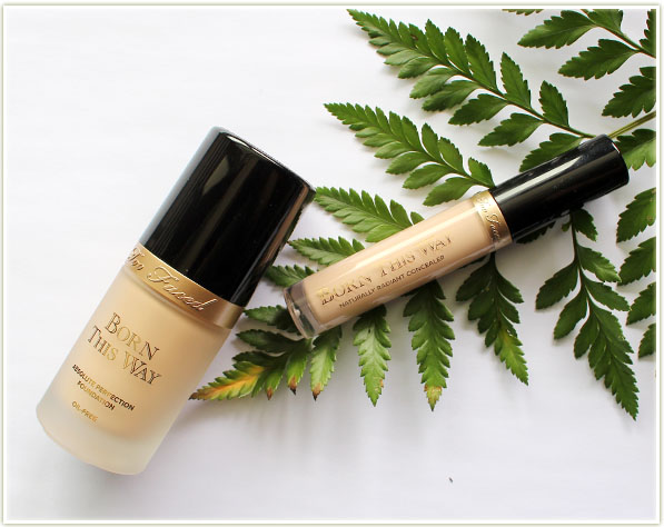
Too Faced Born This Way foundation + concealer

As a rabid lover of all things Too Faced, I have no idea why it took me so long to get around to trying the Born This Way foundation. But hey, I’m trying it now! This review is going to cover the existing Born This Way foundation, as well as the brand new Born This Way concealer which I picked up at Gen Beauty!

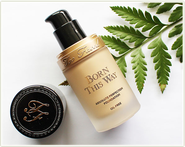
Too Faced Born This Way foundation in Porcelain

The Born This Way foundation has an “undetectable medium-to-full coverage foundation” and contains your standard 30 ml/1 fluid ounce of product. There are 18 shades in the range: from Snow to Mahogany.

As per the packaging, Born This Way is infused with:

  • Coconut Water to delicately replenish skin’s moisture levels
  • Alpine Rose to brighten skin’s appearance and promote elasticity
  • Hyaluronic Acid for a smoother, more youthful appearance
Too Faced Born This Way foundation in Porcelain

It blissfully comes with a pump that dispenses an appropriate amount of product. I use roughly two pumps to cover my entire face, but I could probably get away with only a pump and a half. The shade I have (which I think matches me PERFECTLY) is Porcelain and it’s intended to be for “fair with neutral-to-pink undertones”. (Sidenote: Natalie of Ivory Avenue passed on this shade to me because it didn’t suit her. Thank you!!) I would argue and say I’m more warm than cool toned, and I do feel like this foundation shade veers more towards the yellow side of things. I’m definitely not complaining though because it’s a perfect match for me, but it is something to be aware of if you’re trying to match your undertone. The foundation has a luminous finish that works well on my dry to normal skin.

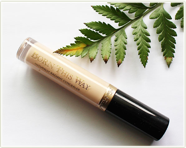
Too Faced Born This Way concealer in Light

Like the foundation, the Born This Way Naturally Radiant Concealer also contains coconut water, alpine rose and hyaluronic acid. It comes in 10 shades ranging from Very Fair to Deep.

Too Faced Born This Way concealer in Light

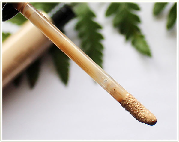
The tube is slick and emulates the foundation packaging. It comes with your standard doefoot applicator to evenly distribute product onto your face. I would say it’s neither too thin, nor too thick in consistency. It’s somewhere right in the middle.

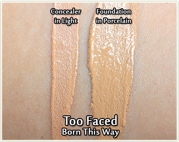
Too Faced Born This Way Concealer in Light and Foundation in Porcelain - swatches
Too Faced Born This Way Concealer in Light and Foundation in Porcelain – swatches

As you can see from the swatches above, the Light shade of the concealer matches quite well with the Porcelain foundation. I feel the concealer is a hint more pink, but once it’s all blended out onto the skin the two shades meld perfectly together.

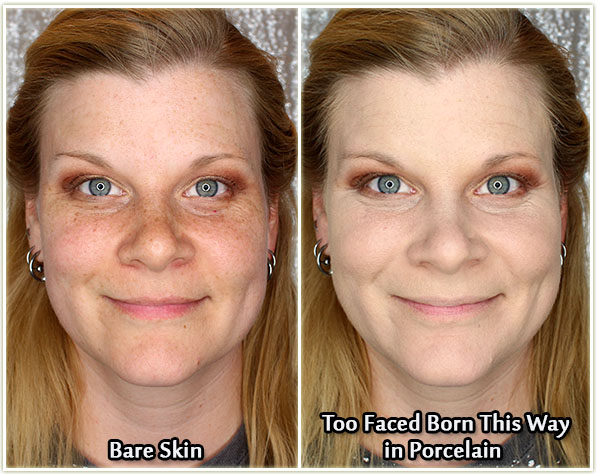
Side by side comparison

On the left is my non-foundation face and on the right I’m wearing the Porcelain foundation with some of the Light concealer underneath my eyes.

Wearing Too Faced Born This Way foundation (all over) and concealer (undereyes)

There is ZERO editing done to this shot. You can see a hint of my freckles coming through the foundation, but if you compare it to the shot above without any foundation on, you’ll see that it covered up a heck of a lot of them. (By the way, I do love my freckles, I’m just trying to indicate how well this foundation can cover up “discolourations”.)

Because of the luminous finish of the foundation, I really do feel like this ACTUALLY looks like my skin in person. It doesn’t look cakey, or makeupy – it just looks like my face. And that’s not something I can usually say about foundation because generally there is SOME aspect of visibility of the product in your skin. This product seems to melt into my skin while not settling into fine lines. I have no idea how they’ve done it, but it’s wonderful!

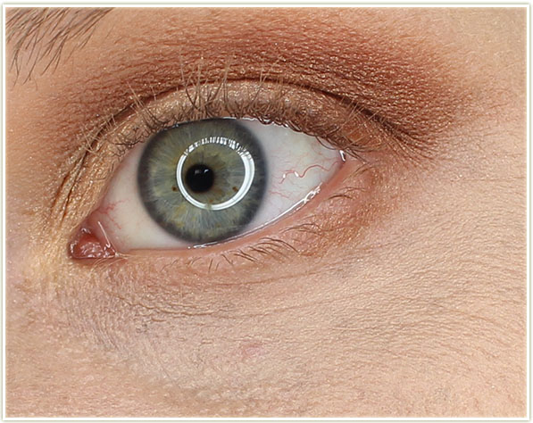
Concealer on my undereye area

Here’s a closer look at my eye where I’ve applied the concealer. You can see I’ve got some fine lines, but the product hasn’t sunk into them. I am exceptionally prone to “crepey” looking undereyes if I apply anything under them. I see a faint hint of that towards my inner tearduct, but nowhere near as much as I usually see. The concealer has also covered my broken blood vessel  (the slightly darker spot in the center) which is incredible since that thing is RED (to the point where people actually tell me I somehow got lipstick under my eye!).

Final Thoughts

Born This Way foundation: Guys… I mean… I’d heard the hype.. but until you EXPERIENCE this foundation… you just don’t know. YOU DON’T KNOW. The Born This Way foundation is INCREDIBLE. It gives my skin a gorgeous luminous finish and it covered ever aspect of my face evenly and effectively. This foundation is actually starting to rival my Bourjois Healthy Mix Serum foundation for most loved and I truly didn’t think that was ever going to be possible. This was one of those products that I put on my face and I was just KNEW it was a match made in heaven. There is no aspect of this product that I don’t love: the bottle is beautiful to look at and solid to hold. The pump is perfection. It even applies spectacularly to my face – especially on my nose which has always been a problem area for me! I am in *love* with this foundation!

Born This Way concealer: Much like the foundation, the concealer is also a winner which is something I didn’t expect to say either since I’ve had a LOT of problems with concealers over the years. Although concealer is not a product I use daily, it’s good to know that this sucker can cover up things if need be. I used it primarily on my undereye area and I experienced very, very minimal creasing after 6+ hours (without setting it so I could fully test it out). Please note that the Born This Way concealer is launching on June 15, 2016 – I just got an early sample via Gen Beauty.

The Too Faced Born This Way foundation can be purchased on sephora.ca for $49 CAD or on sephora.com for $39 USD.

The Too Faced Born This Way concealer can be purchased on sephora.ca for $32 CAD or on sephora.com for $28 USD.

BECCA Luminous Blush in Snapdragon (Review, Swatch & Look)

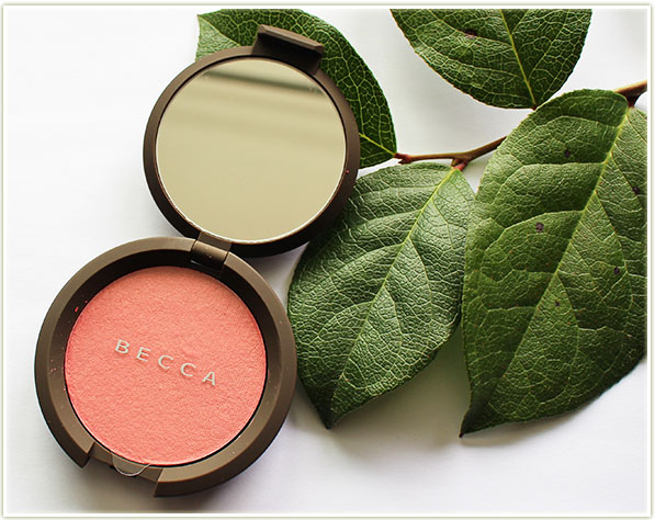
BECCA Luminous Blush in Snapdragon

It’s becoming VERY obvious to me that blush is my latest product to become obsessed with. So, when I saw the previews of the BECCA Shimmering Skin Perfector Luminous Blushes, I knew I was going to be taking some home with me.

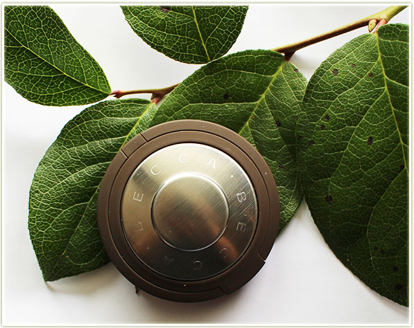
BECCA Luminous Blush in Snapdragon

Shimmering Skin Perfector Luminous Blush” – good HEAVENS is that ever a mouthful. The premise for these blushes, and the reason for the insanely long name, is that these were developed with BECCA’s Shimmering Skin Perfectors in mind (see my previous reviews on Champagne Pop and Pearl). They wanted to create a blush which emulated the highlighting properties of their shimmering skin perfectors.

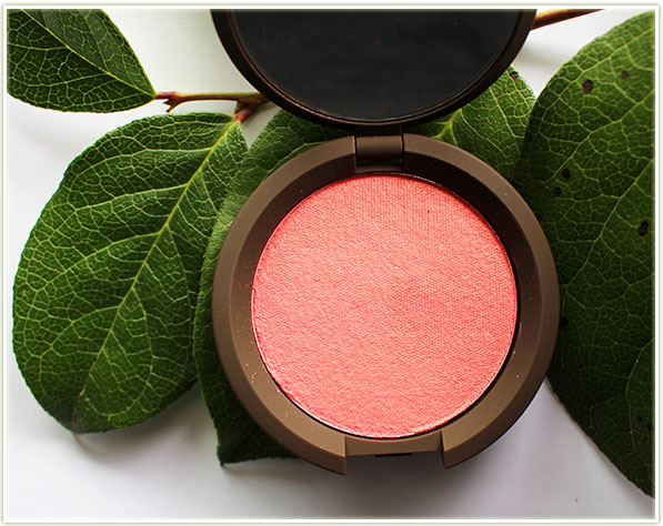
BECCA Luminous Blush in Snapdragon

As I’ve mentioned before, I want to own every single shade of coral out there, so I opted for Snapdragon. Snapdragon is a warm pink-orange with a hint of golden sheen. I don’t find the gold translates too much in a swatch however, which is a bonus for me since I don’t like a ton of reflective qualities in my blush. And like all BECCA products… this is second to none in terms of pigmentation.

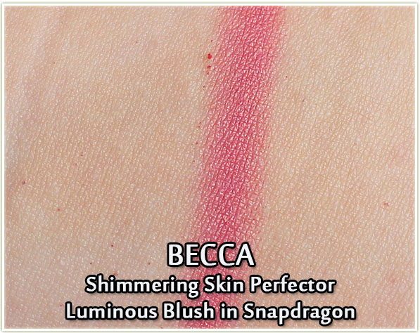
BECCA Luminous Blush in Snapdragon - swatch
BECCA Luminous Blush in Snapdragon – swatch

My Snapdragon swatch, for whatever reason, ends up fairly pink in my arm swatch. In practice, I see more coral on my cheeks, so I’m not sure why the swatch was so pink.

Wearing Snapdragon
Wearing Snapdragon

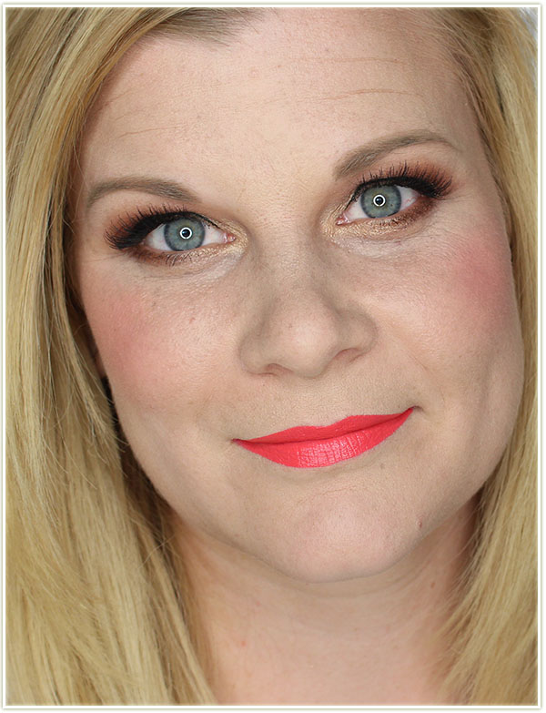
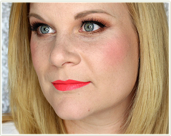
Gahhhh I love this blush so much! In these shots I’m wearing the blush without any added highlighter. While the blush is quite luminous, it’s not as in your face as their shimmering skin perfectors, which is a very good thing because I did not want super reflective cheeks!

Wearing Snapdragon
Wearing Snapdragon

There’s a soft quality to the blush which is enhanced by the highlighting properties contained in the formula. And it’s just… guys… I can’t say this enough… it’s just gorgeous. Snapdragon is the kind of colour that just makes me HAPPY and it’s a shade I’m going to be wearing all summer long.

Final Thoughts

Although I’ve only tried the one shade, I do feel like the BECCA Luminous Blushes are a win. While they’re quite pigmented, they can also be sheered out to give more of a flush than a full on blush look. I love that the sheen enhances the luminosity of the blush – it’s just really, really freaking stunning. And yes, I do add my Champagne Pop highlighter on the tops of my cheekbones even while wearing this blush! If you want to see this blush “live”, I wore this whole makeup look in my recent YouTube video.

These blushes are on the pricier side of things, but if there’s a shade you’re really lusting after, I don’t think you can go wrong. Of course… once you fall in love with them (like me)… suddenly you want to own a lot more than just one!

The BECCA Shimmering Skin Perfector Luminous Blushes can be purchased on sephora.ca for $41 CAD or on sephora.com for $34 USD.

Mary Kay Summer 2016 (Review, Swatches & Look)

Mary Kay Summer 2016

Mary Kay‘s got a bunch of new products out for Summer 2016, so I grabbed some of them and put together a look alongside some quick reviews. Let’s get into it:

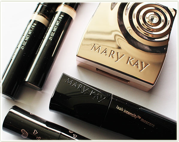
Mary Kay Mineral Eye Colour Bundle ($76 with compact)

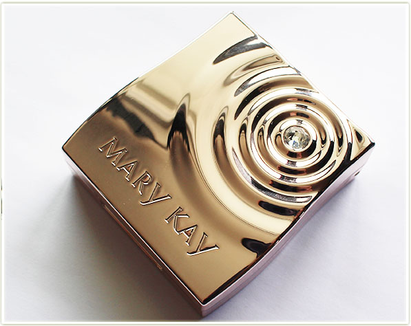
The most eyecatching item was easily the Rose Gold Compact Mini ($22 if bought unfilled).

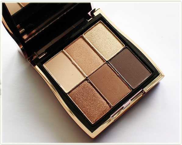
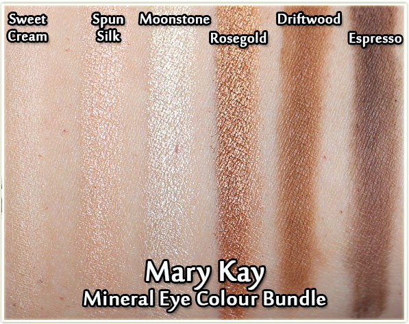
Mary Kay Mineral Eye Colour Bundle - Sweet Cream, Spun Silk, Moonstone, Rosegold, Driftwood & Espresso
Mary Kay Mineral Eye Colour Bundle – Sweet Cream, Spun Silk, Moonstone, Rosegold, Driftwood & Espresso

If you purchase the full compact with shadows, you’re looking at $76 CAD ($54 CAD without the compact). It comes with six shadows in your standard neutral shades. This is the kind of compact absolutely anyone can grab and create an easy day-to-day/work look.

Mary Kay Mineral Eye Colour Bundle - Sweet Cream, Spun Silk, Moonstone, Rosegold, Driftwood & Espresso - swatches
Mary Kay Mineral Eye Colour Bundle – Sweet Cream, Spun Silk, Moonstone, Rosegold, Driftwood & Espresso – swatches

The colours swatched well, and are quite pretty (if not fairly standard fare), but they were really, REALLY powdery in the pan. They applied well, but the kickup in the pan is INTENSE, so be sure to bang your brush off hard before you apply this to you lids!

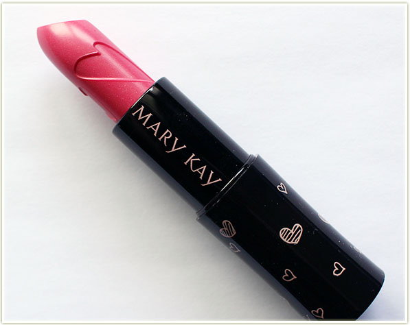
Mary Kay Beauty That Counts - Hearts Together Lipstick
Mary Kay Beauty That Counts – Hearts Together Lipstick ($18 CAD)

Also out is a limited edition Beauty That Counts “Hearts Together” lipstick. From May 16, 2016 onwards, $1 of the sale of each lipstick will support the Mary Kay Ash Charitable Foundation in its efforts to support women living with cancer and to help end violence against women by providing grants to women’s shelters and community outreach programs.

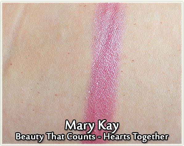
Mary Kay Beauty That Counts - Hearts Together Lipstick - swatch
Mary Kay Beauty That Counts – Hearts Together Lipstick – swatch

Hearts Together is a labelled as a “soft pink creme lipstick”, but I’d say it veers more towards a sheer-shine lipstick with a glossy cool pink hue.

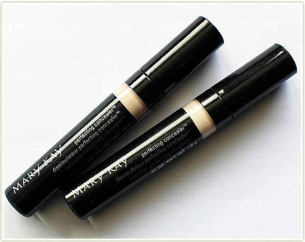
Mary Kay Perfecting Concealer ($17.50 CAD)

Okay guys… deep breath. DEEP BREATH. I loathe reviewing concealers because I just don’t use them. Why, you ask? Because every freaking concealer creases on me. Or looks crepey under my eyes. Basically, they all look like absolute garbage, so I can’t be bothered to use them.

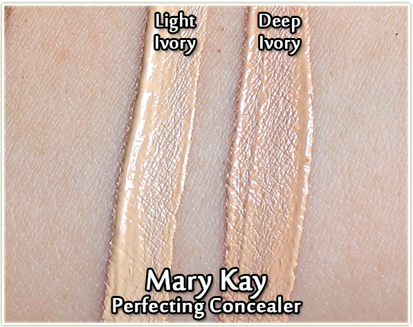
….UNTIL NOW. I don’t know what the heck is in this thing except for magic. PURE FREAKING MAGIC. I put this on my undereyes and it not only brightened the area, but it also didn’t budge. It didn’t crease. It didn’t look crepe-y. I am totally and completely floored.

Mary Kay Perfecting Concealer in Light Ivory & Deep Ivory - swatches
Mary Kay Perfecting Concealer in Light Ivory & Deep Ivory – swatches

The shades featured above are the ones that are most likely to match my skintone so they’re the ones I’ve swatched. As it turns out, I used Deep Ivory under my eyes and it was slightly lighter than my skintone, so it helped to brighten up the area.

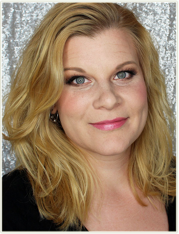
Mary Kay Summer 2016 Look

Mary Kay Summer 2016 Look

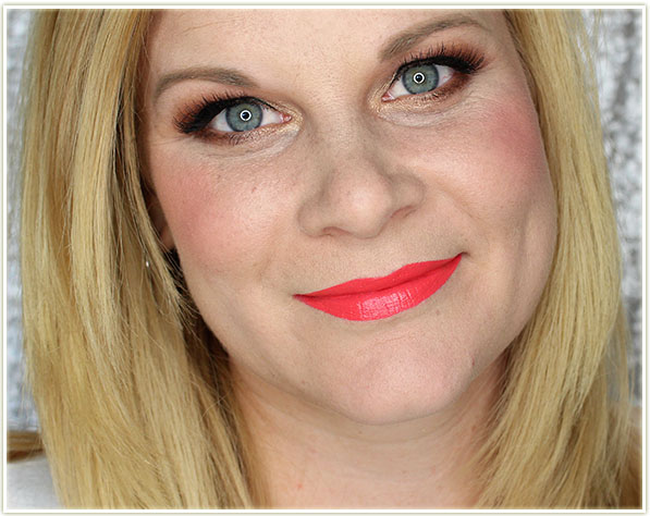
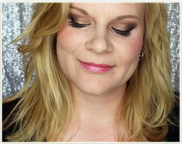
In these shots I’m wearing the eyeshadow palette on my eyes, the Lash Intensity mascara (which I forgot to photograph – I am so sorry!), the Perfecting Concealer in Deep Ivory under my eyes and the Hearts Together lipstick.

Mary Kay Summer 2016 Look
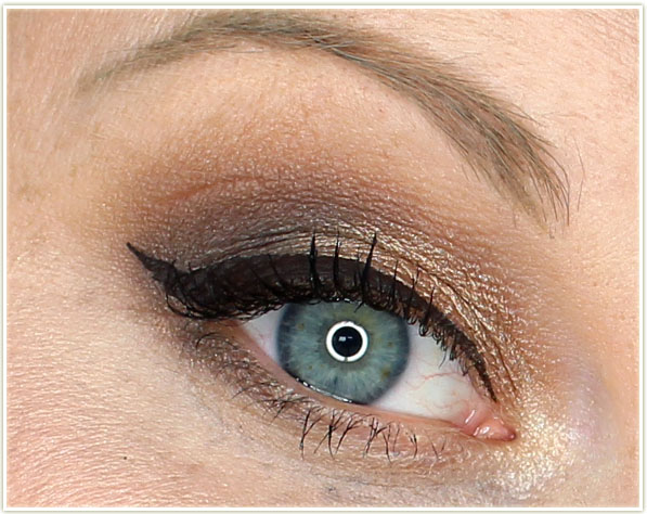
Mary Kay Summer 2016 Look - Eye Closeup
Mary Kay Summer 2016 Look – Eye Closeup
  • Rosegold on the lid.
  • Espresso on the outer corner and on the outer lower lash line.
  • Driftwood through the crease.
  • Sweet Cream on my brow bone.
  • Moonstone on the inner corner.
Mary Kay Summer 2016 Look - Eye Closeup
Mary Kay Summer 2016 Look – Eye Closeup

Final Thoughts

I wasn’t totally blown away by this collection as there are a few misses in the lot. (Overall, I found the Spring launch a lot more up my alley.) Of the products I used here, I think the eyeshadow palette is a miss for me. The eyeshadows, while lovely on the lids, are intensely powdery and I think the price point is unreasonable when other brands are putting out more shadows for a cheaper price point. (And it’s odd too, because the rest of the Mary Kay line is not unreasonably priced, so I have no idea why these shadows are so expensive. I also feel they’re inferior quality to the ones I tried last quarter from the spring line.)

The lipstick was perfectly adequate, and completely comfortable to wear. My only reservation is that it’s just not a shade I’d wear with any kind of regularity. If you love it though, get it – it’s comfortable and easy to wear!

All that to say… the complete and absolute winner out of this whole lot were the Perfecting Concealers. I can’t even begin to explain my excitement for this product! AT LONG LAST, I can finally wear undereye concealer without having to WORRY about it. I’d long since given up thinking I could wear undereye concealer just because no other brand has ever worked for me. I am so excited that the Mary Kay ones took me by complete surprise because I absolutely love them!

The products featured in this post were sent to me for consideration.
Kat Von D Shade + Light Quad in Rust (Review, Swatches & Look)

Kat Von D Shade + Light Quad in Rust

I see the launch of the Kat Von D Shade + Light Eye Contour Quads as a colourful extension to her Shade + Light Eye Palette. You know… kind of like colourful addons that you can use to help flesh out the neutral look of the original palette.

Except… I was drawn to the shade range that is probably MOST like the original eyeshadow palette!

Kat Von D Shade + Light Quad in Rust

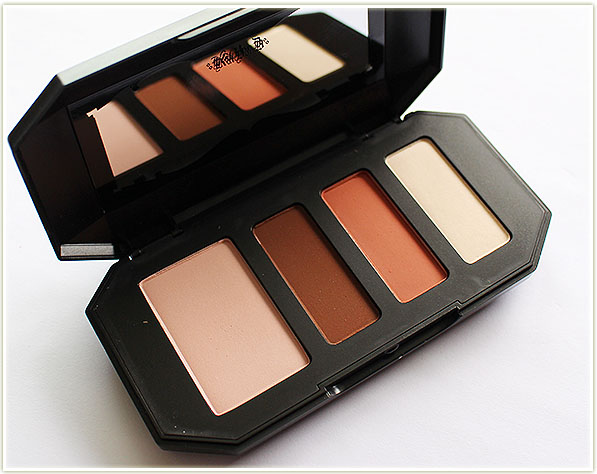
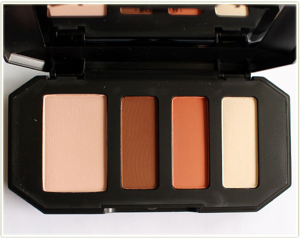
The brand new Kat Von D Shade + Light Eye Contour Quads come in four different colours that speak to different tonal shades. There’s Rust (matte brownish reds – which is the one featured in this post), Sage (matte greens), Plum (matte purples) and Smoke (matte cool grays). They’re also ALL matte shades.

Kat Von D Shade + Light Quad in Rust

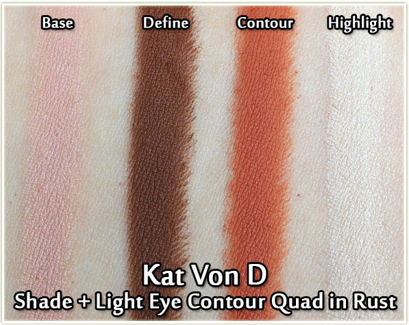
So the Rust quad is… well… it’s pretty freaking gorgeous. As the name suggests, it features very warm and rusty shades. The largest pan is a bit more peach, the two middle shades are varying tones of orangey-red (be still my heart) and the final shade is a perfect brow bone highlight colour for me.

Kat Von D Shade + Light Quad in Rust - Swatches
Kat Von D Shade + Light Quad in Rust – Swatches

Swatched out on my skin you can see that they are really saturated with pigment. They do verge on slightly powdery (as does the original palette), but I’ll take that over a hardpacked shadow any day. I don’t tend to struggle with powdery shadows because I feel like you’ve got even more pigment to blend with.

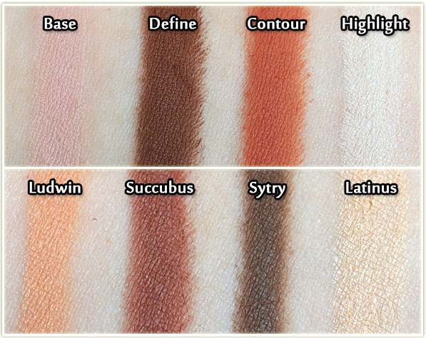
KVD Rust versus KVD Shade + Light Palette - swatches
KVD Rust versus KVD Shade + Light Palette – swatches

I know a lot of people are going to compare the Rust quad to the warm toned section of the original KVD palette, so I thought I’d swatch both out for you to compare yourselves. They are definitely *similar*, but not quite the same. I prefer the tones in the Rust quad personally, but if you’re looking for more colour dimension to add to your collection, the other quads (Plum, Sage) may suit you better. You cannot go wrong with the formula though – so pick whichever quad suits your fancy!

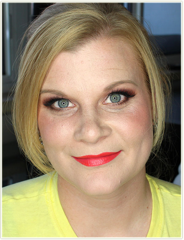
Wearing Rust
Wearing Rust

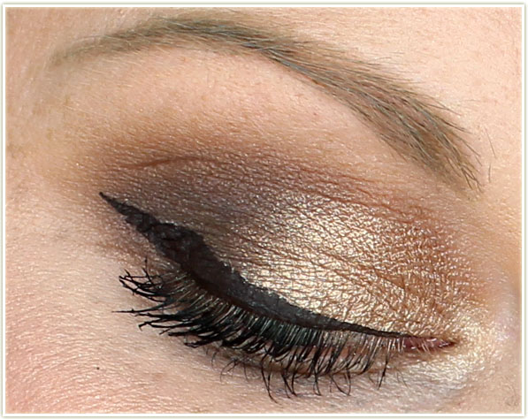
Here’s how it played out on my face. I’m wearing only the Rust quad on my eyelids, and, since I know I’ll be asked, on my lips is Maybelline’s Vibrant Mandarin and on my cheeks is Hard Candy’s Skinny Dipping.

Wearing Rust
Wearing Rust
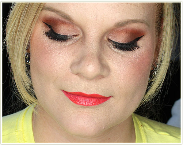
Eye Closeup
Eye Closeup

The Contour shade (the orange) was easily the most pigmented, so I’d say start small when you apply it to your lids and then keep building it up. I ended up whacking a whole ton on when I first applied it and the colour just kept blossoming over my lid as I was blending. (Not a bad thing, just worth mentioning!)

Eye Closeup
Eye Closeup

Final Thoughts

The Kat Von D Shade + Light Eye Contour Quad in Rust is a thing of beauty. The texture of the eyeshadows is soft and powdery (which I’ll leave up to you to decide if that’s a texture you enjoy – for me, that’s a thumbs up!) which make them very easy to blend. The colours are gorgeous and work incredibly well together – you can wear this quad without needing to pull in any other shadows for a cohesive eye look. I do find the packaging is a bit bulky, but it does fit with the KVD aesthetic so I understand the reasoning for it. I also love that she stuck to matte shadows with this launch. Overall product definitely gets two thumbs up from me!

The Kat Von D Shade +Light Eye Contour Quads can be purchased on sephora.ca for $34 CAD or on sephora.com for $26 USD.

The product featured in this post was sent to me for review.