Category Archives: Swatches

Four or More: Lips Edition

201404_4ormore-lips1

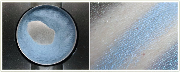
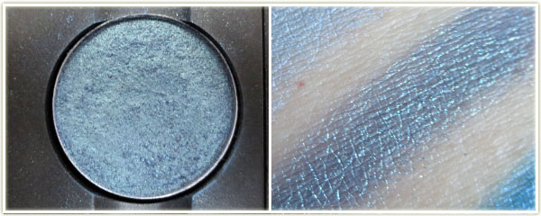
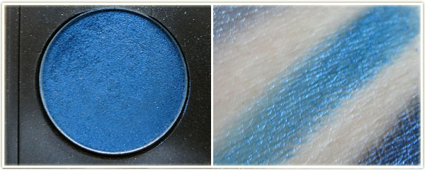
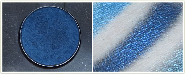
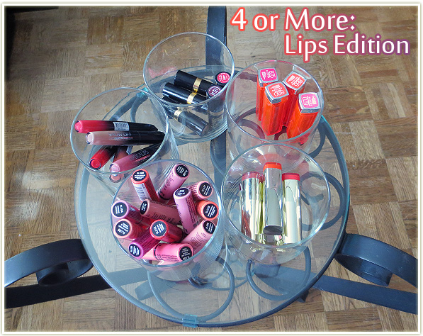
I saw EmilyNoel83 do a “Four or More Tag” and thought I’d follow suit. Usually if you own a ton of a particular product by a brand, you generally like them, or you’ve at least got a good idea of how the products work. (Or you’re stupid and bought a whole bunch without testing any out *cough* We’ll get to that later…) I’m sticking to lips for this edition because if I included eye makeup, we’d be here a loonnnng damn time. Onwards!

Rimmel Apocalips
Rimmel Apocalips

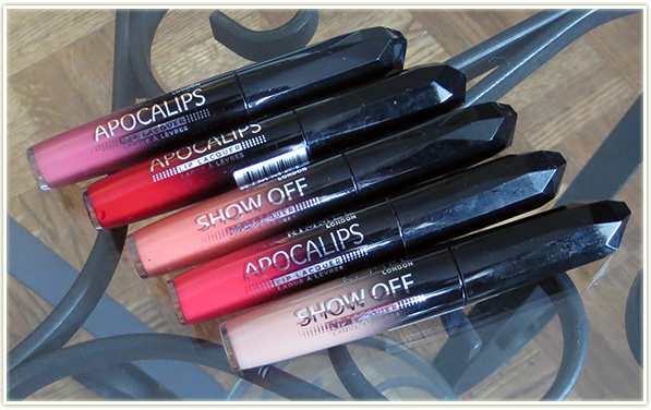
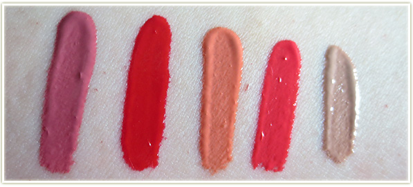
Out of all of the lip products I’m going to mention in this post, these are my absolute favourites. Rimmel‘s Apocalips (called Show Offs in the U.S.) are freaking stellar! They’re a liquid lipstick that dries to a creamy finish with amazing lasting power. Even the applicator with the extra dip in the doefoot wand makes it even easier to get the right amount of product on your lips. While the U.K. and (I think) the U.S. are blessed with the entire line, Canada has to make do with a reduced number of shades. I’ve heard some people complain about the scent of them, but they don’t bother me as I don’t find them overly pungent.

Rimmel Apocalips (l-r): Celestial, Big Bang, Luna, Stellar, Nude Eclipse

Revlon Super Lustrous Lipsticks – Creme formula

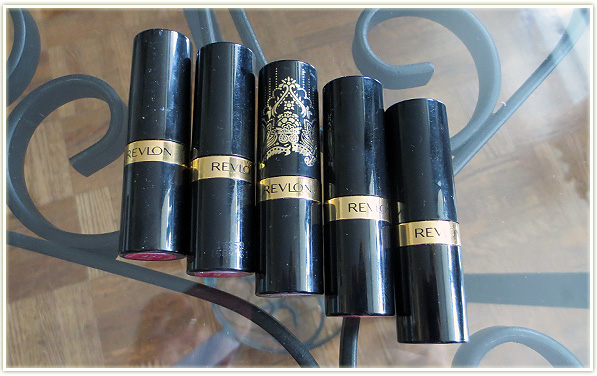
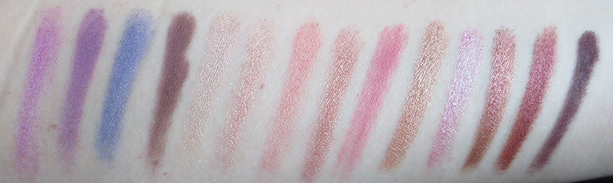
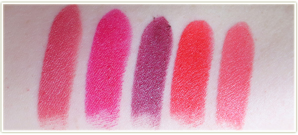
Another massive love! Revlon Super Lustrous Lipsticks, specifically in the Creme formula, are my most comfortable lipsticks to wear. They stay put, aren’t dehydrating on the lips and the colour selection is absolutely massive! I really like the swatches below – you can very clearly see that there is a lot of pink in Cherries in the Snow, however I often get comments on my “red lips” when I’m wearing it! Out of the ones I have though, Fire & Ice is my favourite.

Revlon Super Lustrous (l-r) – Pink Velvet, Cherries in the Snow, Black Cherry, Fire & Ice, Snow Peach

Maybelline Vivids
Maybelline Vivids

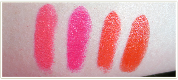
The Maybelline Vivids are what got me started on wearing bright, luminous, absolutely NEON lipstick. They have a sweet scent and taste, although it does dissipate after a while. Again, excellent lasting power and the colours are just gorgeous. If you want vibrancy in your lipstick, these are the way to go. Vivid Rose is my favourite out of the bunch. (Also, I had no idea thatMandarin Orange and Neon Red were so similar to each other.)

Maybelline Vivids (l-r): Shocking Coral, Vivid Rose, Mandarin Orange, Neon Red

NYX Butter Glosses
NYX Butter Glosses

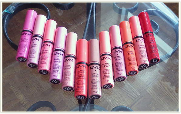
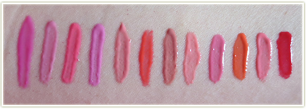
I went insane and bought the entire NYX Butter Gloss line (the original line, before they released a whole bunch of new ones) after trying a couple of them a friend had given me. These are it for gloss for me. I don’t need, or want any other lip gloss in my life and I’ve completely avoided buying any other lip gloss since I picked these up. They’re non-sticky, easy to apply and don’t fade awkwardly. These are the be all, end all of glosses for me. I really can’t recommend these enough. (Full lip swatches can be found in my original review.)

NYX Butter Glosses (l-r): Strawberry Parfait, Eclair, Peaches and Cream, Merengue, Creme Brulee, Peach Cobbler, Tiramisu, Apple Strudel, Vanilla Cream Pie, Cherry Cheesecake, Maple Blondie, Cherry Pie

Milani Color Statement Lipsticks

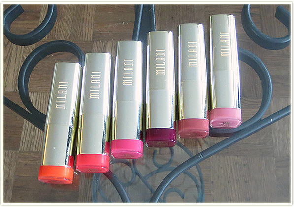
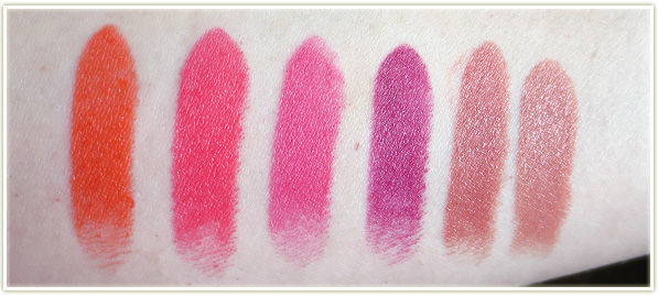
And the duds of the group. I’m so mad I bought all of these! Milani‘s Color Statement lipstick line has lovely colours – they’re vibrant and certainly attractive. Heck, even the tube is beautiful! But they all have this horrible fake watermelon taste that just never goes away. I’ve worn these lipsticks 6+ hours and the watermelon taste just sits on your lips. Bleughhhhh. If only I had bought one before going nutso and picking up so many.

Milani (l-r): Sweet Nectar, Flamingo Pose, Hot Pink Rage, Sangria, Naturally Chic, Nude Creme

That’s it for my Four or More: Lips Edition. Any lip products you own multiple of within the same line?

5 Blushes for Spring & Summer

201404_5blushesforspringandsummer1

Is it time for bright cheeks yet? Could it be that spring is finally going to happen at some point? (Sources say no based on the amount of snow that Toronto got this past Tuesday… yikes!) Maybe we’ll skip right into summer – either one is fine, let’s just feel some heat already!

Stack ’em up!
Stack ’em up!

These are my top blush picks for the spring and summer. I’m a sucker for coral and orange shades, which, conveniently enough, is the theme of every spring and summer EVER!

Hard Candy - Skinny Dipping
Hard Candy – Skinny Dipping

First up is Hard Candy‘s boxed powder blush (which they refer to as Fox in a Box) in the shade Skinny Dipping. The left side is more of a bronzer really and has a sheen to it. The right side is bright orange that seems rather matte. You could use them independently of each other, but I prefer to swirl my brush into the two shades and get the combined muted peach shade. It’s almost a boring shade – it really doesn’t look like much in my swatch does it? But this shade is really surprising on the cheeks. There’s an instant pick-me-up vibe to the shade that is really refreshing. This has been one of my most surprising blushes (in the sense that I wasn’t expecting to look as amazing as it actually did!

MAC – Petal Power
MAC – Petal Power

MAC recently came out with a collection for the spring called Fantasy of Flowers and this blush in Petal Power was part of that limited edition collection. Unfortunately it’s sold out online, but you may be able to still find them at free standing stores or counters (Edit: It’s part of the permanent collection now!). Petal Power is one of their mineralize blushes which usually means it has more dimension to it than a normal blush by MACPetal Power is no exception – this is a bright hot pink/coral shot through with gold shimmer (not glitter). Personally, I find mineralize blushes can be pretty hard to apply so I have to use a stiffer brush to apply them to my cheeks otherwise I don’t get enough product onto the brush. The nice thing about this shade, aside from the fact that it’s stunning, is that since there’s so much gold in the product, you don’t need to add highlighter to your cheekbones as the gold flecks in this product will set off your cheekbones anyway.

Tarte – Blissful
Tarte – Blissful

This is the first blush I ever owned and it’s my absolute favourite to this day. Tarte describes their Blissful blush as “warm peach”, but to me this is the very definition of the colour coral. The shade is completely matte and goes on the cheeks wonderfully. Tarte‘s Amazonian clay formula is pretty stiff in the pan, so I use a duo fiber brush to really stab at the product before buffing it onto my cheeks. This isn’t to say that the product doesn’t blend nicely, it does! It’s just something with the formula that seems to make it a harder blush. On me, this blush looks especially good in tandem with a shimmery bronzer.

Revlon - Coral Reef
Revlon – Coral Reef

Revlon‘s Photoready cream blush in Coral Reef is a strong orange coral. The texture of this product is pretty neat – it has a slightly waxy but slippery slicone-y feel. Fingers or a synthetic brush work really well to blend this into the cheeks. It goes on smooth and can be built up in light layers if you’re afraid of the vibrancy of the colour. Me though? Pack that on and blend out the edges and you’ll get a wonderfully flushed look.

Hourglass - Diffused Heat
Hourglass – Diffused Heat

Hourglass‘ Ambient Lighting blush in Diffused Heat was such a huge shocker to me. In the pan it looks like a bright vibrant pinky-coral mixed with the Diffused Light powder. As a result, I  was expecting coral *something*. Instead, this swatches out, and applies like, a pale pink. This is almost a bit of a relief to me as I tend to focus too much on coral blushes and as a result don’t end up with much variety.

I said it the last time I mentioned this blush, but I’ll say it again: This blush is idiot-proof. The swatch above is heavy, but it doesn’t apply like that. It goes on softly and can be built up in intensity. The powder swirled into the mix ensures that the blush isn’t as stark or as bright as you would expect it to be by looking at it in the pan. This is an incredibly easy colour to wear and on my fair skin it’ll match pretty much any eye look I come up with.

My blishes pics - click to enlarge
My blishes pics – click to enlarge
  1. Hard Candy’s Fox in a Box in Skinny Dipping
  2. MAC – Petal Power
  3. Tarte – Blissful
  4. Revlon – Coral Reef
  5. Hourglass – Diffused Heat

That’s my roundup! Any blushes you’re loving for the warmer months?

My MAC Pinks & Purples Palette

201403_mac_pinksandpurples1

This the last of MAC palettes and it contains my pink and purples shadows.

My MAC Pinks and Purples Palette

Despite the number of shadows that make up this palette, I’m really not much of a pink eyeshadow wearer. A lot of these shadows were purchased because the makeup artist used them on me at my wedding and I wanted to buy the pans to keep for memories sake.

On with the swatches!

MAC – Star n Rockets

Name: Stars n Rockets
Finish: Veluxe Pearl
Notes: I almost didn’t buy this shade because I thought it would be too similar to Dame’s Desire (below). Thankfully, it’s not. This is a beautiful purply-pink with a darker purple/blue duochrome.

MAC – Dame’s Desire
MAC – Dame’s Desire

Name: Dame’s Desire
Finish: Frost
Notes: This is a limited edition shade that was re-promoted in the Liberty of London collection, which is when I picked it up. It has a slight edge of blue duochrome, but there’s barely a whisper of it.

MAC – Parfait Amour
MAC – Parfait Amour

Name: Parfait Amour
Finish: Frost
Notes: Oh man this shade. Everyone loves it… except me. This is a purple with pink duochrome and despite it swatching nicely, this applies like an absolute bastard on my lids. Patchy, sheer, just out and out BAD. This is a pretty old shade though, so chances are the formula may be better these days.

MAC – Blackberry
MAC – Blackberry

Name: Blackberry
Finish: Matte
Notes:  Despite looking rather brown in the swatch, this is a matte maroon shade. One of my more recent shades that I got from a Back 2 MAC.

MAC – Naked Lunch
MAC – Naked Lunch

Name: Naked Lunch
Finish: Frost
Notes: Frosty light pink – a cult favourite. Not one I wear too often anymore, but it has lovely colour payoff.

MAC – Gleam
MAC – Gleam

Name: Gleam
Finish: Lustre
Notes: Used on me for my wedding – but I can’t figure out why because this is a glittery mess. It’s a lustre, so it’s chunky, filled with glitter and pretty sheer. If you’re using it, make sure to pack it on. I use this a lot with Coppering.

MAC – Paradisco
MAC – Paradisco

Name: Paradisco
Finish: Frost
Notes: I was given this by a friend because she couldn’t figure out how to wear it. In the pan it looks orange with a pink duochrome, but it swatches (and wears) more pink with an orange duochrome. I mix this predominantly with teals and it works out pretty well.

MAC – Expensive Pink

Name: Expensive Pink
Finish: Veluxe Pearl
Notes: Another cult favourite and another shade that was used on me for my wedding. Pink with gold duochrome, great colour payoff.

MAC – Sushi Flower
MAC – Sushi Flower

Name: Sushi Flower
Finish: Satin
Notes: Yet another wedding shade (do you see how I ended up with so many pinks now?), although I think the artist used this on my cheeks. I don’t wear this shade that often, but when I do I usually place this in the outer corner and do a thick black winged liner.

MAC – All That Glitters

Name: All That Glitters
Finish: Veluxe Pearl
Notes: Before the beauty community fell in love with rose-gold, this was THE rose-gold. Applies beautifully.

MAC – Swish
MAC – Swish

Name: Swish
Finish: Frost
Notes: Ugh. My younger self didn’t know any better. I bought this in my teens – I think that right there says enough. This is a pink frost that is incredibly sheer and I obviously used a lot of this when I was younger, but it makes me look pretty ill. The only decent combination I’ve found so I can actually wear this in publish is to pair it with Sketch.

MAC – Star Violet
MAC – Star Violet

Name: Star Violet
Finish: Veluxe Pearl
Notes: This shade looks like nothing in the pan and my swatch isn’t great either, but this is a truly wonderful shade. I love pairing this with seafoamy greens and blues.

MAC – Cranberry
MAC – Cranberry

Name: Cranberry
Finish: Frost
Notes: This is like a red version of Star Violet. Beautiful shade.

MAC – Sketch
MAC – Sketch

Name: Sketch
Finish: Velvet
Notes:  Another shade that looks like nothing, but if I had to recommend any out of this entire post, this would be the one to get. This is a beautiful crease colour and it blends out incredibly smoothly.

My MAC Pinks & Purples Palette – Click to enlarge
  1. Stars n Rockets
  2. Dame’s Desire
  3. Parfait Amour
  4. Blackberry
  5. Naked Lunch
  6. Gleam
  7. Paradisco
  8. Expensive Pink
  9. Sushi Flower
  10. Expensive Pink
  11. Swish
  12. Star Violet
  13. Cranberry
  14. Sketch

That’s it for my MAC palettes! If you’re interested in seeing my other palettes, you can check them out here:

My MAC Whites & Blacks Palette

201401_mac_whitesandblacks1

You know… I have this labelled as my MAC Whites and Blacks palette… and I have to say, while photographing and swatching this palette, it is very distinctly not whites and blacks. In fact, there’s only one white and only one black (and it’s a charcoal colour at that).

My MAC Whites & Blacks Palette

So I guess that my original thought when I created this palette would be that this would range from pure white to black, with all the shades of grey in between… but that never worked out. There’s some greys in here and some colours I probably should’ve put in other palettes if I have room.

My MAC Whites & Blacks Palette – Labels

Unfortunately (or fortunately, for my wallet), this palette isn’t full, so I have a few less shades to share with you today.

MAC – Crystal Avalanche

Name: Crystal Avalanche
Finish: Frost
Notes: Super frosty and super white. I use this primarily on the lid with Print in the crease. I think I also bought this as a replacement for the now discontinued Krisp from years ago (it’s not even remotely a dupe though).

MAC – Vellum
MAC – Vellum

Name: Vellum
Finish: Frost
Notes: I’ve owned a few of these pans, in fact, probably about three or four of them over the years. This used to come in the larger pan sizes (back in the 90s anyway), but I can’t quite remember if it was the same size as a blush. It’s a white frosted shade with a blue/violet sheen to it which is a nightmare to photograph. You can see that the pan has shades of purple in it,  and you can see the swatch has shades of blue, that’s the duochrome. I love the colour, but the current pan I have (and I remember this from older version as well) gets really crusty on top and ends up requiring you to scrape a few layers off every now and then in order to get colour payoff. Very much worth owning however.

MAC – Vex
MAC – Vex

Name: Vex
Finish: Frost
Notes: Another nightmare colour to photograph. This is a pinky-green duochrome shade. It’s beautiful and is one of MAC’s softer shades – I always love applying this colour to my lids because it just goes on so easily.

MAC – Vanilla Pigment

Name: Vanilla
Finish: Pigment
Notes: Unlabelled in my palette at the moment since I’d just recently pressed it – this colour is like fairy dust. I don’t even know how to describe the base colour of this shade, maybe off-white, although I wouldn’t use it hoping for “off-white” on my lids. The sparkle within it is gold with some pink and orange in there. It’s absolutely stunning.

MAC – Club
MAC – Club

Name: Club
Finish: Satin
Notes: Satin is a weird finish for this one since it’s a duochrome and definitely has shimmer to it. The base of the shade is a red-brown colour and the duochrome is decidedly green. I love this especially with Vex.

MAC – Copperplate
MAC – Copperplate

Name: Copperplate
Finish: Matte2
Notes: Beautiful brown-grey in a lovely matte2 formula (although not as soft as Handwritten which is like butter!).

MAC – Electra
MAC – Electra

Name: Electra
Finish: Frost
Notes: Probably my second pan of this shade – I used this to death in my early twenties as my “going out” look. It’s a very frosty, very shiny silver.

MAC – Bough Grey
MAC – Bough Grey

Name: Bough Grey
Finish: Satin
Notes:  Limited edition – I picked this up with the Liberty of London collection in 2010. Very muted grey.

MAC – Print
MAC – Print

Name: Print
Finish: Satin
Notes:  A not-quite-black shade (more charcoal than black) that goes on with very minimal sheen.

Swatches – Click to enlarge
  1. Crystal Avalanche
  2. Vellum
  3. Vex
  4. Vanilla Pigment
  5. Club
  6. Copperplate
  7. Electra
  8. Bough Grey
  9. Print

There’s only one palette left in my MAC collection, and that’s my Purples and Pinks palette, which should be up within the next two weeks. If you’re interested in seeing my previously posted palettes (wooo alliteration!), you can check them out here:

My MAC Greens & Blues Palette

201401_mac_greensbluespalette1

Time to showoff my MAC Greens and Blues palette!

My MAC Greens & Blues Palette

Green is my absolute favourite colour, so I love working with it. I also have a high affinity for teal colours just because they’re so darn pretty.

Labels
Labels
Greens & Blues
Greens & Blues

I’m a bit sad I didn’t photograph this palette earlier. I had a very old shadow called Sprout in there that MAC doesn’t make anymore (discontinued somewhere in and around 2007!). Sprout was sheer, but I remember using it on a friend of mine for a Halloween dance party in high school when she wanted to be Britney Spears from the Crazy music video (I’m dating myself here), so I had a lot of warm and fuzzy feelings towards that shadow. Humid is the other empty slot which I haven’t replaced yet (loved it, but I’m trying out an Inglot shade that’s almost an identical dupe). I Humid predominantly with Juxt and it was those two shades together that sparked a deeper interest in makeup several years ago.

Here’s a closer look at the individual shades that make up this palette.

MAC – Juxt
MAC – Juxt

Name: Juxt
Finish: Satin
Notes: Discontinued by MAC in 2011. This is my second pan of this shade – beautiful light green with subtle gold highlights. I’m surprised it’s a satin as this can actually get quite shimmery/reflective. Some people say it’s sheer, but I really just feel like it’s a light shade – heck, it’s almost pastel!

MAC – Bio Green
MAC – Bio Green

Name: Bio Green
Finish: Frost
Notes: I bought this over a decade ago when I think it was released in a special collection. I’m pretty sure it’s a PRO only colour now. Beautiful vibrant green.

MAC – Golden Olive
MAC – Golden Olive

Name: Golden Olive
Finish: Pigment
Notes: Pressed pigment. I don’t wear this often enough (which is not good news since I’ve got a LOT of it) but it’s absolutely beautiful. As the name suggests, this is a very golden olive shade.

MAC – Jealousy Wakes

Name: Jealousy Wakes
Finish: Veluxe Pearl
Notes:  I bought this because as soon as I found out that Christine over at Temptalia had developed a shade for MAC, I knew it had to be good! I tend to wear this a lot with Vex. I wish I’d bought a backup because I doubt they’ll ever bring the shade back.

MAC – Steamy
MAC – Steamy

Name: Steamy
Finish: Frost
Notes: A bluey-green shade that can be kind of patchy if you don’t apply it thickly.

MAC – Greensmoke
MAC – Greensmoke

Name: Greensmoke
Finish: Lustre
Notes: Lustres are not my favourite finish as they can be really patchy, flakey and holy hell does it ever take some work getting this out of the pan. You really need to pack this colour on to get decent payoff.

MAC – Fade
MAC – Fade

Name: Fade
Finish: Satin
Notes: This shade has been re-pressed after being completely broken. I bought this ages and ages and ages ago. My older (wiser?) self has no idea how to wear a powder blue shade anymore!

MAC – Tilt
MAC – Tilt

Name: Tilt
Finish: Frost
Notes: Another one of the shades I’ve repurchased, this is my second pan of Tilt. It has a beautiful duochrome (light blue/violet) that reflects beautifully on the lids. This was one of my go to shades throughout my teen years.

MAC – Freshwater
MAC – Freshwater

Name: Freshwater
Finish: Veluxe Pearl
Notes: Beautiful… but underused. Honestly, I really have no complaints about this shade… I wonder why I don’t use it more.

MAC – Deep Truth
MAC – Deep Truth

Name: Deep Truth
Finish: Frost
Notes: Argh this one… I love the colour, it swatches beautiful, but I feel like it never looks this beautiful on my eyes. When I apply the shadow, it retains the dark blueyness of the shade, but the reflective properties seem to dissipate. Could just be user error… maybe I need to try a different brush.

MAC – Birds & Berries

Name: Birds & Berries
Finish: Veluxe Pearl
Notes: I’ve read that people consider this a dupe for Tilt, but I don’t see it at all. This one is darker, and doesn’t have the same duochrome that Tilt has. I picked this up with the Liberty of London collection.

MAC – Moonlight Night

Name: Moonlight Night
Finish: Pigment
Notes: Another pressed pigment and I use this one often. It’s a deep, dark teal (almost black really), shot through with teal glitter. This one was limited edition with the Tartan Tale holiday collection in 2010.

MAC – Contrast
MAC – Contrast

Name: Contrast
Finish: Velvet
Notes: Beautiful in the pan but looks mostly black on my lids.

My MAC Greens & Blues Palette – Swatches – Click to enlarge
  1. Juxt
  2. Bio Green
  3. Golden Olive
  4. Jealousy Wakes
  5. Steamy
  6. Greensmoke
  7. Fade
  8. Tilt
  9. Freshwater
  10. Deep Truth
  11. Birds & Berries
  12. Moonlight Night
  13. Contrast

Two more palettes to go! Upcoming are my pinks/purples and whites/blacks.