Category Archives: Swatches

My MAC Neutrals Palette

201401_mac_neutralspalette1

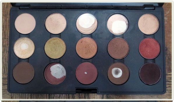
I thought I’d show you all a look into my MAC Neutrals palette. I also tend to think of this palette as the one with the “metals” because the middle row inspired me to think that way (gold, bronze, copper).

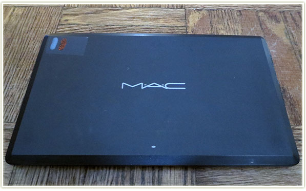
In order to identify my palettes since I do have the old style and won’t be converting to the new ones (I don’t see the point really, kind of a waste of money purely for aesthetics – says the person who loves makeup… lol) I put a piece of tape on the top left hand corner and then paint a nailpolish colour or two that best describes the shades in the palette. For my neutrals palette, there’s a stripe of nude polish and one of a sparkly orange because that was the closest I could get to neutral shades out of what I had!

MAC Neutrals Palette

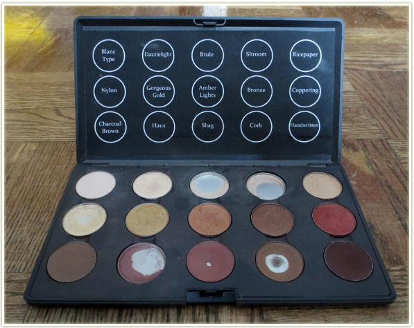
Although the highlight shades are used quite often, this is probably my least used MAC palette. Some of the browns are showing a lot of pan, but that’s because those are my oldest shades that date back to when I had less makeup so they got used a lot more often. Since I tend to prefer coloured eyeshadow, I don’t reach for this palette as often.

MAC Neutrals Palette Labels

These fantastic labels were completely stolen from Zabrena. You can find her video tutorial for creating these templates here. They are fantastic and much nicer looking than the ghetto Post-It notes I had stuck to the top of the palette before!

MAC Neutrals Palette Shadows

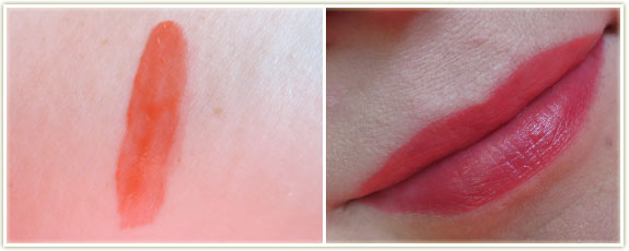
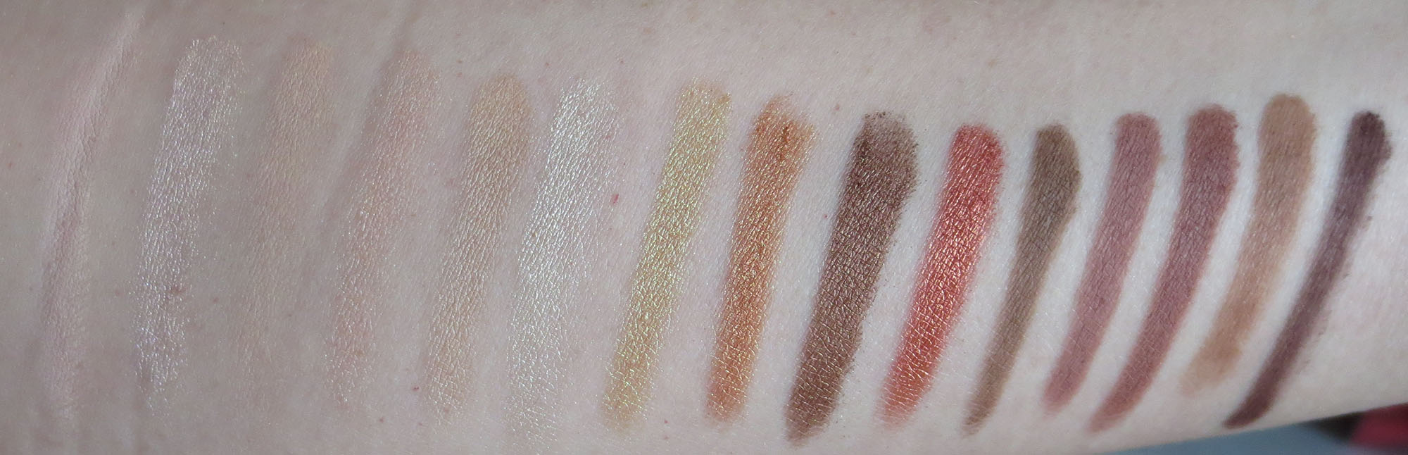
Let’s take a look at the individual shades I’ve plunked in. All swatches will be a diagonal stripe through the middle of graphic – I point this out because some of the swatches were a bit too close together on my arm so you may see more than one colour in some pictures.
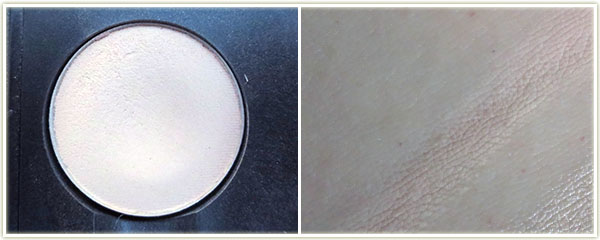
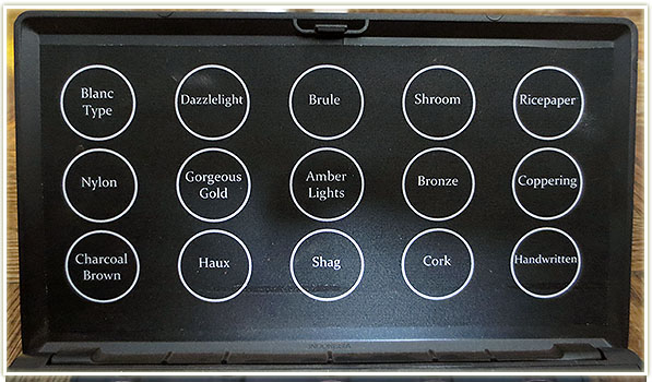
MAC – Blanc Type
MAC – Blanc Type

Name: Blanc Type
Finish: Matte2
Notes: Blanc Type is one of MAC’s buttery, soft Matte2 formula. On my my skin it looks slightly pink in the swatch, but it does wonders to brighten up any look and I tend to think of it as whiter than my other highlight shades. The texture is very, very smooth.
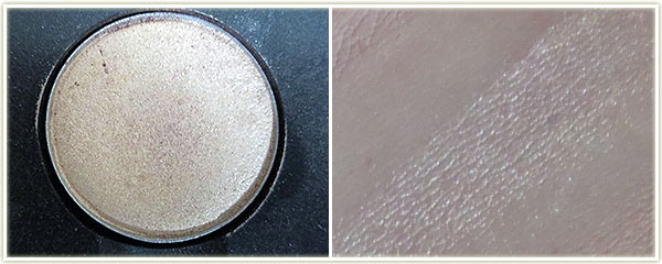
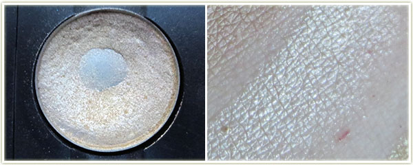
MAC – Dazzlelight
MAC – Dazzlelight

Name: Dazzlelight
Finish: Veluxe Pearl
Notes: This shade is slightly underused in my palette, but to me it’s a paler, whiter Shroom and definitely more shimmery.
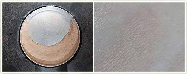
MAC – Brule
MAC – Brule

Name: Brule
Finish: Satin
Notes: Brule is an off-white that seems to completely melt into my skin. I’ve been trying to bust through this shade but it feels like the pan is never ending! This makes a great brow highlight on me and honestly, that’s the only thing I ever use it for. When I’m done with this, I’ll end up using Blanc Type as my usual brow highlight as I prefer the brightening effect that Blanc Typeprovides.

MAC – Shroom
MAC – Shroom

Name: Shroom
Finish: Satin
Notes: I like to think of Shroom as a shimmery Brule. I’m confused as to why this shadow is a satin finish because it definitely has shimmer to it that you don’t often see in satins. A great deal of people compare Shroom to Urban Decay‘s Virgin, but I personally do not feel they are the same.

MAC – Ricepaper
MAC – Ricepaper

Name: Ricepaper
Finish: Frost
Notes: Ricepaper is a yellow tinted, shimmery beige. It has a frost finish, but it doesn’t reflect the same amount of frost that some of the frost finishes do… such as the next one:

MAC – Nylon
MAC – Nylon

Name: Nylon
Finish: Frost
Notes: Nylon is phenomenal. In the pan, it looks like a white-gold, but on the skin it definitely seems to just embody the term “frost”. It definitely has a frost finish and looks slightly yellow. This is my second pot of this shadow and one of the first ones I ever owned from MAC.
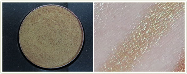
MAC – Gorgeous Gold
MAC – Gorgeous Gold

Name: Gorgeous Gold
Finish: Veluxe Pearl
Notes: This was was a nightmare to photograph in the pot, but as you can see from the swatch, it’s a beautiful reflective gold with hints of green.

MAC – Amber Lights
MAC – Amber Lights

Name: Amber Lights
Finish: Frost
Notes: I know this is supposed to be phenomenal for blue eyes, but I must be mixing this with the wrong shades because it never looks that good on me. It’s very frosted and very orange. The pigmentation is fantastic and it smoothes on the lid beautifully.
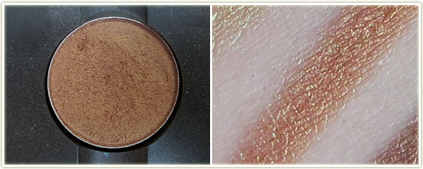
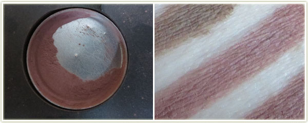
MAC – Bronze
MAC – Bronze

Name: Bronze
Finish: Frost
Notes: Beautifully pigmented, although not one I use often.
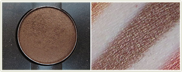
MAC – Coppering
MAC – Coppering

Name: Coppering
Finish: Veluxe Pearl
Notes:  This is an absolutely outstanding colour, easily my number one favourite by MAC. This is a bright copper that has wonderful pigmentation.

MAC – Charcoal Brown

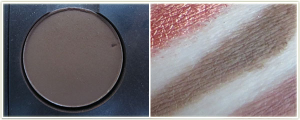
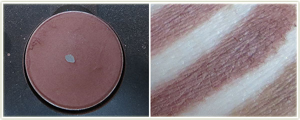
Name: Charcoal Brown
Finish: Matte
Notes: Another shade I’ve not used often. Seems to apply quite well, but it’s not as smooth as their Matte2 formula.
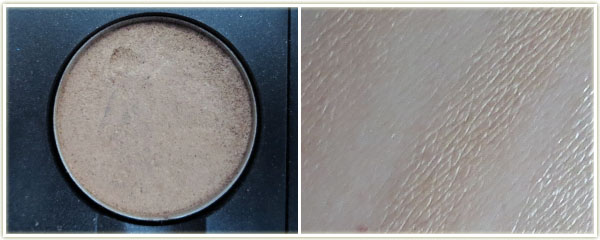
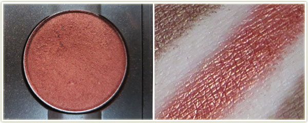
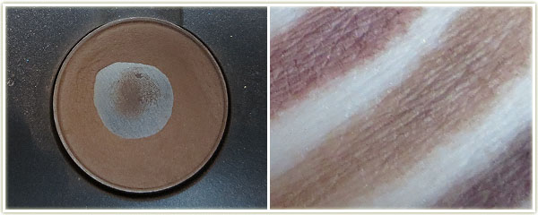
MAC – Haux
MAC – Haux

Name: Haux
Finish: Satin
Notes: This pan is my first ever MAC eyeshadow, bought in 1995. Yes, this shadow is that old! It’s a rosy-tinted brown and does wonders to make my eyes look awake. I use it in my crease with some kind of light shimmery shade on the lid.
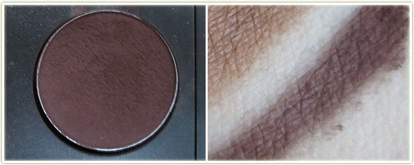
MAC – Shag
MAC – Shag

Name: Shag
Finish: Unknown, likely a satin
Notes: This is another incredibly old shade. MAC doesn’t seem to make this shade anymore and a quick Google search didn’t indicate to me when they discontinued it. That being said, it’s very similar to Haux. Maybe slightly deeper, but not by much. I usually pair this with Nylon.
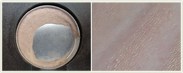
MAC – Cork
MAC – Cork

Name: Cork
Finish: Satin
Notes: I used to use this shade a lot, but I don’t even remember touching it in the last year.

MAC – Handwritten
MAC – Handwritten

Name: Handwritten
Finish: Matte2
Notes: If you buy this shade, one of the first things you need to do is touch it with your fingertip. The texture is so incredibly soft that it actually feels pillowy. I’ve never felt a shadow like that before! The pigmentation on this is insane – to the point where it can actually be too soft so be careful when you stick your brush into the eyeshadow!

MAC Neutral Palette – Swatches – Click to enlarge
  1. Blanc Type
  2. Dazzlelight
  3. Brule
  4. Shroom
  5. Ricepaper
  6. Nylon
  7. Gorgeous Gold
  8. Amber Lights
  9. Bronze
  10. Coppering
  11. Charcoal Brown
  12. Haux
  13. Shag
  14. Cork
  15. Handwritten

So that was my neutrals palette! I’ll have three more MAC palettes to show you in the upcoming weeks.

Review: NYX Butter Glosses (Entire Collection)

20131203_nyxbutterglosses

In a moment of madness, I picked up the rest of the entire NYX Butter Gloss line after having been gifted two by a friend. These may just be the be-all, end-all of glosses for me.

The glosses come in an assortment of shades, ranging from a few neutrals, to pinks, to peaches and finally to some oranges and one red. They are on the milkier side, which the lighter colours tend to display more. The brighter peaches and oranges tend to look more juicy than milky and come across as having a slightly gel-like appearance (although they don’t feel gel-like).

There is a slight tackiness, but it’s so slight that chances are you won’t even notice it, although it does give the gloss some grip on the lips to help increase the longevity of the product. I wouldn’t say these are especially long lasting, they are a lipgloss after all, but you can expect about two hours of wear before you’ll need to re-apply (assuming you haven’t been eating or drinking).

As for the scent/taste of the gloss… well it’s a bit bizarre. The shades have a lovely buttery, slightly vanilla, creamy scent to them (some smell stronger than others). It’s certainly a tasty scent! However, once you get the product on the lips, it does tend to actually taste like plastic. I don’t find the taste to be off-putting really, but it is something worth noting as they definitely do not taste the same way they smell. Some colours have more of a plastic taste than others, so it’s not completely widespread across the entire range. (At the moment, I’m wearing Peach Cobbler and it has one of the stronger plastic tastes.)

In my opinion, these Butter Glosses are an absolute must-have. My favourites out of the bunch are Creme Brulee, Strawberry Parfait and Vanilla Cream Pie.

See below for pictures and swatches of the entire collection of Butter Glosses.


NYX Butter Gloss in 01 Strawberry Parfait

The brightest, slightly fuschia, pink in the collection.


NYX Butter Gloss in 02 Eclair

One of the milkier shades. Definitely pale, pink and milky.


NYX Butter Gloss in 03 Peaches and Cream

Looks quite coral/peach in the tube, but comes across as quite pink on my lips. I love this colour.


NYX Butter Gloss in 04 Merengue

Merengue has a definite lavender tone mixed with pale pink. Very pale and milky in appearance.


NYX Butter Gloss in 05 Creme Brulee

A slightly pinky nude.


NYX Butter Gloss in 06 Peach Cobbler

This one is super bright! Very orange in the tube, but comes across slightly redder on the lips.


NYX Butter Gloss in 07 Tiramisu

The “pure” nude of the bunch. Slightly, pink/mauve tone.


NYX Butter Gloss in 08 Apple Strudel

Peach in the tube, slightly pinker on the lips.


NYX Butter Gloss in 09 Vanilla Cream Pie

Lovely mid-tone pink.


NYX Butter Gloss in 10 Cherry Cheesecake

Bright orange in the tube and on the lips.


NYX Butter Gloss in 11 Maple Blondie

Peachy pink with a slightly milky appearance.


NYX Butter Gloss in 12 Cherry Pie

The red out of the whole lot. Looks slightly gel-like on the lips.

The NYX Butter Glosses can be purchased at Ulta.com for $4.99 USD each.

Drugstore Foundation Roundup

20131118_foundation_roundup

I’ll start this off by saying I still feel like I’m an extreme rookie when it comes to foundation. I often feel I have no concept as to what colour actually matches my  skin tone. A lot of what I say is going to be based on what professionals at MAC, Sephora or Boots have said to me. At MAC, depending on who I speak to, I’ve been told I’m either NC20 or NW20 (I do get pointed towards NW20 more often though). My veins appear blue, which means I have a cool undertone. One of the most important thing to note in the following swatches are that these are all done on the underside of my arm which is pretty darn pale. The underside of my arm does not match my face, nor does it even match tops of my arms, so keep that in mind as you’re comparing the colours to my skin. I tried swatching on my jaw line but it just made for incredibly awkward pictures.

Things to note about my skin:

  • At MAC I’m in the NW20/NC20 colour range.
  • My skin is not overly oily, however I do get occasional shiny patches. If I do get oily patches, I don’t generally try to powder it down as I don’t find them particularly blinding!
  • My veins appear blue, which means I have a cool undertone.
  • I don’t wear foundation every day as I don’t have anything to really cover up. A few occasional red patches where I pick at my skin, but I don’t need to cover acne or anything of the like. For me, foundation evens out skin tone.

On with the swatches! Prices are marked with the appropriate currency to the country in which I bought the foundation.

Bourjois Healthy Mix Serum in 51 Light Vanilla (~€14)

While in Ireland in May, I picked up the Bourjois Healthy Mix + Serum foundation in shades51 (Light Vanilla) and 52 (Vanilla). I’d heard many a good thing about this foundation and wanted to give it a try. The first thing that has to be said about this foundation is that it smells amazing. Putting this on your face is an absolute pleasure – it smells refreshingly like berries! The consistency is rather thin, although it does have somewhat of a gel-like texture which I suppose is the “serum” effect they refer to in the name. Shade 51 is too light for my complexion at the moment (even though in the swatch above it looks damn near perfect), so I’m hoping my skin pales out enough throughout the winter to be able to use it pure. If not, I’ll mix it with a darker foundation to get a better colour match.

Also worth noting is that this comes with a pump. I can’t tell you how invaluable pumps are for foundation. Nothing is worse than a bottle with an open end (I’m looking at youRevlon Colorstay!). I do find this gets patchy/wears away pretty quickly so the lasting power isn’t amazing.

Bourjois Healthy Mix Serum in 52 Vanilla (~€14)

Right now this shade (52 Vanilla) seems perfect for my skin. It blends in smoothly and evenly. As with the shade I mentioned above, this is a really liquid consistency that feels really refreshing on the skin despite not having a very long wear time. It’s perfect for those who don’t like the feeling of overly thick foundations.

No7 instant Radiance Foundation in Cool Vanilla (~€16)
No7 Instant Radiance Foundation in Cool Vanilla (~€16)

No7 Instant Radiance foundation in Cool Vanilla is the foundation I feel the most comfortable wearing, which probably has to do with it being the foundation shade I was colour matched to in Boots. I’m never QUITE sure if a foundation matches me, so having a laser gun tell me my perfect shade eases a lot of my worry. I was colour matched in Ireland in May, so I had a partial tan at the time as it had already been quite warm in Canada by that point. This is the ONLY foundation I’ve worn where someone has commented on how amazing my skin looked. I will admit that it looks dark in the bottle, but it certainly doesn’t appear that intense on my face.

This also comes with a pump – therefore I love it. There is a faint “cosmetic” scent to the product, but it’s not offensive. Lasting power is quite good as it will endure an entire work day without issue.

Revlon Colorstay Foundation in 220 Natural Beige (Combination/Oily) (~$20 CAD)

I had a bit of a love hate relationship with this foundation. Revlon Colorstay was the first liquid foundation I ever bought after hearing it recommended over and over again for being one of the best drugstore foundations ever. I took a leap of faith with the shade (220 Natural Beige) and it worked out decently well, though I do find this shade tends to run quite pink. This isn’t a shade I can wear during the dead of winter – it’s more an early summer and early fall shade (as my tan is both coming in and going out).

The first time I wore it I wasn’t loving it – it has a rather offensive paint-like scent (although you cannot smell it once it’s on your skin) and it dried down incredibly quickly, which wasn’t something I was used to. I gave up  on this foundation for a while then went back to it to force myself to finish the bottle… only to find that I suddenly LOVED the stuff. The coverage is intense – it will block out almost anything on your face and give you a flawless surface. It can appear quite artificial if you pack it on, so go lightly and build up a second layer if you really need it (I didn’t). It can feel rather tight if you’re not used to wearing foundation. Since the coverage is so heavy, it can look slightly artificial at times, which is why I tend to prefer how it looks after an hour or two of wear time once it’s had a chance to settle into your skin

I only wish this had a pump. I’ve read that some countries do have Colorstay in a pump, but I have yet to see that here in Canada!

Revlon Colorstay Foundation in 150 Buff (Combination/Oily) (~$20 CAD)

Just a paler shade of Revlon Colorstay that I anticipate wearing in the winter. This shade (150 Buff) shade leans more yellow than 220 Natural Beige and is also significantly lighter.

Revlon Colorstay Whipped Creme Foundation in 220 Nude (~$11 USD)

Ugh. This Revlon Colorstay Whipped Creme foundation (in 220 Nude) vexes me. First off, the number is the same as the Natural Beige shade in the normal liquid version and yet the shades have completely different names and are not similar at all. I bought this hoping it would be slightly paler than the liquid 220 Natural Beige shade – it’s definitely not, it’s darker!

I wore this throughout the summer as it was the darkest foundation I had and while it matched well enough, it was just never, ever comfortable to wear. Maybe it’s just because it was a cream foundation in the middle of a warm summer, but it just never felt like it completely settled into my skin. It really just felt like it sat on top of my skin. I forced myself to finish it, but I won’t purchase this one again. (And honestly, it has turned me off all cream foundations altogether now.) Also annoying is that despite it being in a rather cute tub, it was frustrating getting the product out. I resorted to using a cotton bud to remove the foundation, placed it one the back of my hand, and then dabbed my brush onto the back of my hand to pick up product.

Covergirl & Olay Tone Rehab 2 in 1 Foundation – CC Cream in 110 Classic Ivory (~$20 CAD)

Covergirl‘s attempt at a CC Cream is a bit of a laugh. The actual tube doesn’t say anywhere on it that it’s a CC Cream… except for the sticker at the top which looks like it was added as an afterthought once the CC Cream craze started up in the beauty world. As far as I can see, it doesn’t actually have any CC Cream properties: there’s no colour correction properties to it and there’s no SPF. So let’s just forget it’s even labeled a CC Cream and move on. I’ve been wearing 110 Classic Ivory more lately to get a feel for it and I will say that it is an incredibly matte foundation. The colour match is quite good for me as we’re headed into the winter, but it does tend to feel a bit drying as I progressed throughout the day. I would recommend wearing a decent moisturizer underneath this foundation. And thumbs up for the pump!

MUA BB Cream in Light (~£4 GBP)

MUA‘s BB Cream was cheap as chips and it doesn’t disappoint. It does feel rather thick, so go easy when you squeeze it out. The first time I applied it I definitely used too much and with the shade being too pale for me at the moment (man, I feel like I keep saying that!) it made me look rather ghostly. The dry down on this product is nice – you’ve got plenty of time to blend it into your skin and it just looks *nice*. To the touch it’s even rather soft. Love the squeezy tube and the nozzle end.

MUA Matte Foundation in Shade 1 Soft Sand (~£2 GBP)

MUA‘s Matte foundation is actually rather impressive. Not only is it incredibly cheap but it also has a nozzle end – a feature which I find to be an incredibly smart alternative to a pump. As a whole, the packaging on this one is rather awesome: It contains an ounce of foundation (typical for foundations) but it’s a flexible, soft tube with a nozzle. It’s compact and perfect for travelling, which makes it pretty ideal. I don’t find it holds up throughout the day as well as Revlon Colorstay, for example, but the cost of this foundation offsets just about every downside to that.

Here are all the foundations swatched side by side on the underside of my arm in indirect sunlight. As mentioned at the top of this post, my face has been colour matched to NW20 at MAC which is darker than my arm.

20131118_foundation_swatches_numbered

  1. Bourjois Healthy Mix Serum in 51 Light Vanilla
  2. Bourjois Healthy Mix Serum in 52 Vanilla
  3. No7 instant Radiance Foundation in Cool Vanilla
  4. Revlon Colorstay Foundation in 220 Natural Beige (Combination/Oily)
  5. Revlon Colorstay Foundation in 150 Buff (Combination/Oily)
  6. Revlon Colorstay Whipped Creme Foundation in 220 Nude
  7. Covergirl & Olay Tone Rehab 2 in 1 Foundation – CC Cream in 110 Classic Ivory
  8. MUA Matte Foundation in Shade 1 Soft Sand
  9. MUA BB Cream in Light

Those are all my foundations! I hoped the colours and swatches help you out if you were looking information and comparisons. Is there a foundation out there that you think I’d like? I’ll admit to never having owned a high end foundation so I’m sure that’s something I’ll be looking into at some point!

Review: Joe Fresh

201310_joefresh

Joe Fresh is a brand created for Superstore/Loblaws in Canada (although their Wikipedia page indicates they’re also available in JC Penny in the U.S., but I’m unsure if that includes the makeup line, or just the clothing). They came out with their makeup line in 2009 with a price point of $8 or less. I’ve skipped over Joe Fresh makeup a few times without really thinking about it, but when I received a $20 off voucher for Superstore/Loblaws I decided to take a closer look at this brand.

One of the first things that drew me into this line is their packaging. It’s very simple and clean. I love the fact that the bronzer in completely encased in clear plastic. The cream blush is similar, although frosted.

Joe Fresh Bronzer in Sand ($8/8.8g)

Joe Fresh’s bronzer in Sand is a matte, pale tan shade. This will be an excellent bronzer for those with very pale skin and  I’m going to love using this one during the dead of winter. For the late summer/start of fall this was not strong enough to show up on my skin, despite it being very pigmented and smooth. The texture is incredibly soft (touch the product with your fingertips, you’ll be amazed) but it does mean you’ll kick up a lot of product with your brush if you stab at it aggressively. Pat the bronzer lightly to pick up a bit of product and you’ll end up with less mess and just enough on your brush. I noticed zero hint of orange to this shade which makes it not at all intimidating for anyone concerned that they’ll end up looking like an Oompa Loompa.

Joe Fresh Bronzer in Sand (Swatch)

Joe Fresh Cream Blush in Apricot ($8/4.2g)

Their cream blush in Apricot  turned out to be a massive hit for me! On me, Apricot is peach shade that leans slightly more pink. This is such an easy colour to wear – it goes on smoothly and last through an entire workday without any fading (which, for me, means I applied it at 7:30 am and took it off somewhere around 5 pm). The pigmentation and creaminess is the best I’ve experienced so far in cream blushes. I’ve been using a brush to apply it, but you could easily blend this onto your cheeks with your fingertips. I’d highly recommend this formula to anyone looking for a long lasting cream blush.

Joe Fresh Cream Blush in Apricot (swatch)

Joe Fresh Lip Tint in Mango ($6/3.4ml)

The Lip Tint in Mango is an incredibly vibrant coral shade that leans heavily on the orange side of coral in the tube. It has liquid, gel-like texture that goes on semi-sheer and comes with a doe-foot applicator which makes application simple. The colour, on me, goes on slightly pinker than what I can see in the tube and it’s a beautiful shade. It goes on somewhat shiny, but it does dry down and becomes a rather matte colour.

Unfortunately, that’s where the good stuff ends: This stuff tastes like toxic waste – there’s a very distinct acrid taste to the product that is impossible to ignore. If you happen to lick your lips to get used to the taste of it (and it does taste nasty, which is bizarre because it doesn’t smell offensive straight out of the tube) you end up removing all of the product from your lips. The lip tint will eventually stain, but you need to hold your lips immobile for quite some time before this happens (we’re talking upwards of 10 or more minutes here). If you move your lips, you end up with that horrible taste in your mouth which will inevitably lead to either wiping the product off with a tissue, or just licking it off as quickly as possible to get rid of the taste. This is one of few products I have bought over the years that I’m considering throwing straight into the bin. The only reason I’ve held onto it for so long was to test it long enough for this review. I would not recommend picking this product up even if the colours do appeal to you.

Joe Fresh Lip Tint in Mango (swatch)

Overall, I really like the bronzer for the winter months, I absolutely love that cream blush… and the lip tint? Well, I dislike throwing products out, but realistically I’m never going to use it. It’s a shame, because I really do like that shade on my lips, but it’s just not worth the hassle.

Have you tried any Joe Fresh beauty products? Anything in particular you thought was especially good?