Highlighters are one of those products that when they first launched into mainstream makeup, I was intrigued and so, so excited for them. But then I felt like the market got saturated very, very quickly and we ran the gamut of “normal” highlighters within an extremely short amount of time. At this point, everyone has a gold, a pearl, a champagne or an amber tone coloured highlighter, and outside of varying levels of how bright they appear on your cheekbones, there isn’t a whole lot that new highlighters have to offer us on the market.
Unless they’re a unique colour, in which case I am allll over it! Which is exactly what INGLOT has done in their recent Intense Sparkler Highlighter launch.
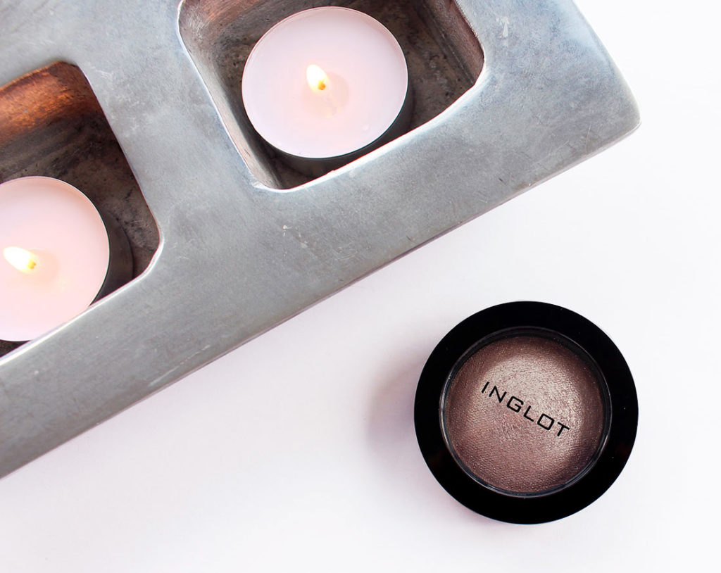
INGLOT Intense Sparkler
I felt like I had a hole in my collection in terms of patina-coloured highlighters, so I ordered the shade 11 which seemed the most unique in their range of five shades. INGLOT‘s Intense Sparklers are intended for use pretty much everywhere as they’re listed as a “face eyes body” highlighter, so I was a bit surprised when my package showed up and the pot was smaller than I thought it was going to be. There’s only about 3.4 gram of product in these, which is far less than the usual 8-10 grams I normally expect out of a highlighter. That being said, I don’t know WHY I expect products to be so large. I don’t have a hope in hell of ever finishing up a highlighter, so I definitely don’t need MORE product in my collection.
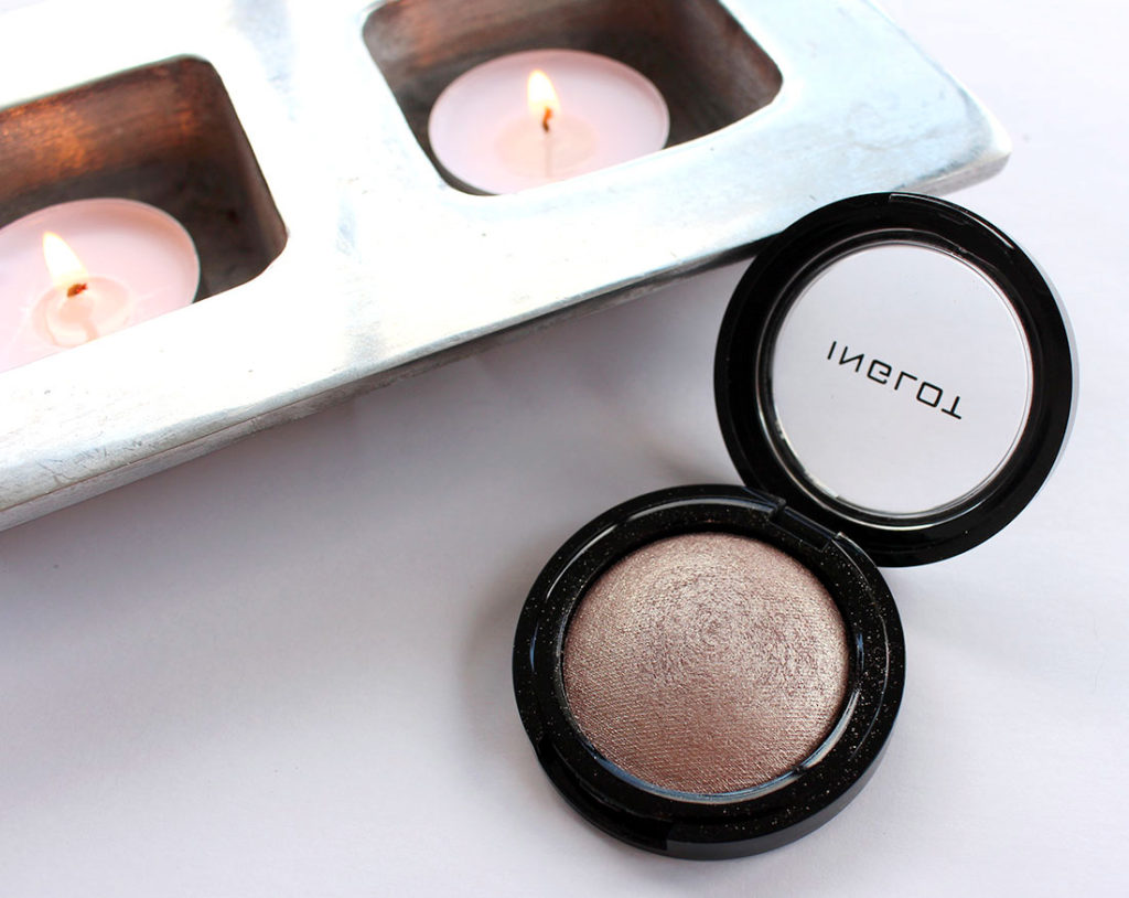
INGLOT Intense Sparkler – swatched
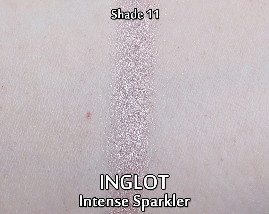
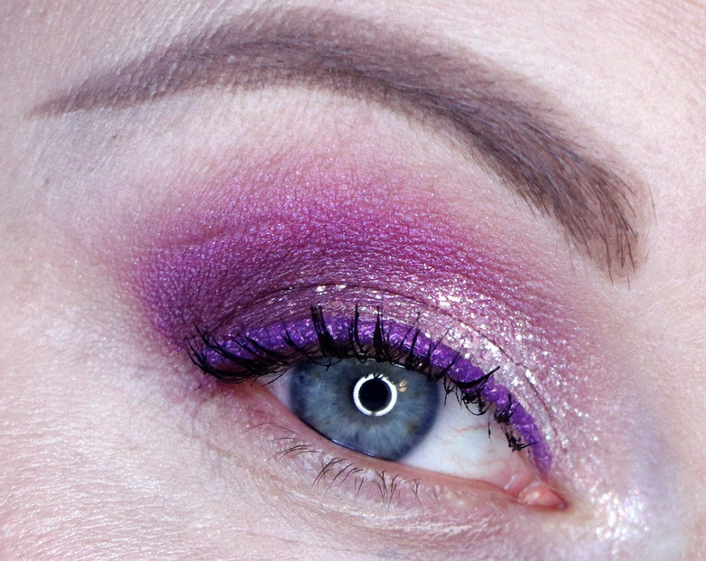
The Intense Sparklers are definitely suited towards their name – they go on the cheeks extremely luminescent and you will find tiny flecks of shimmer throughout the formula. I love the shade I picked up (#11) as it’s definitely something I didn’t already own. I think they classify this colour as “beige” which I kind of see… but I like to think of it more as a burnt silver.
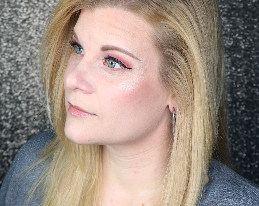
Wearing INGLOT Intense Sparkler in the shade 11
On the cheeks it was hard to capture the effect of the Intense Sparkler. When I looked at myself in a mirror, I sometimes felt like I had a strobe light coming off my cheek bones – that’s how strong it looked! However… when I tried to capture it on camera and in video (I’m wearing it in yesterday’s March Favourites video) I felt like it looks much more subtle. I have a tutorial up on my channel using this product in case you want to see it in action!
Application was easy and smooth and required very little blending. These, like all of the powder products I have tried by INGLOT are just so easy to use and the pigmentation is excellent.
Final Thoughts
While the size of the product surprised me, that’s really the only negative thing I have to say about the INGLOTIntense Sparkler. I loved the unique shade of #11, I loved the effect it gave my cheeks (both strong and subtle at the same time) and I loved how it wore throughout the day. I’m so glad that INGLOT is putting out unique shades and products that are filling holes in my collection that I didn’t even know I had – that makes me really, really happy in a time when I feel like a lot of makeup is slightly repetitive.
For those who are unaware, I’m also an INGLOT affiliate which means I make a little bit of commission off your purchase if you buy through my links or use my code. This code used to be only available for Inglot Canada, but now it’s available for the US as well!
If you’d like to save yourself some money, use code “MAKEUPYOURMIND” to get 10% off at:
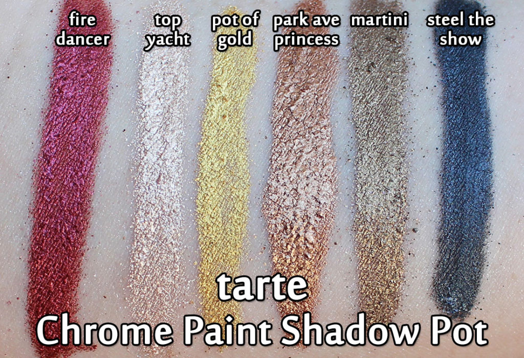
Sometime last year tarte released their Chrome Paint Shadow Pots and I was instantly smitten with the shade Fire Dancer (that deep metallic burgundy-red you see on the left). That shade in particular was so intriguing to me – in the pot it looked more pink than red (which isn’t my style), but in swatches it was this molten fiery lava shade that just set my heart on fire!
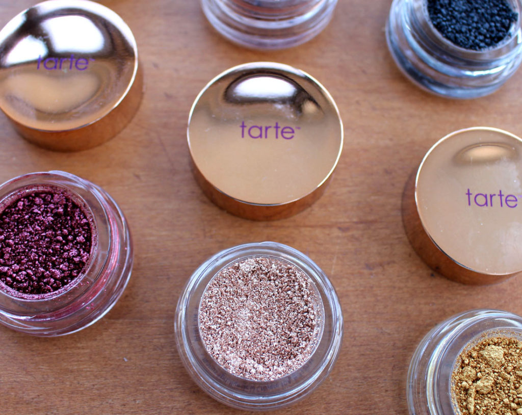
tarte Chrome Paint Shadow Pots
So when I received a package of these Chrome Paint Shadow Pots to try out, I was over the moon! And then also… suddenly nervous. While I do use pigments from time to time, they’re not generally my favourite kind of eyeshadow because my god are they ever messy. These Chrome Paints are no exception, but once you see how the colours play out, you may want to dive in headfirst and play around with them too!
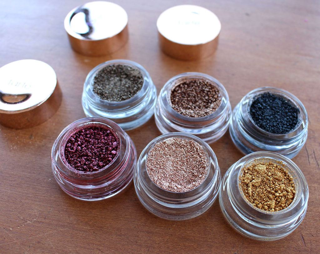
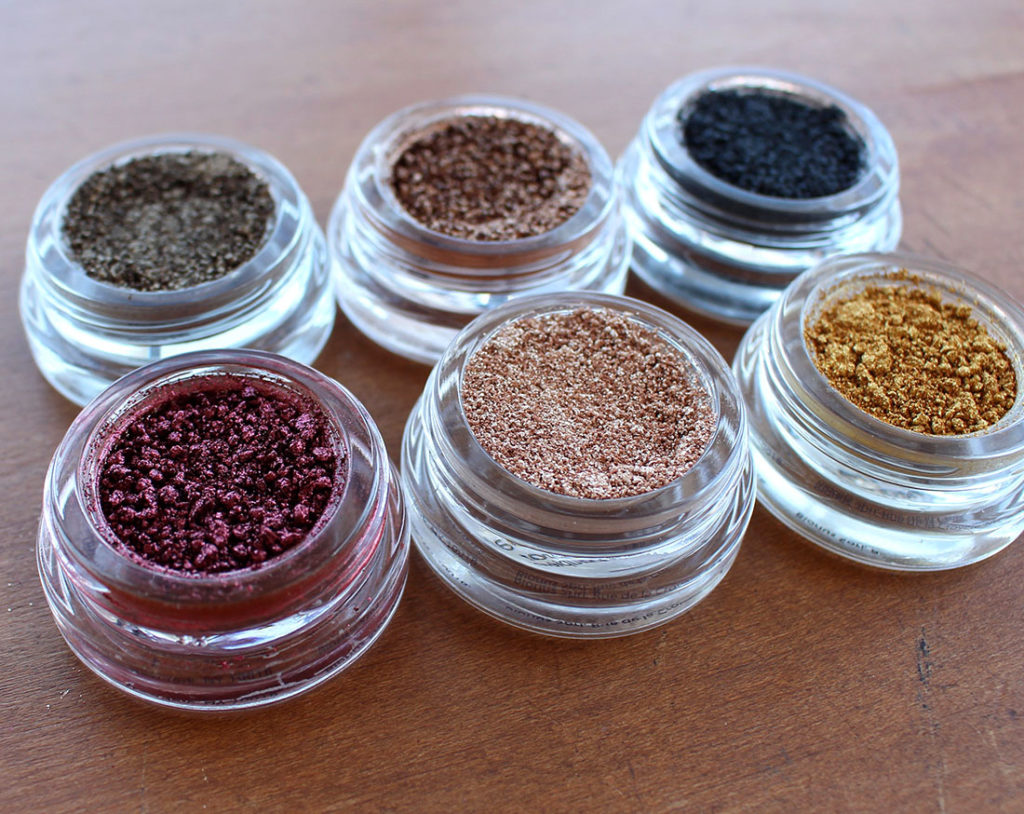
tarte Chrome Paint Shadow Pots
Each pot contains 3 grams (0.11 ounces) of product – which is roughly double what you would expect to get in a traditional pressed eyeshadow pan. I’m glad there’s so much product in there, because the price point is a bit up there ($27 CAD/$22 USD) for a single shadow. That being said, you’re getting a heck of a foiled eyeshadow pigment out of these… just check out the swatches!
tarte Chrome Paint Shadow Pots – swatched
These were swatched (as per usual) with a cotton bud, but the brand does indicate these work best with your fingertip in order to melt the product into your skin. I didn’t read that tidbit until after I’d swatched them, but I can confirm that using something to “melt/crush” the product (so to speak) works a lot better than something dry. If you apply them dry, you end up with a few chunks (as you can see above) that need a bit of smoothing out. For all the eye looks you’ll see below, I ended up wetting my brush before applying the shadow to my lids and I found that worked very, very well in order to smooth out the pigment. That being said, these are metallic right out of the gates and don’t necessarily need the extra oomph from a wet brush.
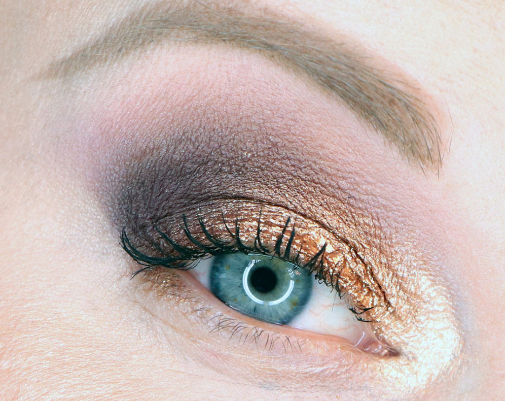
Wearing Park Ave Princess and Top Yacht
For this look I opted for Park Ave Princess on the lid with Top Yacht on the inner corner. Top Yacht is unbelievably reflective. I could probably also use it as a cheek highlight because the reflection is incredible!
Wearing Park Ave Princess and Top Yacht
Closed eye shot with the same colours as above so you can see the texture a bit better. It’s quite foiled (and my eyelids are a touch crinkly) but overall it’s quite a smooth application with a wet brush.
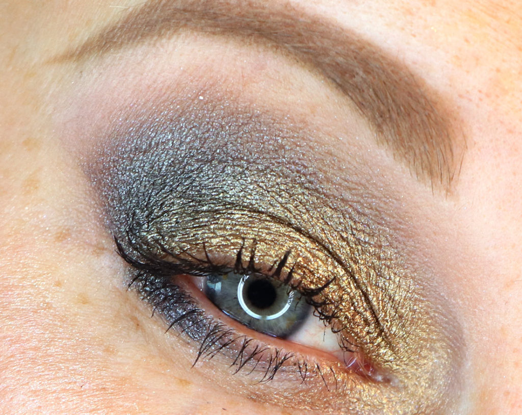
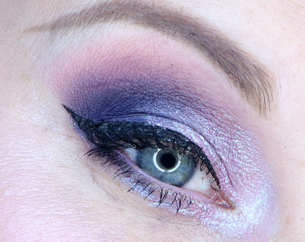
Wearing Martini and Steel The Show
The next look involves Martini all over the lid with Steel The Show on the outer corner and through the crease. I thought Steel The Show would be more grey overall, but it’s got a beautiful grey cast to it. Martini is one of those darker golden-olive shades – wonderful as a lid shade.
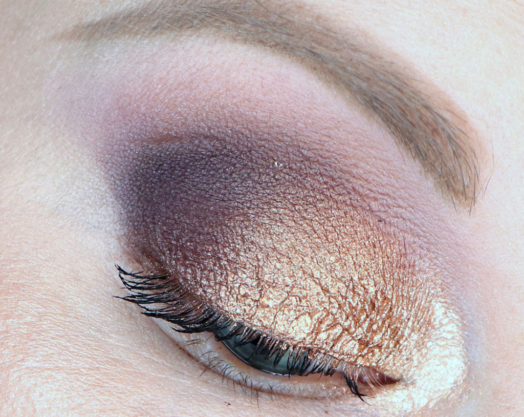
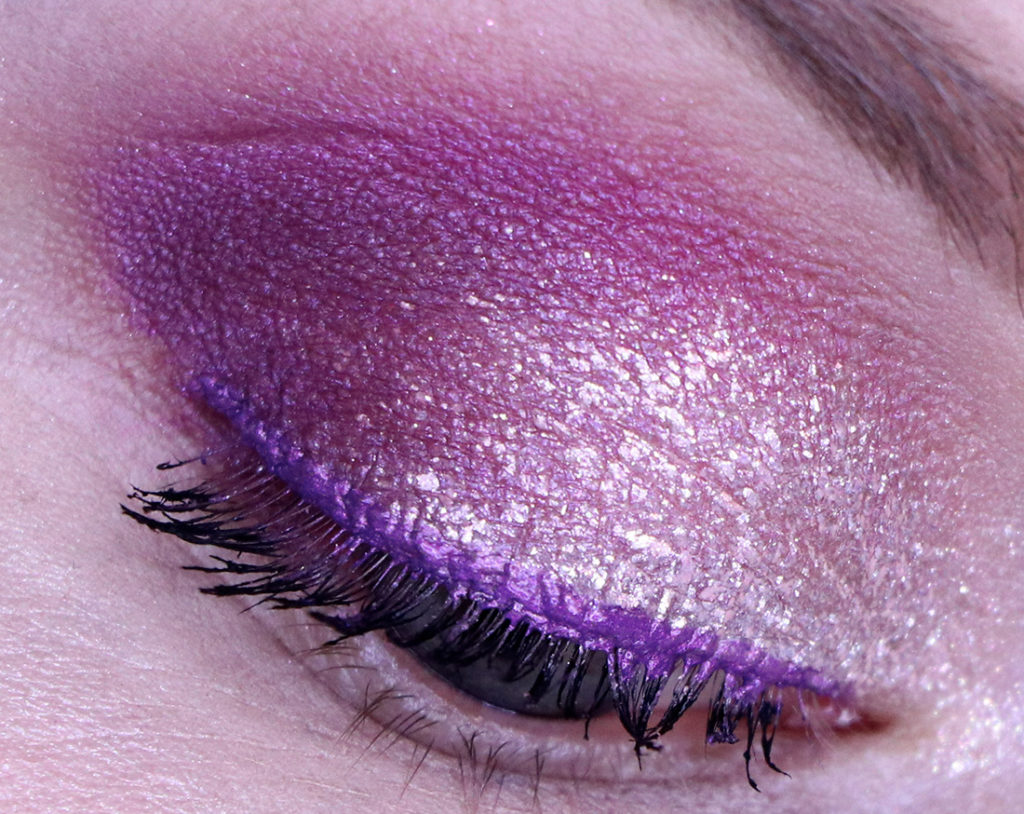
Wearing Fire Dancer
And my favourite? No surprise here, but it’s Fire Dancer (I even love the name!). This colour is basically all of my makeup hopes and dreams rolled into one fiery shade of wonder. This colour is EVERYTHING to me! It’s the only colour I used all over my lid, crease and lower lash line (I have a glitter on the inner corner) and the end result is breathtaking. If there’s one shade I’d urge you to pick up the most in this collection – it’s this one!
Final Thoughts
The tarteChrome Paint Shadow Pots are definitely a bit messy, and slightly finicky but oh-so-worth it. (To cause the least amount of mess, I’d scoop my brush into the product and plop it into the lid, wet my brush, then smush the shadow into the lid of the product and apply it directly to my lid.)
Each colour is beautifully pigmented and has a beautiful foiled/metallic finish. While most of the shades are fairly neutral, the ones that stood out to me the most were definitely Fire Dancer and Pot of Gold. I experienced no creasing after 12+ hours of wear on all shades and each of them had solid opacity on the lid and didn’t require constant layering. These are a definite winner!
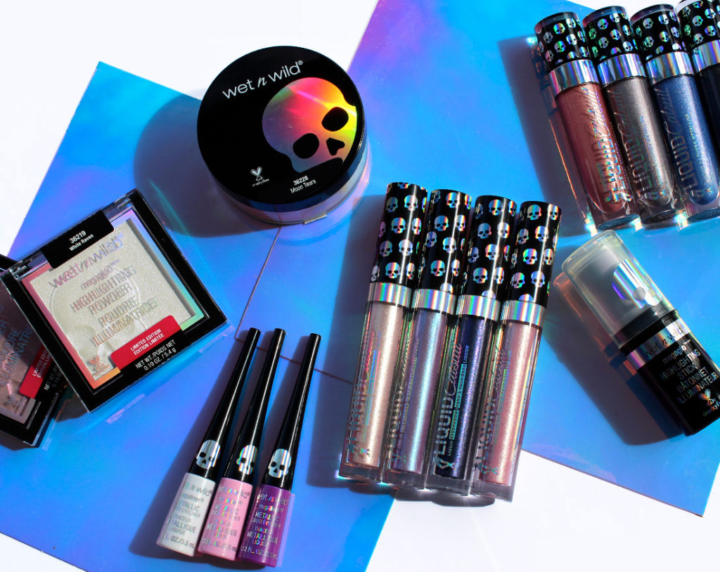
Buckle in guys, this is going to be a long one! Wet N Wild has released their anti-unicorn collection (their words) with their limited edition online-only launch of “Goth-O-Graphic”. This collection dips into the holographic trend (which is really just duochrome) while piggybacking on the anti-thesis of unicorns – skulls and a goth-esque vibe!
Let’s dig right in, because there’s a LOT of product to discuss!
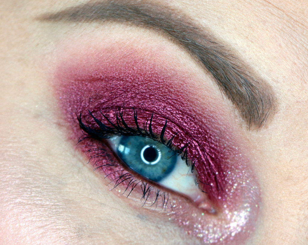
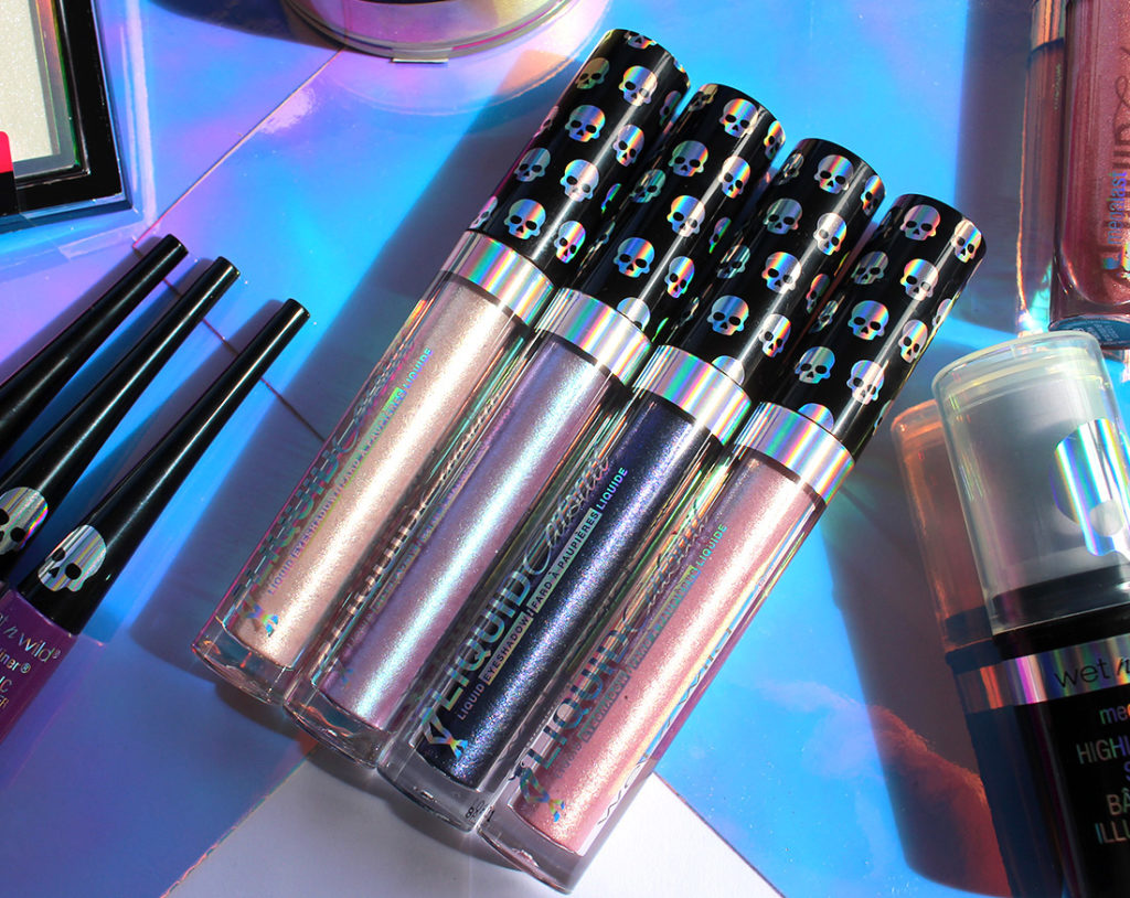
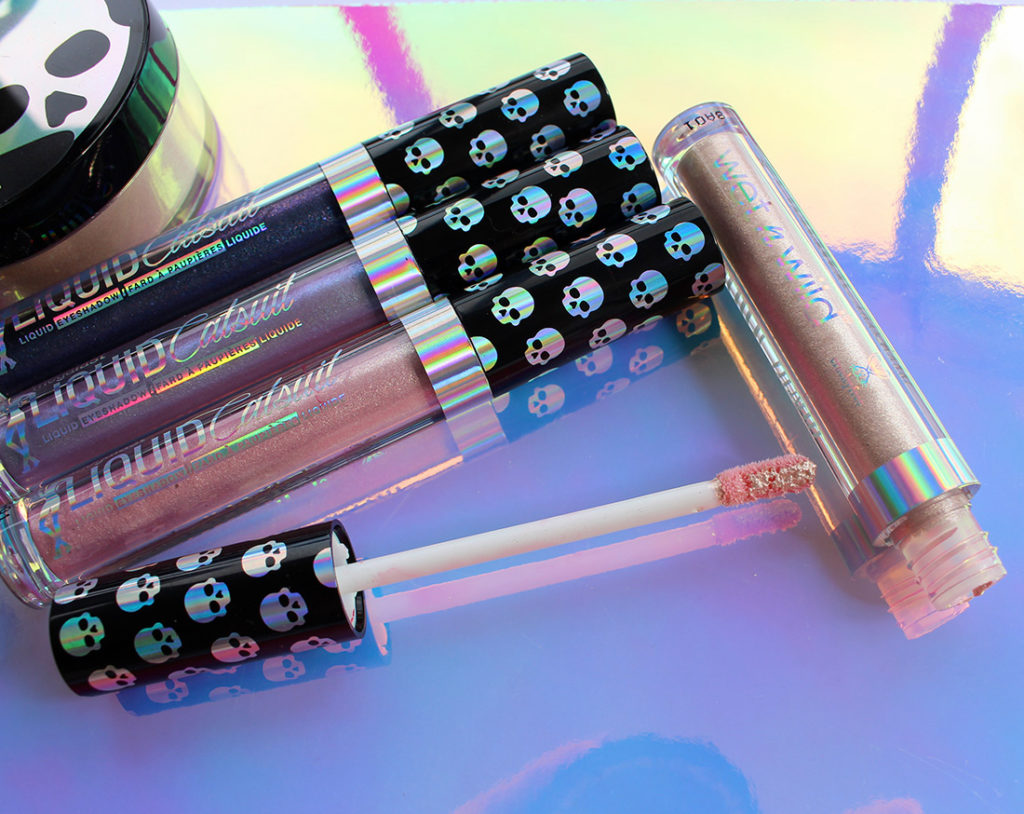
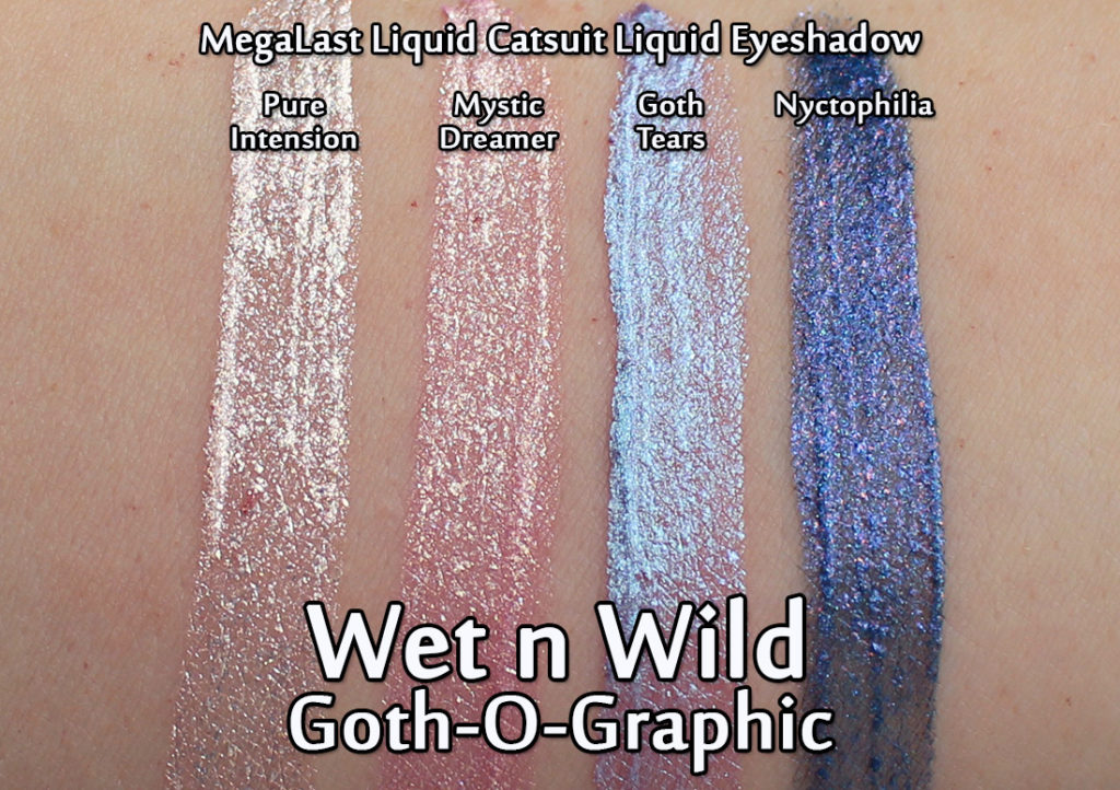
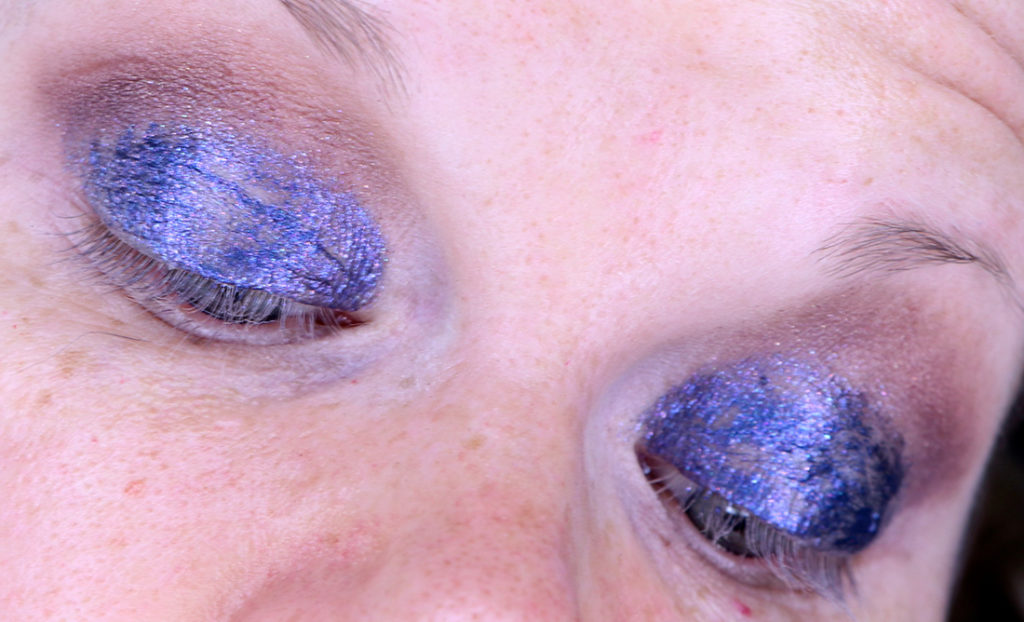
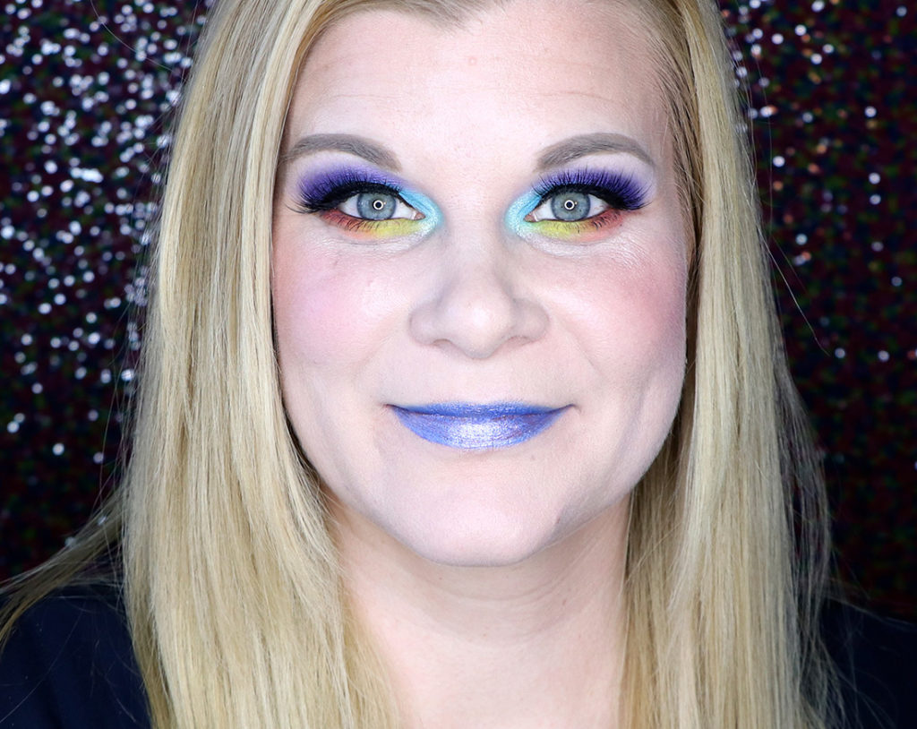
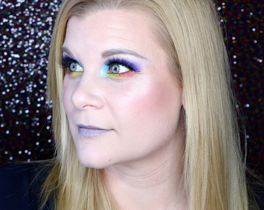
The first item that piqued my interest (and terrified me a little to be honest) were the MegaLast Liquid Catsuit Liquid Eyeshadows. The reason I was little apprehensive about these was because my eyelids have never handled liquid eyeshadow very well. More often than not it’s a crease-y mess, but these colours were so beautiful it was hard not to get excited about them!
Swatched out the shades are interesting in texture: the paler shades are more translucent whereas the darker onces are more opaque. Each colour has either flecks or flakes of shimmer.
The two palest shades – Pure Intension and Mystic Dreamer are on the more flakey side of the sparkle spectrum. You get a bit of a broken up glass type look on the eye.
It can appear quite chunky, but it’s a look I’ve gone back to with other products over the years and I do like the look of fragmented shimmer – I think it adds a bit of different dimension. I would also like to point out that the colours are a heck of a lot more pigmented on the eyes (two coats) than they were on my arm swatch. Hooray!
My favourite shade is definitely Goth Tears – it’s a stunning blue shifting purple that goes on smoothly (there’s no flakes in this one) and looks beautiful paired with cool toned shades. And best of all? I had no creasing with these shades!
The only one that didn’t work on me (and turned out to be an utter trainwreck) was Nyctophilia. I was so surprised at just how terrible this went on my eyes – as you can see it’s a clumpy mess and I didn’t even bother to finish my eye look because there was no salvaging it. It creased within seconds and applied patchily – this one is a total miss for me.
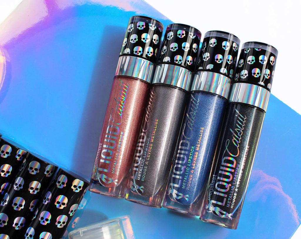
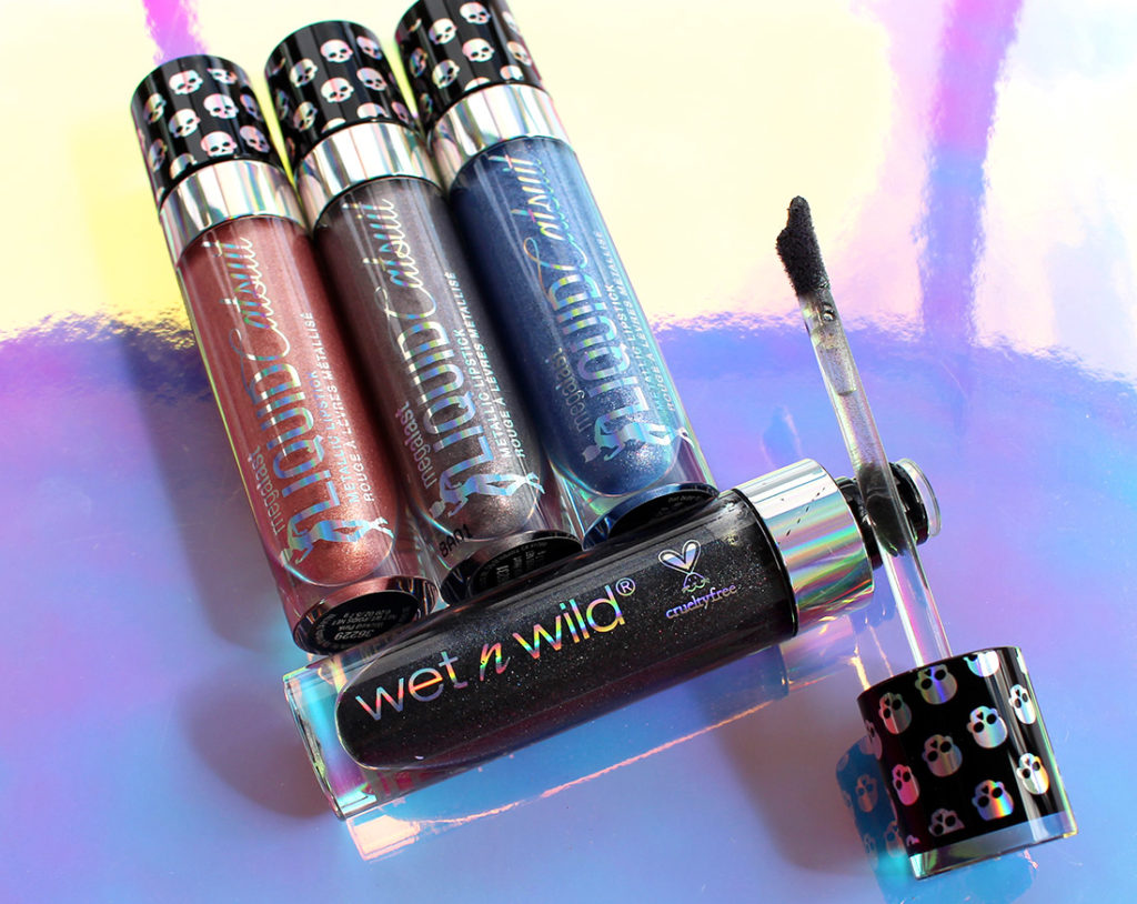
The liquid lipsticks released with the Goth-O-Graphic are a metallic version of their regular line up for MegaLast Liquid Catsuits (you can see my full review of that range here). Wet N Wild says that these have buildable coverage and can act as a holographic topper. Let’s keep in mind – none of this collection is actually holographic. Holographic shows you the colours of the entire rainbow spectrum – this collection is more on the duochrome side of things.
As per their regular line, these Metallic Liquid Catsuits have stubby packaging with a scooped doe-foot applicator. The scoop helps to collect product from the tube and evenly disperse it on your lips.
The first thing I noticed when I swatched these out is that they are INCREDIBLY dry. They come out of the tube rather clumpy – which is in stark contrast to their regular lineup which can feel thick, but also really fluid. These are… chunky. The colours are interesting and quite dimensional… but it’s like they’re already half dried out!
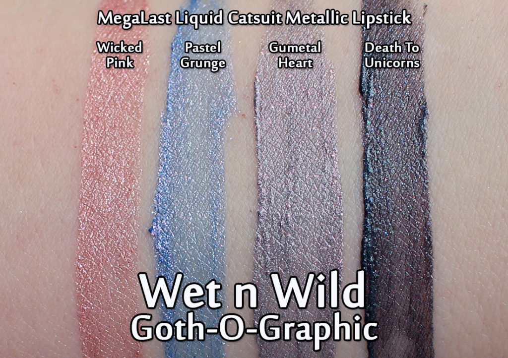
Wearing Wicked Pink
Wicked Pink is the softest you’re going to see out of this collection – not only in terms of shade, but it was also the least drying and clumpy to apply. I love the overall effect of this one!
Wearing Pastel Grunge
Pastel Grunge is so freaking cool – pale blue with shots of silver sparkle thrown in. While the colour is really neat, it applied supper patchily and could not be layered without getting too thick and uncomfortable.
Wearing Gunmetal Heart
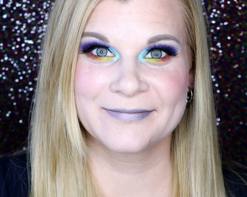
Hands down my favourite shade is Gunmetal Heart – I’ve never seen a shade like this before! It’s a pale grey with a lavender edge and it has copper micro-glitter in it. It’s so incredibly unique! (I wore this shade in my Pinky Rose Bright Lights palette review if you want to see it in action.) It is, however, quite drying and a little bit patchy.
Wearing Death To Unicorns
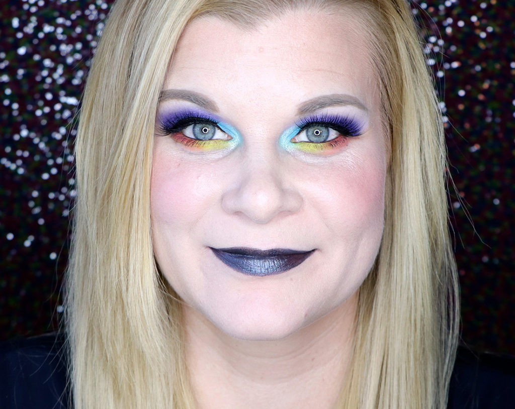
Death To Unicorns is a charcoal shade with some brown and silver glitter thrown in. It’s a really neat shade to look at… but uncomfortable to wear and clumpy to apply.
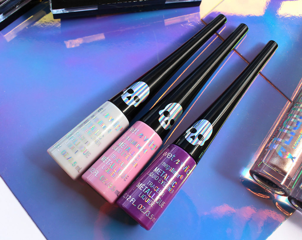
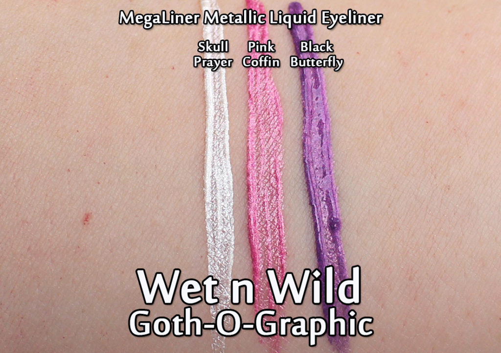
Wet N Wild – Goth-O-Graphic – MegaLiner Metallic Liquid Eyeliners
I was extremely excited for these – these are the metallic version of their MegaLiner Liquid Eyeliner! While I’m not huge on the dip pot style of eyeliner, Wet N Wild does make some of my favourite shades (they’ve got an unreal blue that I love dearly) so I’ll excuse the applicator in favour of the beautiful colours they make!
But these are… chunky. Dare I even say… crusty? I’m cringing so hard while typing this out but these come out of the pot in BLOBS. The brush is so coated with product that I didn’t think I’d even be able to get a clean line.
Wearing Black Butterfly
In the end, after two coats the liner is opaque and it looks okay… but you can see the thick blobs clinging to the roots of my lashes. The easiest one to apply is the white as it’s the most fluid, but for the most part these are just too chunky for me.
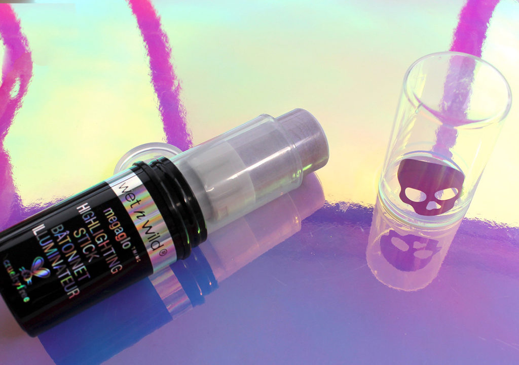
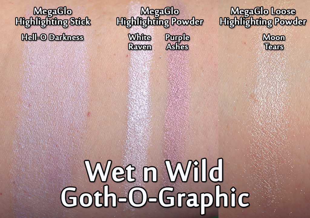
Wet N Wild – Goth-O-Graphic – MegaGlo Highlighting Stick
And finally, the last few items in this collection are all highlighters. Wet N Wild released a whole whack of them with the Goth-O-Graphic collection, and I for one am always happy to see variety in highlighters!
The first item is the MegaGlo Highlighting Stick in the shade Hell-O Darkness (lol I love the name!). The stick is a cream highlighter with a blue-lavender shift. I found it to be more subtle on the face than I had expected. Somehow I’ve lost the photos I took of it on my face, so sadly I can’t share that, but definitely check out Melanie’s Versus: Milk Makeup Holographic Stick and Wet n Wild Mega Glo Highlighting Stick post – she has a great comparison and review there!
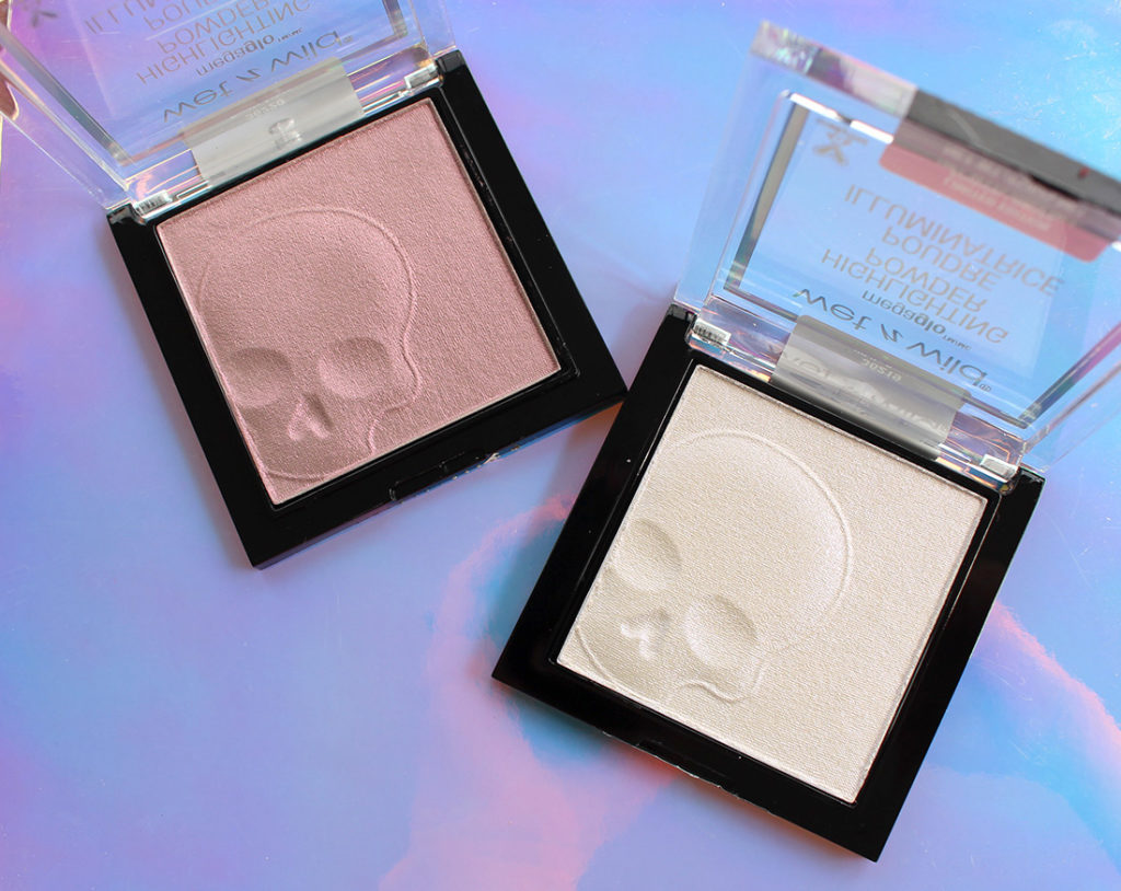
Wet N Wild – Goth-O-Graphic – MegaGlo Highlighting Powders
I’m more of a fan of powder highlighters, so I loved the idea of the MegaGlow Highlighting Powders with their skull imprints! One shade looks bright white in the pan but it comes across on the cheeks with a blue shift. The other is more of a pinker sheen and honestly has a lot of pigmentation – so much so that it really only works as a blush on me.
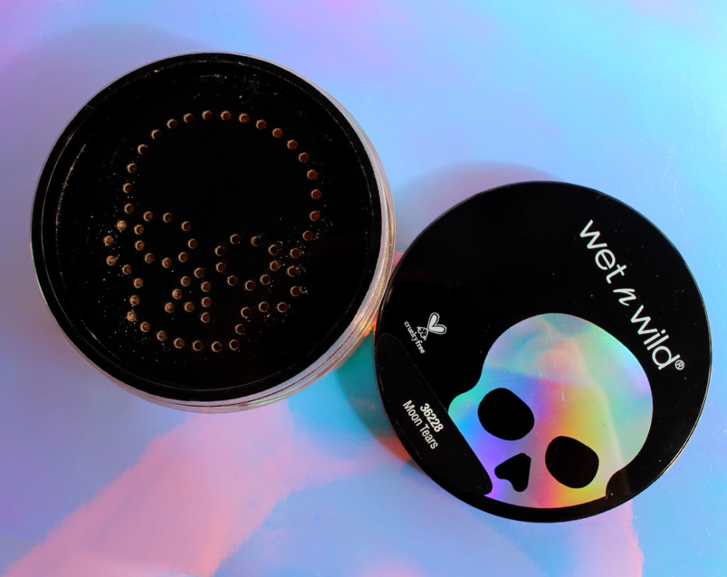
Wet N Wild – Goth-O-Graphic – MegaGlo Loose Highlighting Powder
And the very last highlighter is the MegaGlo Loose Highlighting Powder in the shade Moon Tears. If you twist off the cap, you can see that the sifter is shaped like a skull!
Wet N Wild – Goth-O-Graphic – Highlighters – swatched
And here they are all swatched out. I like that there’s variety in the highlighter shades that they’ve provided, but they’re all kind of unique – not just boring shades of champagne.
Wearing Moon Tears
My absolute favourite was the loose highlighting powder in Moon Tears. This product reminds me so much of MAC Iridescent Powders (which are now discontinued). It’s got a similar texture to Silver Dusk, but it’s more on the slightly gold side of things (Silver Dusk was pink-white). This highlighter is absolutely BEAUTIFUL and I think it’s my favourite item out of this entire launch. One word of caution though – the sifter isn’t amazing and if you tip this upsidedown with the cap on, you’re going to end up with a ton of product in the barrel of the jar.
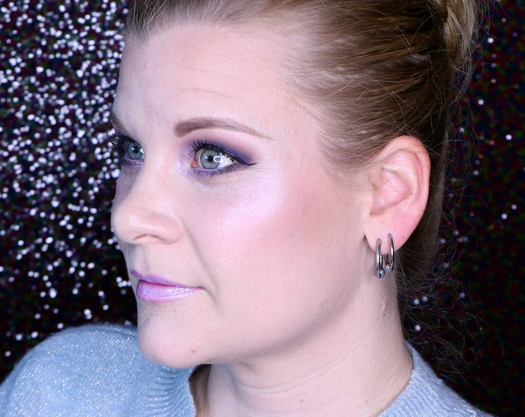
Wearing White Raven
Of course, I also love a good shifty cheek highlighter, so I found the pressed highlighter White Raven to be absolutely beautiful. I love matching my highlighter with my eyeshadow, and it worked out so well with the liquid shadows from the same collection.
Final Thoughts
Wow, this collection is all over the place for me, and sadly there’s only a few items I would recommend to you. I adore Wet n Wild, and I felt like this launch had a lot of potential, but the products themselves just fell very short in terms of quality. Let’s run through each set of items:
Liquid Catsuit Liquid Eyeshadows: These were surprisingly good given that I didn’t think they would work on me. The darkest shade – Nyctophilia – is a disaster though. Don’t buy that one, but get the rest of them – they’re lovely.
Liquid Catsuit Metallic Lipstick: The shades are gorgeous, but they’re a clumpy, chunky mess. They’re unpleasant to apply and feel super dry on the lips. You might able to wear them with a matching lip pencil underneath… but I’d personally take a pass on all the shades. 🙁
Metallic Liquid Eyeliner: Another no. Don’t buy these. The white was okay and the colours are pretty overall.. but I can’t handle how chunky these are to apply.
Highlighters: These are so much fun! The Loose Highlighting Powder was definitely my favourite, then the pressed powders (White Raven in particular). The cream stick was okay, but it didn’t have enough oomph for me overall (maybe better suited to people who like more subtle colour).
Story time (with a point, I promise)! I used to skate when I was younger, going so far as to compete locally in Ottawa, until I quit around the age of 17. I kind of fell out of love with the sport – I mean it made sense at the time – I was getting older and my tastes were changing, but I was also tired of going to the rink 3-4 times a week for 2-3 hours at time (including 7 am practices on Saturdays which is never fun for a teenager who craves nothing but sleeping till 1 pm on the weekend). All this to say, I fell out of love with a sport that I had devoted almost all of my free time outside of school to.
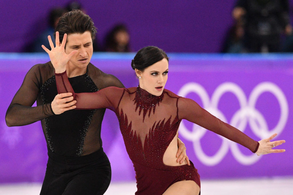
It wasn’t until this year, 18 years later, that I found myself completely re-enamoured by the sport – and that’s in large part due to Tessa Virtue and Scott Moir.
(And for those who don’t know who I’m talking about, they’re a Canadian ice dance duo that are now the most decorated figure skaters of all time!)
If you’ve been following my Instagram stories over the last month or so, you’ve seen me go from “piqued interest” in figure skating to “stark raving mad”. I fell deep down the rabbit hole thanks to Virtue and Moir (their Team Dance skates really set me off), and by the end of the Olympics, I was so filled with terror that they wouldn’t win gold that I was almost sick to my stomach. (Which was followed by blood curdling screams of joy at Julie‘s apartment at midnight on a Monday evening when their results popped up and confirmed they had won gold after the free dance!)
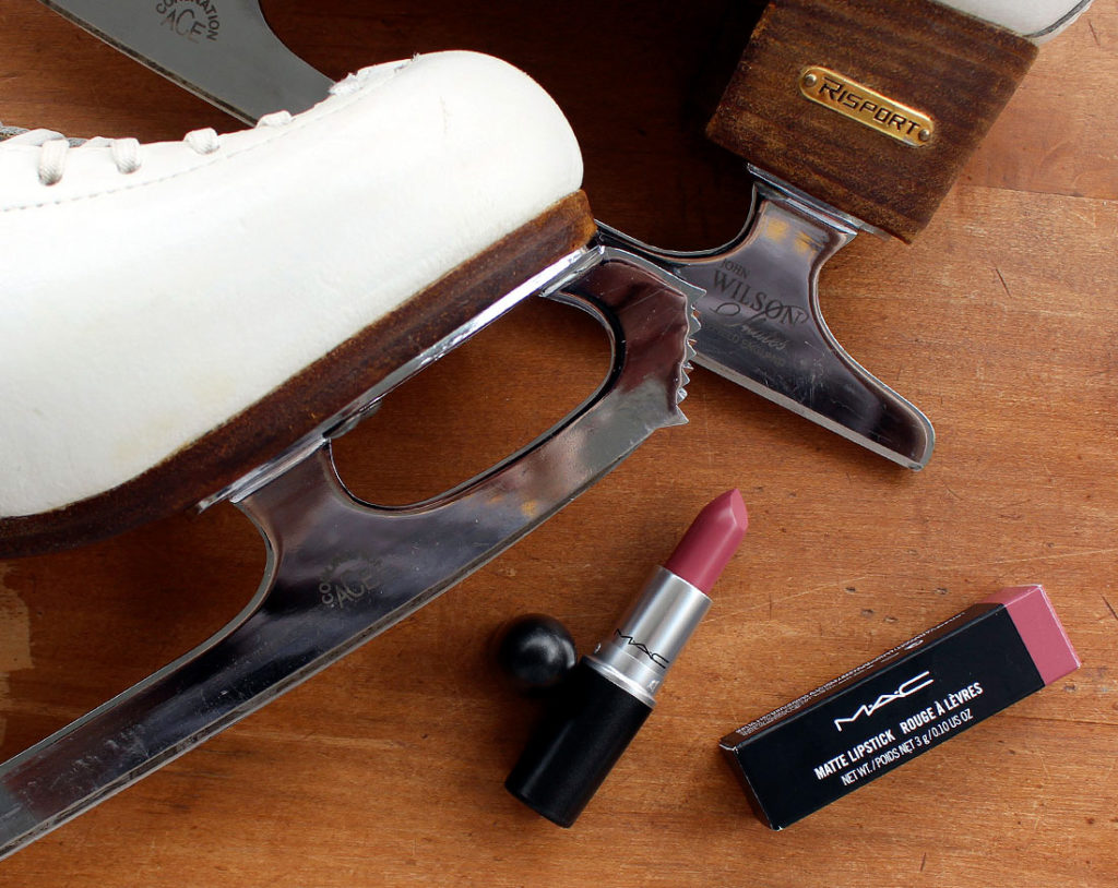
Exactly one week ago I had the opportunity to actually MEET Tessa Virtue at the brand party for her partnership with Nivea here in Toronto and I was so, so terrified. I had gone from not caring about figure skating much anymore to feeling deeply involved and completely enamoured by her and her partner. So when I actually got to speak to Tessa Virtue – I was shellshocked (see that post here!).
Tessa Virtue wearing MAC Mehr Lipstick | Copyright: Scanpix/Mladen Antonov
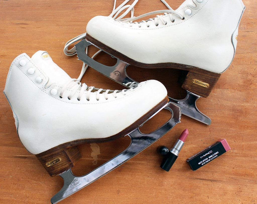
But, thankfully, I was sent in to the Nivea event with a mission by Steph (her friend, actually) to ask Tessa what lipstick she wore during the Moulin Rouge finale free dance. A conversation piece I could work with – thank heavens! So I asked Tessa, and her answer was that it was the MAC matte lipstick in Mehr. So course I ran out the next day and picked it up!
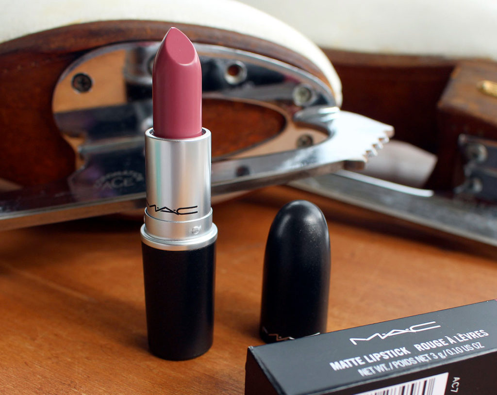
MAC Mehr Lipstick
MAC‘s Mehr lipstick is described by the brand as a “dirty blue pink” with a creamy rich formula, high colour payoff and a no-shine matte finish. It’s a permanent product, and I’ve known about the shade for quite some time, but I wouldn’t be able to tell you how long the brand has had in their range.
MAC Mehr Lipstick
Mehr fits into that “my lips, but better” category. It’s a deeper shade than my own lips, but not by much. Honestly, I was a touch surprised that Tessa would choose a shade like this to match with a red dress (as she traditionally wears in her Moulin Rouge performances) as my first thought would be to whack on a red lip. But then I started looking at her other performances this year, and I half wonder if it’s just her shade of choice because it’s the kind of colour that will match anything. Here she is in her ice dance short program outfit – I swear it’s the same shade!
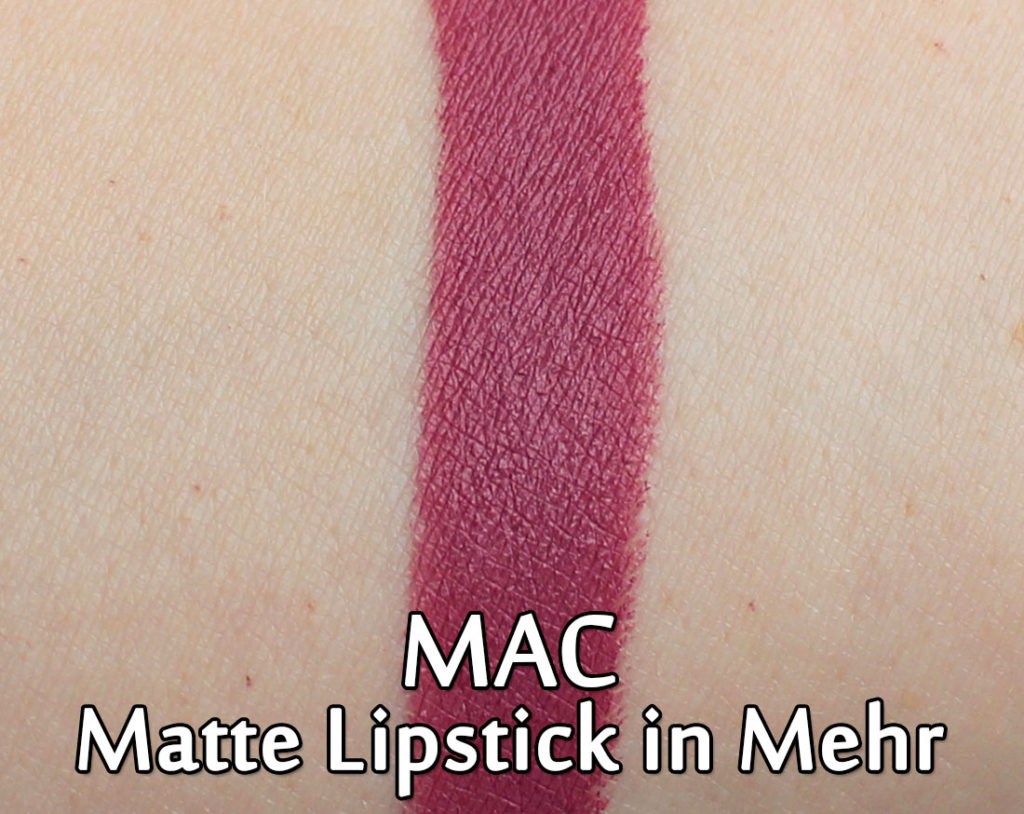
Swatched out it actually comes out a bit darker on my hand than it does on my lips. I’d classify this as darker rose shade.
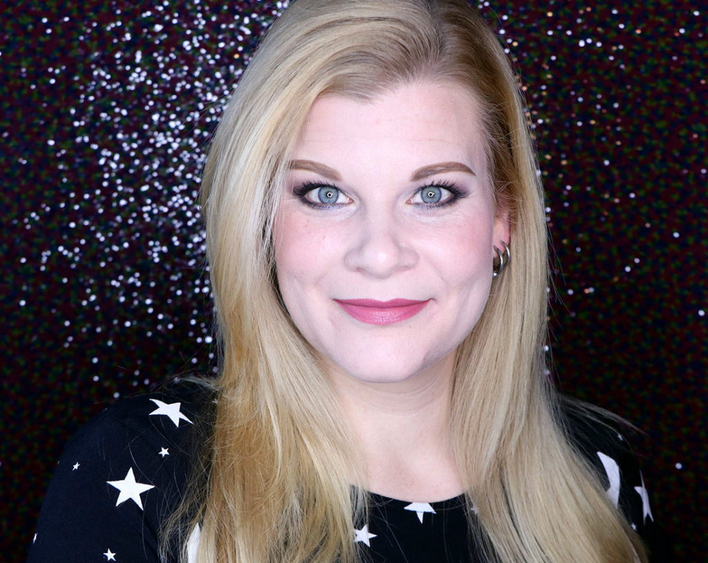
Wearing MAC Mehr lipstick
And on the lips? It’s perfect. This is absolutely one of the easiest shades to wear and it will match almost every single eye look I could think to throw at it. I can see why Tessa reaches for this kind of shade! Also, since it’s a matte formula, it’s not going to move around on your lips very much, which is helpful when you’re being tossed around by your partner on the ice! I was also impressed with the formula – it’s been quite a while since I bought a MAC matte lipstick, and I was pleasantly surprised with how easily the lipstick glided onto my lips!
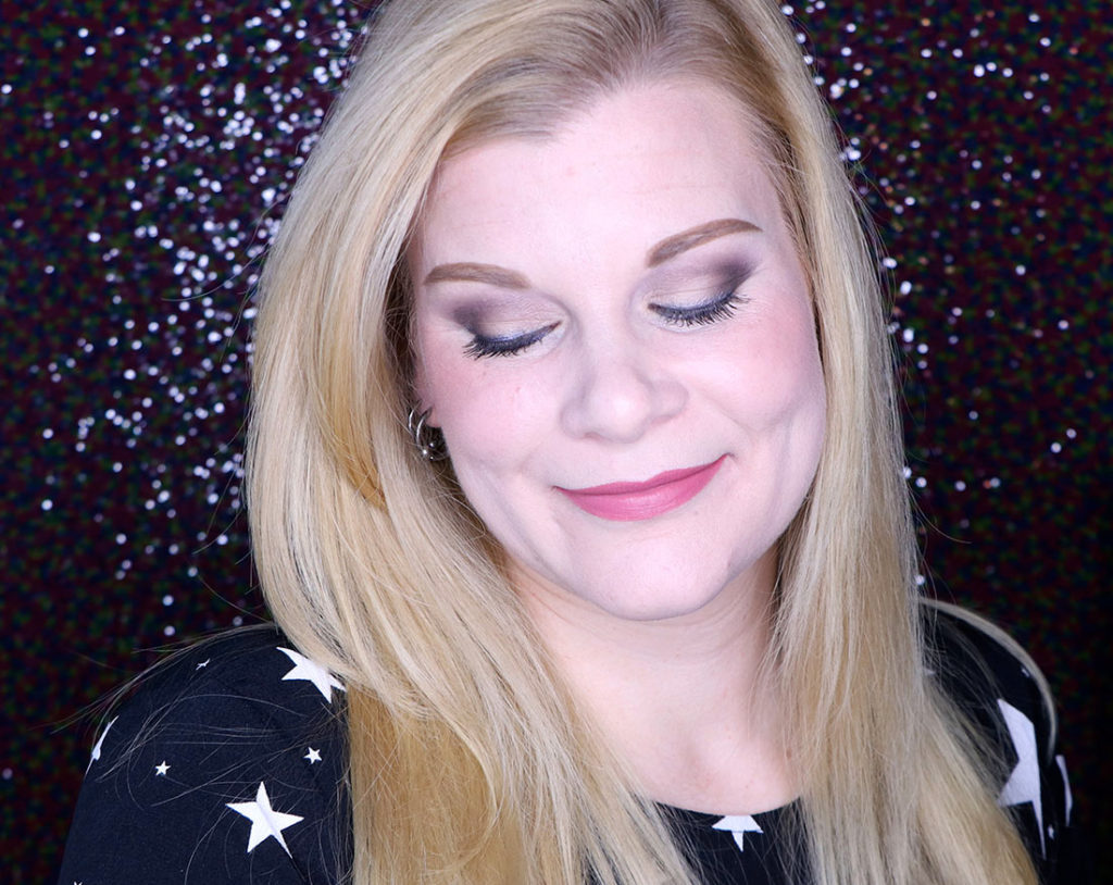
Wearing MAC Mehr lipstick
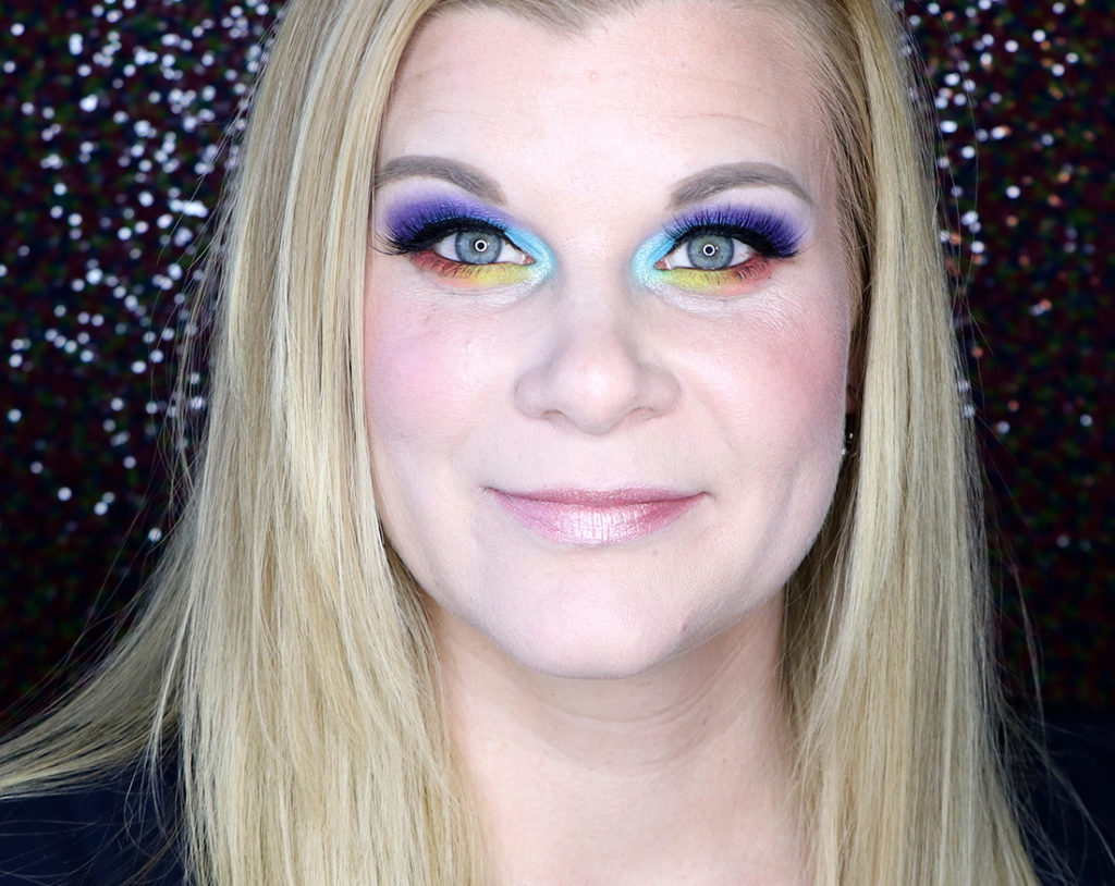
For the sake of the rest of my makeup, I tried to replicate what Tessa seems to do with her eyes – a lot of ringed pencil liner and darker shadows on the outside of her eyes to make them more expressive.
I hope you liked this little bit of insight into Tessa Virtue’s makeup routine! I wish I had asked her more to be honest, but hey, I was having problems stringing sentences together in her presence, so this in and of itself was quite the feat!